Freud-ify Your SAP Fiori
Sigmund Freud developed psychoanalysis in the late 19th century. In short order, it was the dominant form of psychotherapy. While in less active use today, it has still left an enormous footprint on the therapeutic industry. You’re likely familiar with the classic picture: an analyst, holding a notepad, sits in her chair. The patient lies on a couch, babbling about dreams and feelings.
In psychoanalysis, the analyst tries to see the workings of the client’s subconscious. Freud held that the subconscious was the source of most motivations. Thus, understanding the subconscious could help unravel clients’ troubling behaviors. Since no one can access it, the analyst attempts to uncover it through observation. This can be through dreams, free association, and even the famous Freudian slip.
If you’re having flashbacks to boring Psych 101 lectures, I promise I’m going somewhere interesting.
Explore related questions
As developers, we should create experiences where users don’t need to psychoanalyze their apps. Our end-user customers already hold complex business problems in their minds. They shouldn’t have to put our apps on a couch and talk to them about their relationships with their mothers.
Psychology has progressed since Freud’s time. Scientists have uncovered many interesting principles of the human mind. I’ll detail three below, and how using them with SAP Fiori can create incredible experiences. Hopefully, your users will stop sending you the bill for psychoanalysis sessions with your apps.
Memory Is Weird
When I recall an important memory, it’s like a perfect representation of that moment. I can see exactly where people are, what’s happening in the room, and tons of other details. It feels so vivid that it simply must be correct. It’s right there, clear as day in my head!
As it turns out, my confidence is misplaced. Memories are not crystal clear perfect images pulled from pristine storage. They’re reconstructed on the fly. If I were to ask the people in the room at the same time as my vivid memory, chances are we would report the same high-level details — we all agree Alice was there — but many would likely disagree specifically where Alice stood. What’s more, my level of confidence in the accuracy of my memory is not a good indicator of that memory’s accuracy.
What does the inaccuracy of memory mean for user experience (UX), and how can we mitigate it? I suggest two methods: the Wizard floorplan for SAPUI5 screenflow, and BUILD with Design Thinking for design process.
Wizardry
We would all love to build a simple, three-input app with a big shiny “Go” button. Flawless in design, perfect in execution — a harmony of code precision. Our users have … different plans. They need a six-step process, with 34 various things to enter to create a business document. Without our UX wizardry, they’ll skip around the screen willy-nilly, filling in some fields and ignoring others. And when they hit “Save” and an error message tells them they missed the customer’s zip code, they’ll have to scroll (or thumb) halfway up a giant screen.

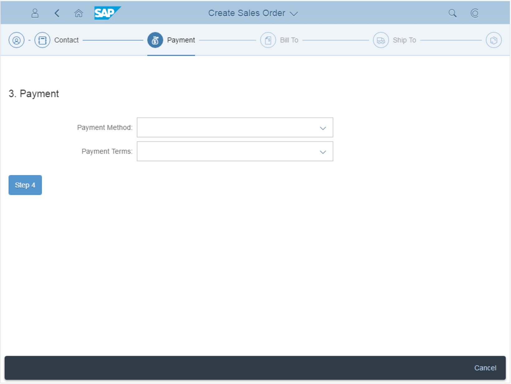
Figure 1: The Wizard floorplan puts smart restrictions on the input process.
Break up the flow of those 34 inputs, and give your users simple steps with targeted inputs on each page (see Figure 1). Don’t expect users to remember to fill in all the fields as they skip around — because they won’t! Put them on a simple, reviewable path that doesn’t strain their memories.
BUILD Something
Because we know that memory is fallible, we should forego the old RICEF waterfall method of gathering requirements. Don’t get on a conference call and listen to someone list off what they think they remember some application will need. They’ll forget something.
Skip the process of remembering altogether. Sit down with your users and work through a rewarding design thinking session. SAP has kicked things up a notch with this process, which I recommend for almost anything needing a solution. Instead of listing things out into some never-read document, designers and users get together to create solutions that get immediate feedback.
The best tool to enhance this process is SAP’s BUILD. This gives you fast-iteration user interface (UI) design functionality, complete with a feedback-gathering mechanism. Your users get to try a prototype of their new applications on a real screen (see Figure 2). They don’t have to trust their memories — the app is right there.

Figure 2: This screen was built entirely in BUILD — no coding required.
Gestalt — Form, Shape, Space
We generally perceive things as structured and organized, and our minds seek out ways to do this structuring. Gestalt psychologists believe the mind as uses rules to form the world into that cohesive mental experience. These rules — called Gestalt laws of grouping — form a major aspect of Gestalt psychology and help to explain why we perceive things in an ordered way.
Most of these laws could apply to SAPFiori/SAPUI5 directly. I’ll show you two ways to make use of these rules in your applications.
Proximity
Per the law of proximity, things that are close constitute a group. If your mind finds ways to group things together, it can fit more things in active memory. So it serves your application well if you can find ways to group items and inputs.
An elegant way to do this is with Object Pages. They come ready to plug in with special blocks of code that break pages into clickable sections. You can then put whatever you want inside the sections, so it’s easy to break your inputs up into digestible segments that a user can jump between (see Figure 3).

Figure 3: Users can jump between sections.
There’s a downside, unfortunately. It takes huge amounts of code to set this up on your Object Pages. So go brew a coffee and prepare for a huge code listing because I’ve done the hard work of preparing it for you. Ready?
<ObjectPageSection title=”Section 1″>
Glad we made it through that.
Past Experience
The law of past experience explains that people understand groupings when they conform to rules they’ve seen before. If objects tend to be grouped in a certain way, an expectation is created. When someone sees a familiar object, they’ll expect to see the related objects in the same way they appeared together before.
To hit on this law, create consistent experiences across your apps. Two SAP resources can help you make this happen. In the design phase (hopefully during design thinking!), refer to the SAP Fiori Design Guidelines. They not only show you what you’ll get, they also explain the best scenarios for each floor plan and point to the application programming interface (API) documentation.
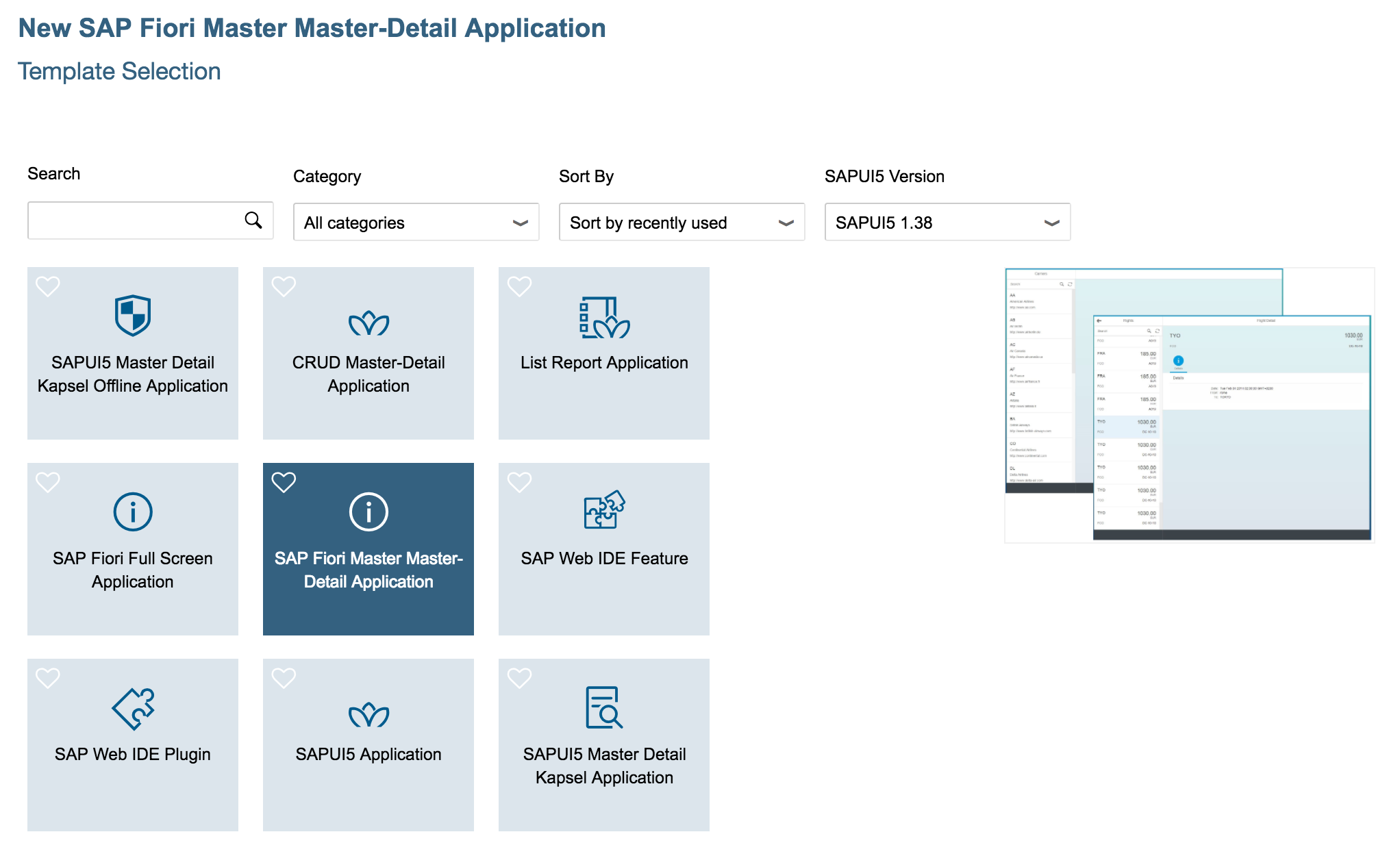
In the build phase, do yourself a favor and use Web IDE. Figure 4 shows what you get if you start a new project:

Figure 4: Example of SAPUI5 template choices.
Web IDE lets you start a project with an SAP Fiori floorplan already in place. This lets you give your users exactly what they expect — every time. Save/cancel buttons go on the bottom right in the footer. Master lists line up on the left side. Search fields are at the top of the lists. It all goes toward creating an experience that fits right into their Gestalt-based perceptions.
Multitasking — Nope
It’s tempting to think that you can split your brain and do two things at once. You probably can’t. Brain-wise, it’s much better to focus on one thing at a time. This is most dangerously apparent if you’re trying to drive and post selfies on Instagram, but it even applies to tasks that you might think are simple. The idea is this: Put your whole focus on the thing you need to do, and then move on.
SAP Fiori can help you facilitate this. Let’s say you’re creating a sales order, and you need to create a new customer to actually receive the sales order. It would be tempting to simply throw a screen or two into your app that creates a customer in the middle of the order process. Resist this temptation! Give the whole attention of your app to what it is supposed to do and let other apps handle their singular, focused task. If your user absolutely needs to complete another task in the process of completing the sales order, give that task the full attention of the SAP Fiori screen.
You can accomplish this with between-app navigation. In our example, just jump right to your customer create app, finish that task, and then land back inside the order create app (see Figure 5). This lets the user concentrate on one thing at a time while maintaining the flow of their overall process.

Figure 5: Users can navigate from SAP Fiori Launchpad to App 1 to App 2 and back again.
To make the magic happen, set up your SAP Fiori Launchpad, give your apps intents, and make use of the Cross-Application Navigation service. SAP has an excellent blog about putting this all together.
Psychoanalysis Session Over
You’ve got a little more perspective on what goes on in users’ heads. Go out and apply great design that respects people’s memory limitations, keeps things visually grouped, and avoids multitasking. Take a load off their minds, and they’ll stop psychoanalyzing your apps.
Paul J. Modderman is senior product architect and technology evangelist for Mindset Consulting. He has more than 10 years of software development expertise, specializing in ABAP, ABAP Objects, .NET, Python, and Java. At Mindset, Paul ideates and develops innovative software products based on SAP, often joining SAP with cutting-edge cloud software such as Google for Work. Before joining Mindset, Paul developed software internally for several large enterprises. He has experience with Fiori, SAPUI5, SAP Gateway, Transportation Management (with BOPF), SAP QIM, Workflow, and standard RICEFW objects. Paul contributes regularly to the widely read Mindset blog.


