Increasingly, business users are requesting that dashboard designers provide compelling data visualizations that outline the overall situation of a company, while at the same time demanding that this be done more quickly. This leaves less time to gather the requirements, come up with the correct data, and develop a great design. Learn how to streamline the process of creating a dashboard by taking a nimbler approach to solving these issues.
Key Concept
The classic waterfall approach to projects—where requirements are gathered, the concept for the dashboard is developed, and then the final result is presented to stakeholders—is no longer the optimal approach. Today’s fast-moving world demands quicker and more accurate delivery of results. Using the older approach often led to failed projects as requirements were miscommunicated or not understood. A new approach, using elements from Agile and Scrum combined with elements from Design Thinking, offer a more flexible and iterative method for gathering feedback frequently, to ensure that all project requirements are identified and met. In this collaborative style, business users are deeply involved in the design process from the outset. They have the opportunity to articulate business problems and work together on solutions to help design more successful dashboards and also shorten the overall development timeframe.
If you are currently in a role where you are responsible for the BI deliverables for your company or are part of the team responsible for this task, then you probably noticed that your business-user audience is increasingly asking for more for visual content, and they want it more quickly. The traditional waterfall approach for creating dashboards is no longer appropriate, and there is more focus on gathering the right requirements from your business users at the outset to ensure that you are delivering the right content.
In this article I first take a look at a new approach for delivering the needed requirements and discuss some common problems with the current approaches. In the next
two articles in this
three-part series, I will discuss the details of each of the eight steps in the dashboard development process.
First, let’s take a look at the overall process for building a dashboard.
There are eight simple steps to creating a successful dashboard. In brief, they are:
- Observe and understand
- Define
- Ideate
- Prototype
- Design
- Roll out
- Training
- Documentation
Figure 1 shows these steps and the iterative nature of the first five steps. After the first five steps have been completed, the roll-out of the dashboard starts with step 6. This is followed by step 7—training users how to use the dashboard as well as training the BI team itself to improve their skillset. Finally, in step 8, documenting the actual dashboard, the components used, and the data-source usage are important parts of the overall process to ensure that the dashboard can be updated and maintained by other team members as well.
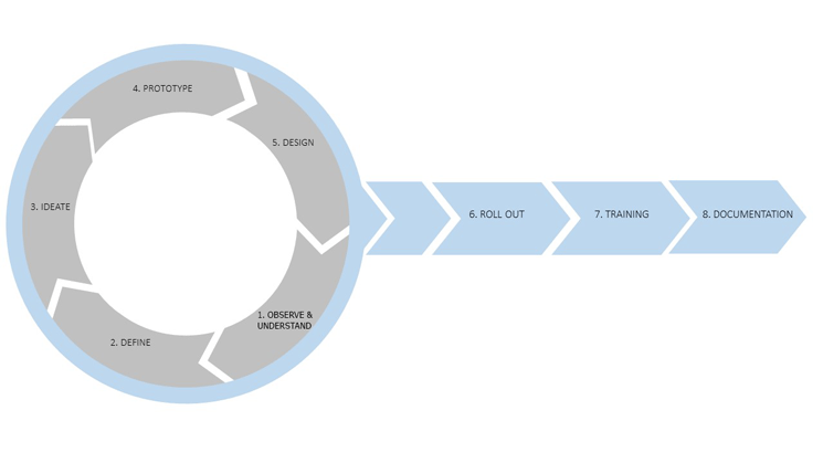
Figure 1
The eight-step process for creating new dashboards
Note
In this article, you notice that the process leverages concepts from agile as well as from design-thinking methodologies. If you are familiar with these two concepts, this process should be more easily understood. If you are not familiar with these concepts, you can learn more about agile and Scrum by following this link:
https://www.scrumalliance.org/. To learn more about the concept of design thinking, follow this link:
https://dschool.stanford.edu/.
In brief, here is an overview of each of these eight steps with some details.
Step 1. Observe and Understand
In this step the main task is to listen to your business user and try to understand the actual business problem, as well as observe how your users are trying to solve the problem currently.
Step 2. Define
In the second step of this process, define stands for defining the key performance indicators (KPIs) that will become part of the overall dashboard. At this point in the process it is not about defining the actual dashboard and the layout, but instead it is about setting up the foundation for the dashboard—in this context, the KPIs and the core message of the dashboard.
Step 3. Ideate
Those of you familiar with design thinking know that ideate is the step in which everyone gets to play with ideas and be creative in trying to solve the problem. In the example in this article, the task is to create a dashboard that meets the business users’ requirements. In regards to the dashboard creation process, ideate is the step where you start to create the design and navigation steps for your dashboard.
Step 4. Prototype
As the name of this step indicates, after the initial ideas for the dashboard have been created and some of the initial judgements are validated, in this step you create actual interactive prototypes of the future dashboard.
Step 5. Design
After the preliminary work of validating the requirements, creating some initial ideas, and using interactive prototyping to validate the design and navigation approaches, the next phase is to start designing the final dashboard.
Step 6. Roll Out
After the final product is created, it’s time to roll out the new dashboard to your users. However, this step is not just about moving the dashboard to the production environment. There are still several other aspects, such as user adoption and garnering continuous feedback, that remain relevant.
Step 7. Training
This step is very important in this process. Always train your team on the technology that is being used to create the dashboard, as well as on some of the data-visualization techniques. Training your team and increasing their skillset and knowledge is an important part of your project. This process ensures that, for the next project, your team members will feel more comfortable and become more efficient.
Step 8. Documentation
The final step is to maintain documentation for the new dashboard design. The documentation for your project consists of two parts. The first part is the actual documentation during and after the project—outlining how the dashboard has been created and which information is visualized. The second important part is maintaining the actual online help for your users consuming the dashboard. Very often documentation is seen as an afterthought for the project, but it is already a very critical element during the project life cycle, as well as a critical part of the actual dashboard itself. During the project life cycle, documenting all requirements and all agreements are very important steps as part of any sign-off on your deliverables. These steps also ensure that you deliver on the actual requirements. In addition, documenting some critical elements of the dashboard itself, for example, the meaning of some important abbreviations or outlining which costs have been considered for calculating your profit margin, and making those explanations available as an online help in the dashboard greatly assist with the eventual adoption of the dashboard itself.
This is just a brief overview on each of the steps of the process. In my next two parts of this three-part series of articles, I will cover each of these steps in more detail. However, for now, let’s take a look at some of the reasons why a new approach is needed for the dashboard-design process.
Why Is a New Process Needed?
In this scenario, your business user asks for a new dashboard that outlines the current sales performance, and he expects the dashboard to be ready and delivered within a week. I am sure some of you have been in this situation, in which a business user asks for this type of content, and you ask yourself how you can deliver those requirements in the short period of time allotted.
In cases like this, when the dashboard is not delivered as quickly as the user would like, very often you find that the teams themselves try to create their own solutions. These solutions are often decoupled from the rest of the overall solution landscape. The business users simply move ahead and begin creating their own solution by using the BI tools available to them and by getting access to the data in any way they can—either directly or by extracting information. This is not to say that you do not want to provide your business user with such an approach, but the approach should be coordinated with the rest of the overall landscape as you want to ensure that the approach can be sustained over the long term.
So, in this case, not only do you need to be able to react quickly to these types of requirements and deliver a potential solution in the form of a new dashboard, but you also need to make sure that the business user is kept involved. This is especially important during the requirements-gathering phase of the process to ensure that accurate requirements are created, as well as to continue to gather feedback and input along the way to the perfect dashboard.
Remember I mentioned in the beginning of this article that parts of this process are concepts borrowed from agile and design-thinking methodologies. In today’s world, a classic waterfall concept is no longer acceptable as it does not take the users’ feedback into consideration during the early stages. In addition, in the traditional waterfall approach, the ability to quickly turn around and deliver on the requirements are limited. In order to deliver dashboards more quickly, receive feedback in a timely manner, and iterate through a set of ideas and requirements, you need to switch to a nimbler approach in order to make the necessary changes. It is also crucial that you work in collaboration with the business user to fully understand the requirements. In step 3, ideate, you use concepts from design thinking to gain a full understanding of the requirements, and also to involve the business user early on in the design process.
I am sure that you also have been in situations in which you have received requirements with lots of measures and KPIs, but are missing necessary details. In addition, it is common during the requirements-gathering process to hear people who are using the same terms, but who are actually referring to different definitions without realizing that they are talking about two different things. In addition, people may have different definitions for identical KPIs, and you probably also have been in situations in which measures were included as part of the overall requirements, but those measures were not aligned with any company goals. All these issues can lead to confusion and to a dashboard that meets resistance when it comes to user adoption because it is not clear what the definitions of the shown KPIs are and what the actual purpose of the dashboard is to the business users.
Here are some common problems that often arise when a new dashboard is being created:
- A shortage or lack of resources and not enough time.
- Requirements that include too many measures and KPIs.
- An unclear definition of the actual KPIs.
- No real alignment with company strategy and goals.
- Business users might already have created their own solutions and are no longer interested in creating a new dashboard.
These are all very common issues with the current approach to dashboard design. The first three steps in the new process (e.g., Understand, Define, and Ideate) were developed to remove these common issues, and to create a true partnership between the business user and the dashboard designer. As a result, the solution includes more feedback from users and better data visualization.
Here are some general recommendations about what you should avoid when using this new process:
- This new dashboard-creation process is not based on a specific product or a specific technology, so don’t fall into the trap of waiting for the perfect product. When I refer to the perfect product, I mean a situation in which you have some requirements and the product of choice does not 100 percent cover all the requirements. There is always something that you will find lacking in any functionality or something that is offered by one product, not but another. However, when you keep looking for the perfect product and don’t commit, you might never get to the point of actually having the tools to create dashboards for your business users. You need to find a balance between finding the right tools to meet most of the requirements—or the most important requirements—and delivering a finished product in the time allotted.
- The same thing is true for creating the perfect dashboard. Don’t treat your dashboard as a one-time requirement. Instead, treat your dashboard as something that triggers feedback on an ongoing basis and that you will continuously improve. This doesn’t mean that you never stop creating and fine-tuning a single dashboard, but you should not try to build a perfect dashboard when creating the first prototype of it. If you do, you end up taking longer trying to gather more feedback, so it delays the final delivery. You can always make changes later on, as new information becomes available to you.
I am sure you have faced some of those issues, and experienced some of those barriers. You may even have been in one of these exact situations that you are trying to avoid—all of which illustrates the need for a different approach to creating a perfect dashboard.
In the
next article I dive into the details of the first four steps of this process and discuss how to make sure that the right requirements are gathered. I also explain how to keep business users engaged as part of this process.

Ingo Hilgefort
Ingo Hilgefort started his career in 1999 with Seagate Software/Crystal Decisions as a trainer and consultant. He moved to Walldorf for Crystal Decisions at the end of 2000, and worked with the SAP NetWeaver BW development team integrating Crystal Reports with SAP NetWeaver BW. He then relocated to Vancouver in 2004, and worked as a product manager/program manager (in engineering) on the integration of BusinessObjects products with SAP products. Ingo's focus is now on the integration of the SAP BusinessObjects BI suite with SAP landscapes, such as SAP BW and SAP BW on SAP HANA, focusing on end-to-end integration scenarios. In addition to his experience as a product manager and in his engineering roles, Ingo has been involved in architecting and delivering deployments of SAP BusinessObjects software in combination with SAP software for a number of global customers, and has been recognized by the SAP Community as an SAP Mentor for SAP BusinessObjects- and SAP integration-related topics. Currently, Ingo is the Vice President of Product Management and Product Strategy at Visual BI Solutions, working on extensions to SAP’s product offering such as SAP BusinessObjects Design Studio and SAP Lumira. You may follow him on Twitter at
@ihilgefort.
You may contact the author at
Ingo@visualbi.com.
If you have comments about this article or publication, or would like to submit an article idea, please contact the
editor.