Learn how to design, create, and deploy mobile applications with SAP BusinessObjects Design Studio and the SAP BusinessObjects BI platform.
Key Concept
The SAP BusinessObjects Mobile application provides mobile access to Design Studio applications. As mobile usage differs from desktop usage, a different development approach is required when creating applications for mobile usage.
Today’s business users expect their data, reports, and dashboards to be available everywhere, all the time. Not just when they are behind their desks, but also on mobile devices such as mobile phones and tablets. Design Studio and the SAP BusinessObjects BI platform can support this request. However, the way a user interacts with a mobile dashboard differs a lot from using a dashboard on a laptop or desktop computer—the smaller mobile screen means less space for visualizations, filters, buttons, and other components.
Thus, developing mobile applications requires a different approach than developing dashboards for normal desktop usage. This article demonstrates practical best practices on how to achieve this with SAP BusinessObjects Design Studio and the SAP BusinessObjects BI platform.
The Basics: Setting Up the BI Platform and Mobile Applications
You can use the SAP BusinessObjects Mobile app to run Design Studio applications on a mobile device. This is the preferred option, as the app provides a secure and easy way to connect to the BI platform and run Design Studio applications, as well as other BI documents such as Web Intelligence, Crystal Reports, and SAP Lumira documents.
The alternative would be to use a web browser like Safari or Google Chrome on the mobile device to access the BI applications. A big disadvantage to this alternative is that the BI Launchpad interface isn’t responsive to the decreased screen size and appears and functions in the same way as on a desktop browser. This means that users must log on using tiny log-in screens, and must browse to specific documents using the folder structure in the BI Launchpad, which is optimized for use on a big screen with a mouse—in other words, not ideal for mobile phone use with their smaller screens. (I go into more detail about the SAP BusinessObjects Mobile app later in this article, in the “Features of SAP BusinessObjects Mobile Applications” section.)
The SAP BusinessObjects Mobile app can only be used in combination with the SAP BusinessObjects BI platform. Therefore, deployments of Design Studio on SAP BW and SAP HANA are not supported.
Setting Up Categories
Before using Design Studio applications on mobile devices through the SAP BusinessObjects Mobile app, you need to ensure that the BI platform is set up correctly. The BI platform uses categories to make BI documents work on mobile devices. By default, the category Mobile is used to allocate Design Studio and other BI documents for mobile usage. The first step is to make sure this category exists. Log on to the Central Management Console (CMC) and select Categories from the drop-down options (
Figure 1). If you don’t see a Mobile category (in the Title column on the right), you must create one.

Figure 1
Create a Mobile Category
If the Mobile category is not available, you need to create it by following menu path Manage > New > Category. In the screen that opens (not shown) enter Mobile as the new Category Name and click the OK button.
The next step is to assign a Design Studio application to the Mobile category. Follow these steps:
- Log in to the CMC or the BI Launchpad
- Browse to the Design Studio application using the folder structure
- Select the Design Studio application
- Right-click and select Categories from the context-menu options
- In the screen that opens (Figure 2) open the Corporate Categories folder, select the Mobile category, and click the OK button

Figure 2
Assign an application to categories
The Mobile category is an easy way to make Design Studio applications available for mobile usage, but this is an all-or-nothing scenario—in other words, when you choose this category, all BI documents are displayed in the same group, on all device types. In some cases, you might need more detailed groupings if your platform hosts a lot of mobile applications, or if there are applications that are used only on specific mobile devices, such as an iPad.
First, let’s look at the grouping of BI documents. Next to the Mobile category (
Figure 2), you can assign other categories to a document. The document is then grouped in these categories in the SAP BusinessObjects Mobile app. Then, in the app, the user can easily filter the documents by browsing through the categories, just like browsing through folders on the BI Launchpad. To do this, simply create more categories the same way you created the Mobile category, and then assign them to the Design Studio applications.
Figure 2 shows—besides the Mobile category—several other categories. Both the Mobile and Finance categories are assigned. In the SAP BusinessObjects Mobile app, the Finance category appears and shows the document to which it is assigned (
Figure 3).
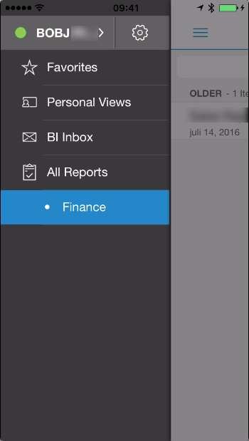
Figure 3
SAP BusinessObjects Mobile app after additional category assignment
You can also further specify the Mobile category itself. When you have, for example, some application built specifically for a mobile phone, taking the different screen size and portrait mode usage into account, you don’t want these applications to appear in the mobile app when using an iPad.
Back in the CMC (
Figure 1) this time select Applications from the drop-down options (instead of Categories) and then select SAP BusinessObjects Mobile > Properties in the screen that opens (not shown). This opens the screen in
Figure 4 where you can see the Mobile Properties. By default, the Mobile category is defined here. You can rename this category using a custom value, and you can also add specific categories for the iPad and iPhone, and Android tablet and Android phone devices.
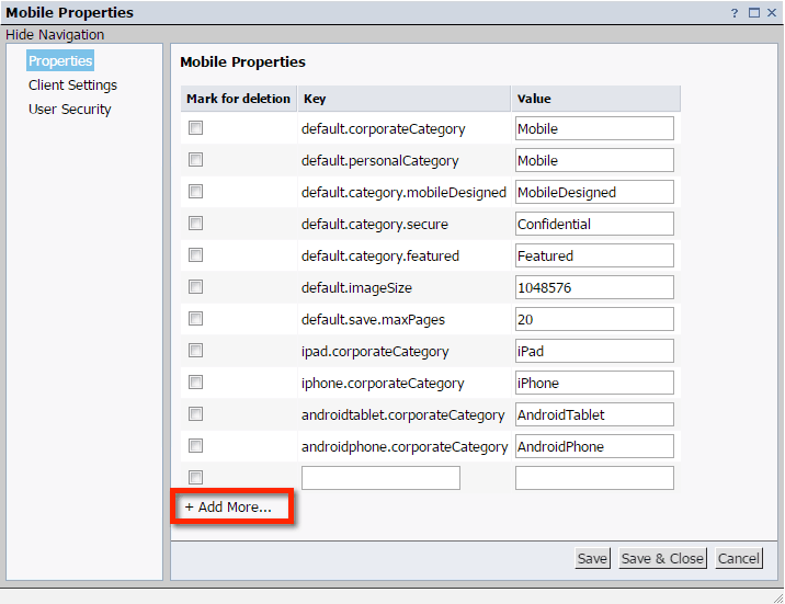
Figure 4
Add or change (device-specific) mobile categories
Click the + Add More… button and enter the keys and corresponding values (shown in
Table 1) in the boxes on the right of
Figure 4. The value is the category name and can be any value you like, but it cannot contain a comma. Once you’ve made your entries, click the Save button to store the new properties.
| Key |
Value |
| ipad.corporateCategory |
iPad |
| iphone.corporateCategory |
iPhone |
| androidtablet.corporateCategory |
AndroidTablet |
| androidphone.corporateCategory |
AndroidPhone |
Table 1
Device-specific category keys and values
Next, back in the CMC (
Figure 5) create additional categories with the same names as the values you entered in the mobile properties. You can assign device-specific categories to the Design Studio applications, or use the generic Mobile category to make the dashboard available on all the devices.

Figure 5
Add device-specific mobile categories
Storing Passwords in SAP BusinessObjects Mobile Apps
The SAP BusinessObjects Mobile app can store log-in passwords for connecting to BI platforms. This functionality needs to be activated in the CMC. To use this option, a personal application password needs to be created, which is then used whenever the app is started. For the iOS version of the app, Touch ID can be used to validate and log in using the iPhone fingerprint scanner.
To enable saving of connection passwords in the app, make the following settings:
- Log in to the CMC
- Go to Applications
- In the screen that opens (not shown) double-click SAP BusinessObjects Mobile
- In the screen that opens (Figure 6) select Client Settings on the left
- In the screen that expands on the right of the figure, change the value for savePassword to true
- Click the Save & Close button

Figure 6
Activate the save password functionality for connecting to BI platforms
To enable the Touch ID option in the iOS app, follow these steps (
Figure 7):
- Open the SAP BusinessObjects Mobile app
- Go to Application Settings by clicking the menu icon (1), then the cog wheel (2), and, finally, the Application Settings option (3)
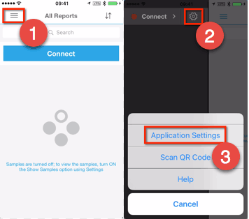
Figure 7
Open the application settings in the SAP BusinessObjects Mobile app
In the Settings screen that opens (
Figure 8), make these settings:
- Select Application Password
- In the screen that opens (the right of Figure 8) click Enable Touch Id
- In the screen that opens (not shown) enter your Application Password to activate the Touch ID option

Figure 8
Enable the Touch ID functionality for mobile devices
Limitations of the SAP BusinessObjects Mobile App
As Design Studio uses HTML5 and cascading style sheets (CSS,) the basic assumption is that all applications can run in the same way on any device, either desktop or mobile. However, there are a few restrictions to keep in mind. Also, the iPhone and Android versions of the SAP BusinessObjects Mobile app are not fully aligned with each other—there are differences in the look and feel of the app itself and the functionality slightly differs when running Design Studio applications.
For example, the SAP BusinessObjects Mobile app for the iPhone does not support landscape mode. This means that nothing happens when you change the orientation of the iPhone. On Android devices, as well as on iPads, you can turn the screen and the Design Studio application rotates accordingly.
Since there is no mouse for navigating on mobile devices, right-clicking to activate the context menu of the crosstab is not supported. In addition, the Fragment Gallery and Split Cell container components do not support drag-and-drop functionality on mobile devices. Thus, this method of working with Online Compositions is not supported.
Scrolling is also disabled. However, scrolling within some components, for example a Crosstab that contains more rows than can be displayed, is supported. The Chart Type Picker component does not fully work as scrollbars are required to show all the line and bar chart types. Zooming functionality, like double-tapping to zoom in or out and pinch-to-zoom, are also not supported. iOS does have a workaround option for zooming, though, explained in SAP Knowledge Base Article 2236030:
https://launchpad.support.sap.com/#/notes/0002236030.
The planning spreadsheet component, introduced in Design Studio 1.6, is also not supported on mobile devices. Also, printing and exporting to Microsoft Excel or comma-separated value (CSV) files is not supported.
Features of SAP BusinessObjects Mobile Applications
The SAP BusinessObjects Mobile app contains many features that can be used when running any dashboard. When users have access to a lot of applications there are some options to improve the accessibility of their most important applications. These are listed below.
Favorites
Users can assign any BI document to their Favorites. Tap the icon with the three vertical dots next to the document you want to add (
Figure 9). Then select Add To Favorites from the options that open. Now, when you view the Favorites section on your mobile device, you see this document listed (as shown on the right of the figure).

Figure 9
Add documents to your Favorites list
The Default Landing Category
To change the default landing category, click the cog wheel to go to Settings and select the Set Default Category option (
Figure 10). In the screen that opens (not shown) you can select the category that the app should show initially (or select none of the categories, which then displays All Reports).
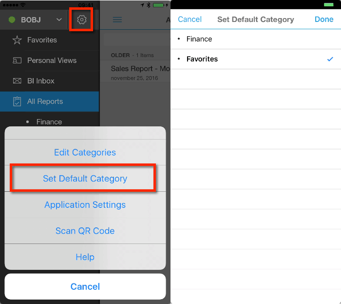
Figure 10
Select the initial category for the mobile app to display
Email
Users also have the option to email a screenprint of a BI document. This is an easy way to quickly share results. Run the dashboard and tap the email icon in the upper right corner (highlighted in
Figure 11) twice and select the Email option in the screen that opens.

Figure 11
Email a screenprint of a BI document
The generated email draft contains the following (shown in the middle and the right of
Figure 11):
- An OpenDocument link to the dashboard that can be opened in a browser. (Note that applications that are specifically designed for usage on, for example, a mobile phone, may look different when using them in a browser due to the different screen sizes.)
- A link to the dashboard that can be opened on a mobile device in the SAP BusinessObjects Mobile app (the app opens when this link is clicked)
- A QR code that can be scanned from within the SAP BusinessObjects Mobile app (by clicking Settings > Scan QR Code) that starts running the BI document
- A screenprint of the BI document, created when the email is generated
Annotations
The tablet version of the SAP BusinessObjects Mobile app also supports the option to create annotations. Double-tap the ellipse icon (…) on the upper right corner twice and select Annotate (
Figure 12). You can draw, erase, add text, select a part of the screen to blur or crop, and even add a voice note. Then you can share your annotated snapshot via email or SAP Jam.

Figure 12
Create and add annotations
Best Practices for Designing and Developing Mobile Applications with Design Studio
In this section, we discuss several ideas, approaches, and tips for how to design and develop mobile applications with Design Studio.
(Re)Designing Mobile Applications
Before diving into the actual building of an application in Design Studio, let’s talk about the design of applications. Or rather, the redesigning of applications. Mobile devices have a different screen size than desktop computers, and they are interacted with via finger touches and gestures instead of using a—very precise—mouse cursor. This all seems obvious, but it really must be considered with every requirement that is included in a mobile dashboard. Simply adding a desktop dashboard to the Mobile category to use on a mobile device won’t work in most cases.
A good setup is to have a detailed application to use on a desktop computer in a browser, and create a smaller on-the-go version for mobile devices. The main message here is: Simplify your application!
Dimensions and Measures
The mobile version of your dashboard should include only the most important measures and dimensions. If you, for example, use Crosstab components with a lot of measures in the columns, consider only showing a few measures. Then users won’t have to scroll horizontally to see all the data (scrolling vertically is less of an issue, as people are used to doing that). A good idea is to use small icons or symbols to indicate the state of certain values instead of showing the numbers. (In the following sections, we show how to do this.)
Make sure you use the right scaling factor and number of decimals for the measures to save screen space. The scaling factor may be set a lot higher than the detailed desktop version of the dashboard (for example, show millions of dollars with a single decimal instead of dollars with two decimals; e.g., $1.2 vs. $1,200,000.00).
For dimensions, consider setting up and using short texts that contain abbreviated values. For example, instead of using complete country names, use US for United States, CA for Canada, NL for The Netherlands, and so on.
Visualizations
Due to space limitations, show only a single visualization on each page, at least for mobile phone applications. Users can then swipe the screen to view the next table or chart. Also, try to limit the total number of visualizations to keep the dashboard simple and easy to use.
Interactivity
As stated earlier, some Design Studio features are not available in the SAP BusinessObjects Mobile app, such as printing and exporting to a PDF or Excel file. Now is probably a good time to reconsider the value of certain features that are technically possible, but may be unnecessary. For example, is it necessary for a mobile application to contain all the interactivity features of a desktop application? Do you need to include ad-hoc analysis features that include drag-and-drop to set up a crosstab, or do you really need to be able to filter on 30 different dimensions? Will a bookmark functionality really be used on a mobile phone, or will it only make the application and the user experience more complex? Again, the main idea is: Keep your application simple.
Company Branding
A lot of Design Studio applications contain the company or departmental logos in very prominent places on the application. Mobile phone applications have extremely limited space, so don’t waste this precious area by including a large logo or other image that adds nothing of value. As an alternative, consider designing applications using the company colors to make it fit with known standards.
Setting Up a Mobile Application in Design Studio
In the Design Studio client, make sure you use the new SAPUI5 m Mode when creating a new application that is meant for mobile usage. This mode is future proof, as it is the only supported option in upcoming Design Studio releases, and it is designed to be used on both desktop and mobile devices. After creating a new Design Studio document, go to the Application properties and set the Display – Compact Form Factor setting to false (
Figure 13). With this setting, components are rendered in a more touch-device friendly way (
Figure 14). For example, the buttons are shown a bit larger, using a bit more space.

Figure 13
SAPUI5 m Mode and Compact Form Factor setting

Figure 14
Mobile phone screen display in SAPUI5 Mode (on the left) vs SAPUI5 m Mode (on the right)
Framework for Mobile Phone Applications
Since all tablets have similar width and height ratios as compared to desktop computer screens, my focus is on the setup of mobile phone applications that can be used in portrait mode (also because the SAP BusinessObjects Mobile app doesn’t support landscape mode for iPhones as of this time, February 2017).
When creating a new mobile application, it is always a good approach to start with a set of panel components that define the framework of your application (
Figure 15). This makes the development and maintenance of the application within the Design Studio client easier. Start with the MAIN panel, and include a HEADER and BODY in it (when needed you can also add a FOOTER panel).

Figure 15
Add panel components to your application
All four of the margins for the MAIN panel should be set to 0 and its width and height set to auto (
Figure 16). This way the application always resizes based on the screen size of the device and will work on all smartphones.
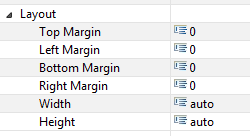
Figure 16
Set the margins for the MAIN panel
The HEADER panel has the same setup, except the height should be set to 70 (pixels) and the bottom margin should be set to auto.

Figure 17
Enter the settings for the layout of the HEADER panel
The BODY panel needs to fit between the header and the footer, so the top margin should be the height of the header (i.e., 70) and the bottom margin should be set to the height of the footer (i.e., 10).

Figure 18
Enter the settings for the layout of the BODY panel
In this example mobile dashboard there are two tabs, each containing a crosstab component (
Figure 19). On both tabs, there are two dimension filters that are linked to the crosstab on the same tab. There are also filters available that should be applied on the whole application. These can be activated by tapping the filter icon (funnel with plus sign) in the header. At the bottom of the screen the legend displays information about the displayed data and the selections made in the overall filter selections (Legend1 and Legand2).

Figure 19
Example dashboard with two tabs
In the HEADER panel (
Figure 16), you can add a grid layout component that divides the header into multiple rows. In this example, the title of the dashboard is in the upper row. The second row contains another grid layout component, with the navigation buttons and a button to display filters. You also need to set the margins for the grid layout component to keep the dashboard responsive—in this case, they’re set to 0 (
Figure 20).

Figure 20
Add a grid component to the HEADER panel
You also need to add a Pagebook component to the BODY panel. This enables users to swipe the screen to move from page to page. Again, the Layout properties are important here because this component should automatically resize with the screen size (
Figure 21).
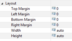
Figure 21
Enter the settings for the Pagebook component
Set Up Navigation
An important element of dashboard design is to make clear to users which tab they are currently viewing, even after swiping to the left or right. To do this, you can use custom CSS classes to change the look of a button (or text) component used for navigation (
Figure 22). In this example (
Figure 23) the selected button has a blue background and a white label (defined in CSS class button_selected), while the unselected button has a white background and a blue label (CSS class button_show).
Figure

Figure 22
Assign custom CSS classes to change the look of a navigation button

Figure 23
Application header displaying an active and inactive button
Note
A detailed discussion on CSS is out of the scope of this article. For more information about using CSS code in Design Studio, read my
BI Expert article, “
How to Use CSS in Design Studio.”
After clicking the navigation button in the Design Studio application, the Pagebook component must move to the selected tab, and the navigation button itself must change its CSS class, so the tab now shows as selected (
Figure 22). (See below for more details about the Pagebook component.)
After swiping to another page, the assigned CSS classes of the buttons should change accordingly (
Figure 24).

Figure 24
For select scripts of Pagebook component, used to assign different CSS classes when changing pages
Pagebook Components
Within the Pagebook component you can set up several pages with visualization components and set up filters and texts as legends. Again, make sure you check the layout properties here again, so that all components remain responsive to different screen sizes and mobile devices. Also, play around with the Pagebook caching setting, which defines what pages should be preloaded during startup. The All and Adjacent options show a smoother initial page-to-page transition, but may take a bit more time at the startup of the application.
Dashboard-Wide Filters
To implement filters that should be applied to the whole application, and not just to specific tabs, you can add another panel that contains these filters, which is not visible by default (
Figure 25). When a user taps the filter icon in the header this panel is made visible. To apply filters, tap the Apply Global Filters button at the bottom of the panel in the screen (
Figure 26). Once the filters are applied, the legends containing the selected values are also automatically updated.
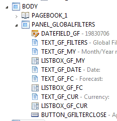
Figure 25
Overview of components in Global Filters panel
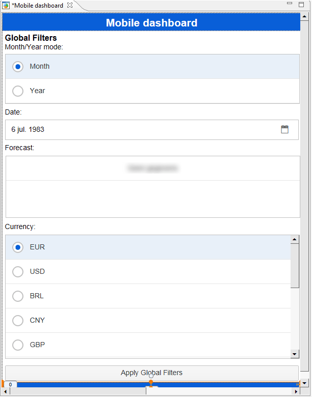
Figure 26
The Global Filters panel display
Crosstab Space Savings
The default components in Design Studio do not always make efficient use of the little space that is available. This becomes especially apparent in the Crosstab when this component is used on an iPhone, where landscape mode is not available. The row and column headers can be too wide and take up so much space that there is almost no room to show all the measures. See
Figure 27 for a comparison of the view of Crosstabs created using standard CSS code and custom CSS code.

Figure 27
Crosstabs using default CSS code (on the left) versus custom CSS code (on the right)
Using custom CSS classes can help in this instance. You can save space by adjusting padding, margins, font sizes, alignment, borders, text-overview, and width and height properties. (For more information about customizing CSS code for the crosstab follow this link:
https://blogs.sap.com/2013/07/21/design-studio/.)
Make sure you review the following CSS classes to see what properties can be adjusted:
.sapzencrosstab-ColumnHeaderArea
.sapzencrosstab-RowHeaderArea
.sapzencrosstab-HeaderCellDefault
.sapzencrosstab-HeaderCellAlternating
.sapzencrosstab-HeaderCellFirstInRow
.sapzencrosstab-DimensionHeaderArea
.sapzencrosstab-DataCellAlternating
.sapzencrosstab-DataCellDefault
.sapzencrosstab-DataCellContentDiv
.sapzencrosstab-FontSize-MainMode
The hierarchy node positioning, which takes up more space when it’s expanded an additional level, can be adjusted so that the nodes are positioned under each other. To do this, review the following CSS classes:
.sapzencrosstab-HierarchyIndentCozy
.sapzencrosstab-HeaderCellCozy
.sapzencrosstab-DataCellCozy
.sapzencrosstab-HeaderCellDivHierarchy.
Using icons to create a traffic light display or show a trend direction is very useful and enables you to include a lot of information while only taking up minimal space in the crosstab. See the last column on the right in
Figure 27 for an example of this.
To use icons in your crosstabs, set up the following:
1. In the BEx Query, add a formula that determines the state you want to display. In this example, the result of the formula is either 1 (green) or 2 (red). This formula is only used to determine the color; it has no other meaning. Make sure to use only a single digit, as this influences the width of the column.
2. Set up an exception rule in the BEx Query to define the Alert Level (Good 1 equals 1, Bad 3 equals 2), as shown in
Figure 28, and click the New button.

Figure 28
Add an exception rule in the BEx Query
3. In Design Studio, set the property Conditional Formatting to true for the Crosstab and enter CSS Class crosstabMobile.
4. Go to
https://www.base64-image.de to upload your icons and convert them to base64 code that can be used in your custom CSS code.
5. Copy the code that you created from the For use as CSS background: box (
Figure 29).
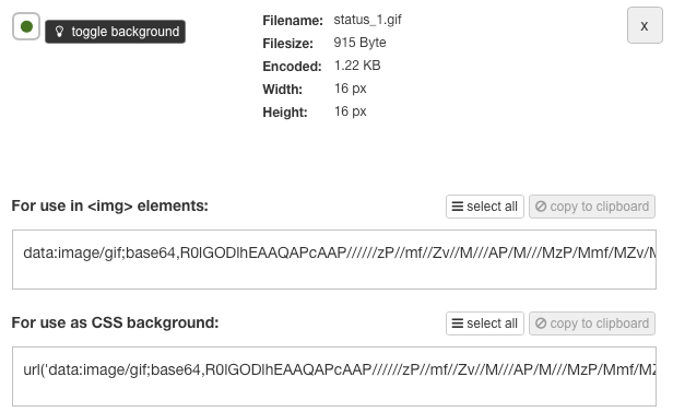
Figure 29
Copy the base64 code
6. Add the CSS classes to your custom CSS file by pasting in the base64 code you just got as a value for the background-image property (
Figure 30). The first class refers to Alert level Good 1 (DataCellAlert1Background) and the second class refers to Alert level Bad 3 (DataCellAlert9Background). There are nine possible alert levels.
.crosstabMobile .sapzencrosstab-DataCellAlert1Background, .sapzencrosstab-HeaderCellAlert1Background
{
color:rgba(0,0,0,0.0);
background-image: url('data:image/gif;base64,R0lGODlhEA… !important;
background-repeat:no-repeat !important;
background-position:center !important;
background-color: transparent !important;
}
.crosstabMobile .sapzencrosstab-DataCellAlert9Background, .sapzencrosstab-HeaderCellAlert1Background
{
color:rgba(0,0,0,0.0);
background-image: url('data:image/gif;base64,R0lGODlhEA…. !important;
background-repeat:no-repeat !important;
background-position:center !important;
background-color: transparent !important;
}
Figure 30
Add the base64 code to the custom CSS code
Two final remarks on using the crosstab component in mobile applications. First, use pixel-based scrolling to enable smooth scrolling. Second, limit the amount of data displayed in a mobile crosstab. Showing big lists of information on a small screen doesn’t work from a user experience perspective. SAP recommends that the number of cells in such a crosstab be limited to 500 (for example, 50 rows and 10 columns).
Mobile Dashboard Testing
Testing your mobile dashboard can be quite a hassle when using the SAP BusinessObjects Mobile app. During development, you want to quickly see the effects of minor changes to the dashboard on several different devices. But you don’t want to have to log in with multiple devices and wait for the app to load for each small development iteration. The best advice would always be to do the final testing with the actual mobile devices that you plan to use with your mobile dashboard. However, for development purposes, there is a workaround to quickly see how the dashboard behaves on different devices, as follows.
1. Make sure you have installed the Google Chrome browser.
2. Execute the dashboard either from the Design Studio client locally or use the OpenDocument URL. Do not use the BI Launchpad to browse to the dashboard and run it from there—if you do, the screen sizing adjustments won’t work.
3. After the dashboard is executed, right-click anywhere in the application and select Inspect from the context-menu options that open.
4. Toggle the device toolbar (
Figure 31).

Figure 31
Toggle the toolbar
5. Now on the left side of the screen some options become available that let you select a specific device (number 1 in
Figure 32). The dashboard is displayed accordingly.
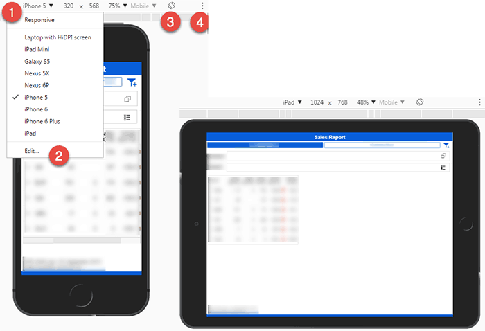
Figure 32
Running the application in iPhone and iPad modes
6. Click the Edit… option to select additional devices (number 2 in
Figure 31).
7. Use the rotate icon (number 3 in the figure) to rotate the screen on the device (as mentioned previously, this feature is available only on Android devices and iPads).
8. You can activate the device frame in the additional settings menu (number 4 in the figure). By showing the device frame, you can clearly see what device that you are using, and it is also useful when creating screenprints.
Demonstrating Mobile Applications
When you want to show your mobile application to a larger audience, on a big screen or during an online webinar, it is convenient to be able to display your mobile device’s screen on your computer. Also, you might want to create a recording of a demonstration of the dashboard. Luckily there are some good solutions available for this.
For iOS, the easiest (and free) way to do this is use the QuickTime application on the Mac. Hook up your iPhone or iPad to your Mac with a USB cable and start a new movie recording (File > New Movie Recording). By default, the FaceTime camera shows up, but you can switch to your mobile device by clicking the down arrow next to the record button (
Figure 33).

Figure 33
Recording an iPhone screen using QuickTime
For both iOS and Android devices, there are tools available to mirror several types of devices on Macs or Windows PCs.
Xavier Hacking
Xavier Hacking is a SAP BI specialist from Eindhoven, The Netherlands, working as a consultant for Interdobs. He has a Master’s degree in Industrial Engineering and Management Science from the Eindhoven University of Technology. He has worked with a wide range of products from the current SAP BW and SAP BusinessObjects toolset, with a focus on dashboard and application development within SAP environments. Xavier is the co-author of four SAP BI-related books, including
SAP BusinessObjects Design Studio – The Comprehensive Guide and
SAP BusinessObjects Dashboards 4.1 Cookbook. He blogs on all sorts of BI-related topics at
HackingSAP.com and you can follow him on Twitter at
@xjhacking.
You may contact the author at
post@xavierhacking.nl.
If you have comments about this article or publication, or would like to submit an article idea, please contact the
editor.