SAP Lumira 2.0 recently became generally available. It brings under one umbrella both the design and the discovery of data. SAP Lumira 2.0 marks the marriage of SAP Design Studio (design) and the original SAP Lumira (discovery). Both applications have been significantly enhanced and complement each other.
Key Concept
The discovery component in SAP Lumira 2.0 takes self-service analytics to a high level by putting power into the hands of the business user in terms of capabilities, intuitiveness, connectivity options, user-friendliness, presentation, and sharing.
SAP Lumira 2.0 marks a step in SAP’s promised consolidation of its BI suite and its provision of a BI self-service application. Companies always prefer to use as few applications as possible, ideally one that can satisfy all their needs. With SAP BusinessObjects BI, there is a dizzying list to choose from (such as Web Intelligence, Crystal Reports, Explorer, Design Studio, SAP Lumira, Analysis for OLAP, Analysis for MS Office, SAP BusinessObjects Dashboard, and Predictive Analytics). When to use which application has been a source of confusion. With SAP Lumira 2.0, SAP provides one application for data design and discovery, thereby significantly simplifying the number of options available.
How so? For data discovery, design, and visualization, companies had the following options to pick from: BusinessObjects Dashboards, Explorer, SAP Lumira, BEx Web Application Designer (WAD), Analysis for OLAP, and Design Studio. Now companies can just install, deploy, and use SAP Lumira 2.0.
From a technical perspective, it comes in two flavors: server and desktop versions. In the server version, both the design and discovery components are installed in a single combined installation. For the desktop version, these are two separate installations. Note that despite the convergence of the design and discovery components, in the desktop version these are two separate applications that are interoperable. These two versions share one run-time engine and a single file format.
Note
If you are interested in learning about key features in SAP Lumira 1.x, read my two previous articles on this topic:
Data Acquisition
One of the biggest improvements in SAP Lumira 2.0 is the ability to access live data from an SAP Business Warehouse (SAP BW) system as well as from an SAP HANA system. This results in improved performance because you no longer need to extract the data into your SAP Lumira environment as you did in previous versions. You can now push any complex calculations you have to either your SAP BW server or your SAP HANA server. This flexibility can give you a further performance boost, especially when you are doing analysis on large and complex datasets (that could include geospatial vector data). Also, with live connections, any changes to the underlying data are immediately visible to you, thus leading to true real-time analytics. No deltas or replication are needed.
From environments outside the SAP system, you can now extract data into SAP Lumira 2.0 from a wide array of sources by running freehand SQL. Obviously, for that to happen you need to ensure that the corresponding drivers are installed. These sources include Amazon Web Services (AWS) applications, Hadoop, Spark, Cloudera, Salesforce, and Sybase. Figure 1 displays a partial list of sources from which you can extract data.
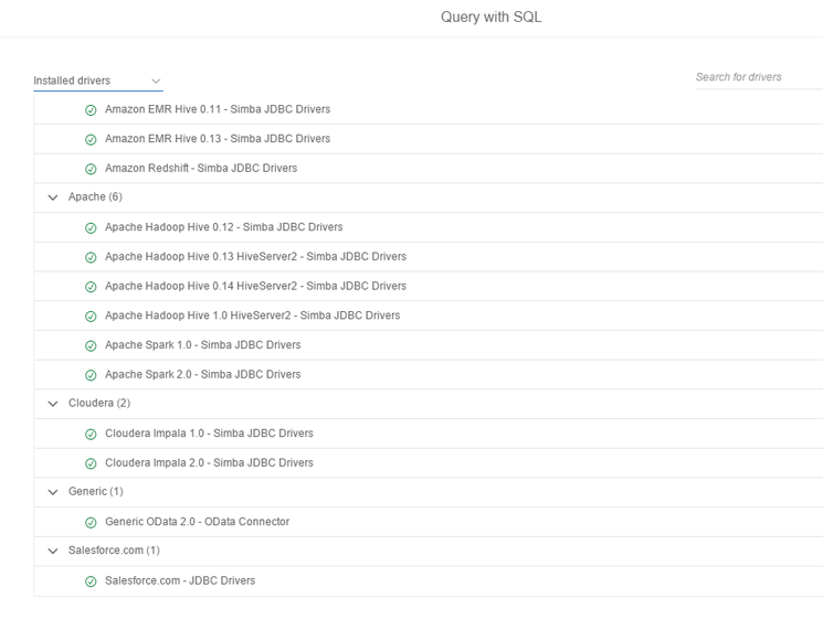
Figure 1
SAP Lumira 2.0 extracts data from these data sources using freehand SQL
Regardless of the option users choose, they need to provide the correct server or port information and credentials to the source system (all of which administrators should provide). Let’s take a look at how to create an SAP BW live connection. First, on the SAP Lumira 2.0 landing page click the Show All hyperlink and then click the SAP BW Live Data tile as shown in Figure 2.
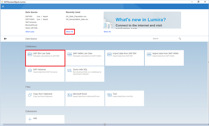
Figure 2
Navigating to a live BW data connection
You are taken to the screen shown in Figure 3. Once you provide the necessary information, you are connected to the source SAP BW system and are able to visualize and analyze any data in the SAP BW system based on the authorizations assigned to you.
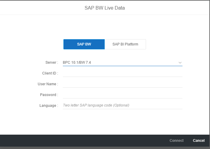
Figure 3
Connecting to SAP BW Live Data
Melding data from so many disparate sources enables you to do “mash-ups,” which are a key component of storyboards. The source of the data is completely opaque to the consumer.
For my example, I extract data from an Excel spreadsheet containing publicly available data on personal mobility and transportation in the US and fatalities. After you upload the data, you can jump straight to the visualization by clicking the Visualize button shown in Figure 4.
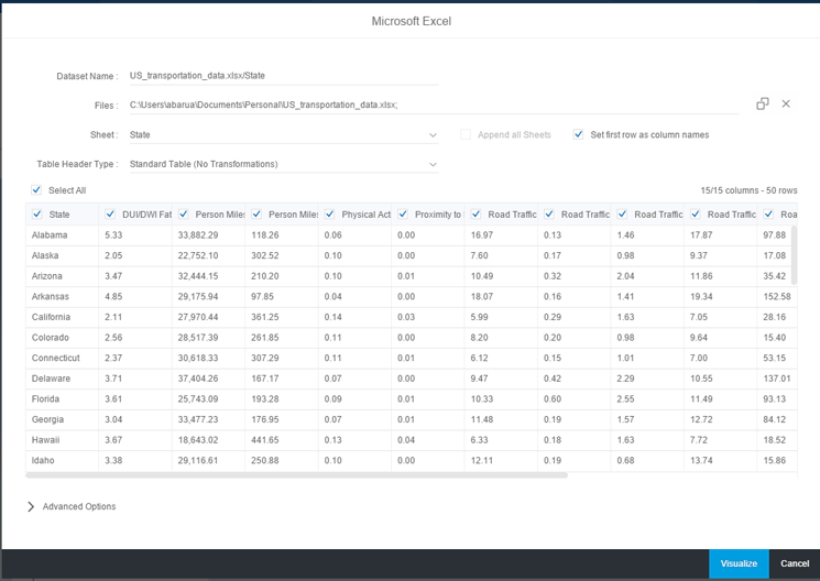
Figure 4
Initial data preview
SAP Lumira automatically assigns field names (metadata) from the spreadsheet to dimensions and measures. You can also display a data view, which is the tabular preview of your acquired data. A partial view of this data is shown in Figure 5.

Figure 5
Data view using the discovery component in SAP Lumira
At first glance, the screen in Figure 5 looks very different from the design screen in SAP Lumira 1.x. Those of you who are familiar with SAP Analytics Cloud (SAC) may recognize the new SAP Lumira 2.0 look and feel. SAP Lumira 2.0 has a lot of new features that were only available in SAC. Let’s first look at some of the less obvious ones and then move on to the obvious ones. You can now analyze your data and build your stories in the same place. Right-click after placing your cursor on one of the links under the State column. The context menu displays a list of data massaging options (Figure 6).

Figure 6
Data massaging options in the context menu
None of these capabilities was available prior to this version. As a result, you would have to do almost all the data preparation and massaging work prior to importing the data into SAP Lumira. Let’s look at some of the new features:
- Duplicate: Using this function you can create an exact replica of an existing column. This feature saves you a lot of effort, especially if you are enriching some existing data, but want to retain other existing data.
- Group by: When you have a large dataset, it is easier to analyze and visualize the data when you group it in some logical order. In a sales report, it is most convenient to visualize when the states are grouped by regions. In SAP Lumira, this task has been made very easy. Place your cursor on the column by which you want to group (States in my example) and click Group by from the menu in Figure 6. You are presented with two options: Group By Selection (as shown in Figure 7) and Group By Ranges. For my example, I recommend that you group by selection so that you can specify the groups.
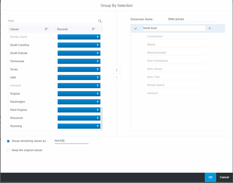
Figure 7
Create groups using selections
Since this is only for illustration purposes, create one group of North-East (NE) states and have the rest all grouped under Not-NE. After you click the OK button and then filter on the NE states, you see the data shown in Figure 8.

Figure 8
Group and filter on a state group
- Calculations: The discovery component in SAP Lumira 2.0 provides you with multiple useful functions that you can apply to both dimensions and measures. These functions enable you to enrich your data. As can be expected, there are a lot of string functions. To illustrate, consider a scenario in which you want to generate another column that displays the first two characters of each state name. Some match the postal two-digit abbreviation for a US state and some don’t. At least you don’t have to key in the abbreviations for all 50 states. From the context menu in Figure 6, click Create Calculations. Since you had placed your cursor on the State column, SAP Lumira defaults to state as the dimension. Enter a name for your calculation and then click the drop-down menu for Functions (Figure 9).

Figure 9
Apply a function to a dimension
Highlight the function in which you are interested. SAP Lumira provides you with an example on the right to make things easy for you. Select the formula and provide the operands. SAP Lumira then validates it to be correct (Figure 10).

Figure 10
Enter and validate a function
After you click the OK button, SAP Lumira creates a new column with the abbreviations (Figure 11). This is the second column from the left.
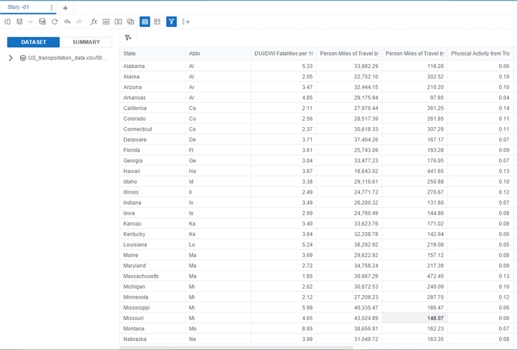
Figure 11
New column with the first two characters of each state
Now I notice that I needed both of the two characters to be uppercase. To make this change, place your cursor on the new column, and from the context menu in Figure 6, select Convert Case and then Upper and you see the revised column as shown in Figure 12.
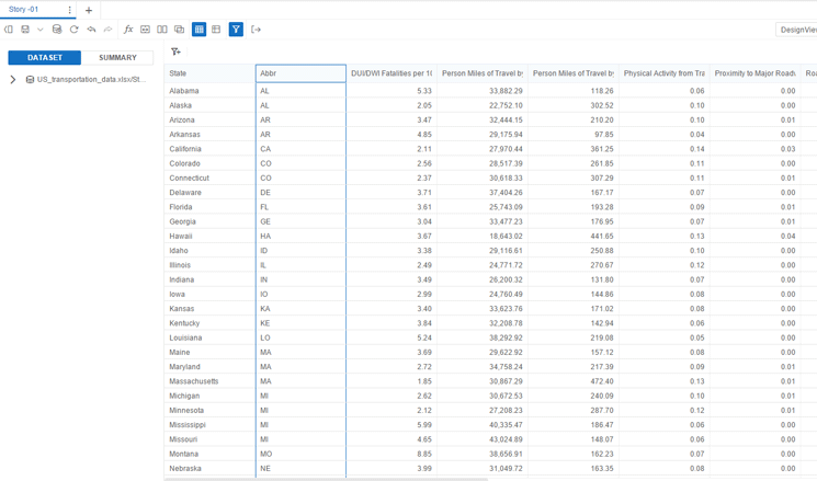
Figure 12
Convert abbreviations to uppercase
- Merging datasets: With this new feature in SAP Lumira 2.0, you can merge multiple datasets to create mash-ups. The source of the data does not matter as long as there is at least one common condition or field on which you merge the data. Another related function called Link datasets allows you to combine data. I find merging datasets more useful as the data from multiple sources is physically combined as opposed to just providing links. I now show you how this works with an example.
Imagine that you want to be able to analyze all these transportation statistics within the context of the population of each state. Otherwise, these numbers do not mean much to you from a comparative standpoint. So I imported publicly available Census data from the US Census website into SAP Lumira.
After sorting and scrubbing the data clean of a leading period, you now have an additional dataset ready for merging. Let’s take a peek at the data by going to the data preview. You can preview your data by clicking the Preview button on the data view shown in
Figures 5 and
8.
Figure 13 displays a partial view of this data.
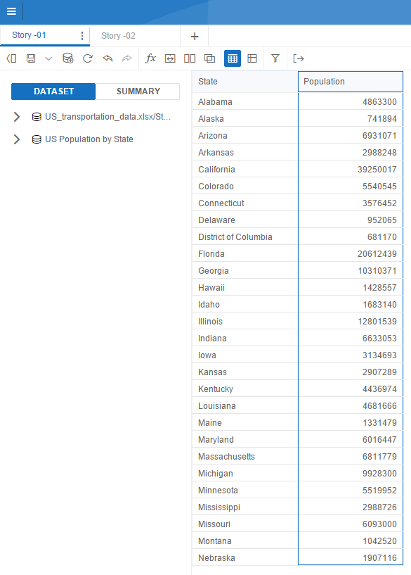
Figure 13
US population by state from census data
Now you want to merge this dataset with the first dataset that you have been using (i.e., the transportation data). Double-click the name of the first dataset in Figure 13. Click the merge datasets icon . A pop-up window opens (Figure 14).
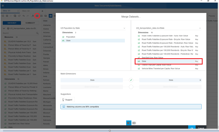
Figure 14
Merging two datasets
In the pop-up window, you need to determine the fields and dimensions on which you want to merge the data. In my example, it is the state dimension. Highlight this dimension in the left and either click the suggest icon or identify the common dimension on the second dataset yourself. For my example, I chose the latter option for illustration purposes.
After you scroll down to the state dimension, highlight it and select the type of join. Currently, the two available options are the left outer join and the inner join. (A description of these two joins is outside of the scope of this article.) I select the default left outer join and click the OK button. You see an information message saying that the matching columns are 98 percent compatible. Why do you think you get this message? If you noticed earlier, there was one extra row in the Census population dataset (for the Washington, DC, population). So SAP Lumira finds a mismatch and warns about it. Now click the OK button and after purging the extra row and doing some rearrangement of columns, you get the merged dataset. A partial view of this dataset is shown in Figure 15.
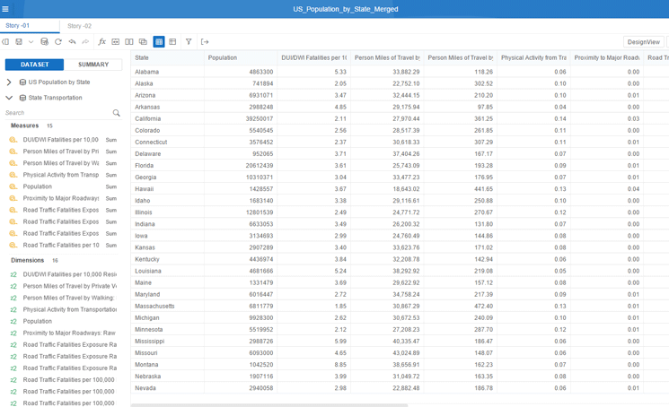
Figure 15
Merged datasets
- Summary view: A very useful feature is the summary view of data. This gives you the cardinality of each facet in your analysis. This feature is useful if you want to get an idea of your data at a quick glance. In the summary view, each facet is displayed for the number of unique occurrences.
Design View
Let’s now switch to the Design View to do a few visualizations on the merged data. You can save each of your visualizations as “stories.” A story in reality is a canvas on which you design your analytical elements. The advantage of stories is that they make for powerful presentations. Each one of your analytical views (that you save as stories) reveals additional aspects of the data. After you click the DesignView button in Figure 15, you are taken to the design screen in which you insert a chart into your story (Figure 16) by clicking the Insert Chart button.
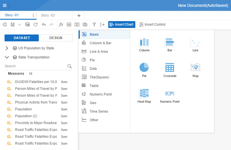
Figure 16
Insert a chart into your story
Note that there are multiple categories of chart types you can pick from. Compared with SAP Lumira 1.x the options have expanded. I do not go through each of these categories since you can find sufficient documentation on SAP’s Help website. The category that has some advanced chart types is the Other category. Among the choices, it has tag cloud, funnel, network, and tree chart types. For my analysis, a good chart option is the stacked column or stacked bar (under Column & Bar). These chart types were available in earlier versions, but the purpose of picking these is primarily to show you new features that have been introduced in SAP Lumira 2.0.
After you click the stacked column, a blank template is inserted into the story (canvas). First, drag and drop the state dimension into the X-axis of the canvas and a couple of measures that to analyze (Road Traffic Fatalities per 100,000 residents in automobiles and person miles of travel per private vehicle). You want to understand the correlation between these key metrics. Figure 17 displays the results.
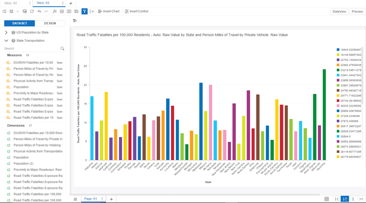
Figure 17
Stacked bar chart with selected parameters
You now want to do some conditional formatting and want to apply a high-alert (red) color to all states with a fatality count of 15 per 100,000 residents or higher. Click the Conditional Formatting button in the context menu of the story (Figure 18).

Figure 18
Data analysis options in the context menu
The system then displays a pop-up screen in which you enter High auto fatality as the new condition’s name, identify the measure, assign a condition, and pick a color format (Figure 19).

Figure 19
Create a new formatting rule
After you click the OK button, the system takes you to another pop-up screen in which you need to ensure that the Applied check box is flagged. Now click the OK button and Figure 20 displays the data with the high auto fatality states in red.

Figure 20
Output after conditional formatting has been applied
This feature is certainly useful for me. However, a feature I’d consider even more useful would be to see at a glance the percentage of auto fatalities to the number of miles driven. A high percentage would denote a high-risk state for drivers. From the context menu in Figure 18, select Calculations. You then see the menu options shown in Figure 21.
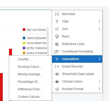
Figure 21
Select a calculation
You can pick from some handy formulas. For my example, select Percentage Of.... After you select this option, a pop-up screen appears in which you enter your calculation’s name. Select the measure whose percentage you want to compute and the base dimension (Figure 22).
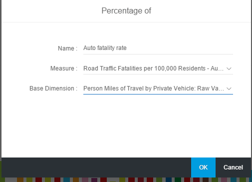
Figure 22
Create a calculation for percentage
After you click the OK button, the results are displayed in the screen in Figure 23.

Figure 23
Results displayed with auto fatality rates
Some interesting results are revealed. Wyoming has not only the highest number of auto fatalities but also the highest percentage relative to miles driven. Surprisingly, states such as New York, Massachusetts, and New Jersey are much safer judging by the much lower fatality rate. Although Washington state had a high fatality count (since it was in the red zone), its fatality rate is low. This finding shows that Washington should be considered a safer city for drivers than Wyoming.
Here are more sources of material for you to read to learn more about SAP Lumira 2.0:
Anurag Barua
Anurag Barua is a principal at TruQua Enterprises. He has 23 years of experience in conceiving, designing, managing, and implementing complex software solutions, including nearly 18 years of experience with SAP applications. He has been associated with several SAP implementations in various capacities. His core SAP competencies include FI and Controlling (FI/CO), logistics, SAP HANA, SAP BW, SAP BusinessObjects, Enterprise Performance Management, SAP Solution Manager, Governance, Risk, and Compliance (GRC), and project management. He is a frequent speaker at SAPinsider conferences and contributes to several publications. He holds a BS in computer science and an MBA in finance. He is a PMI-certified PMP, a Certified Scrum Master (CSM), and is ITIL V3F certified.
You may contact the author at
Anurag.barua@truqua.com.
If you have comments about this article or publication, or would like to submit an article idea, please contact the
editor.