The release of SAP BusinessObjects Design Studio 1.5 includes enhanced components, performance, and functionality. Learn the most important updates to filtering and navigation components, export options, and the ability to integrate maps into dashboards.
Key Concept
With the release of SAP BusinessObjects Design Studio 1.5 comes new features, such as the ability to visualize geographic information using new filtering, navigation, and export components and map integration options. With these new features, SAP BusinessObjects Design Studio becomes a true dashboarding environment that helps companies achieve their overall business intelligence (BI) strategy goals.
With the release of SAP BusinessObjects Design Studio 1.5 there are two important new components for filtering data and enabling users to navigate the data. Before the 1.5 release, the filter panel was available with the option to choose if you can navigate and filter data or perform both these tasks with a single component. Now you have the new filter line component to provide a different type of filtering and also the option to add a pure navigation panel to your dashboard.
An Overview of SAP BusinessObjects Design Studio 1.5’s New Components
In my first part of this series, “What’s New in SAP BusinessObjects Design Studio 1.5 to Enhance Performance (Part 1),” the focus was on the performance-related topics of SAP BusinessObjects Design Studio release 1.5. Here I look at some of the new components—such as the new filter panel and filter line components—as well as some of the added capabilities, such as the ability to export data to PDF files and to add maps to a dashboard.
The New Filter Line Component
The filter line component is a small filter component that allows users to set up filter values with any dimensions and key figures. Figure 1 shows the default look of a filter line component with its list of available dimensions as it would appear as part of your dashboard.
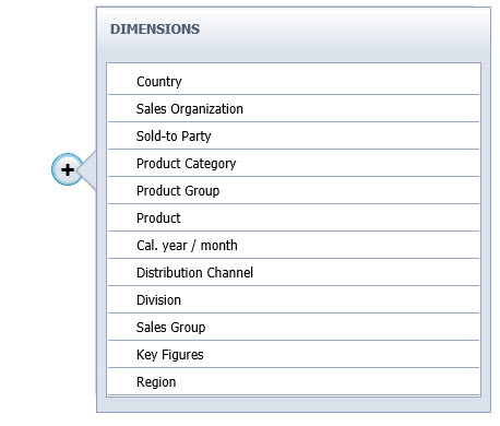
Figure 1
The filter line component in SAP BusinessObjects Design Studio
One of the advantages of the filter line component is its typical bread-crumb look and feel of all the configured filter values. As shown in Figure 2, the configured filter values are placed next to each other, enabling you to quickly remove any filter values by using the X icon in the top right corner.
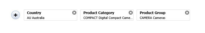
Figure 2
The bread-crumb appearance of the filter component
In addition to its lean look and feel, one of the advantages of this filter line component is the fact that it automatically provides the list of values and the interfaces for selecting the values. For example, after you click the Country line in Figure 2 the options for the dimension Country appear as shown in Figure 3. This means that you do not have to write any scripting code to provide the user with a list of values and to pass the selected values to the data source.
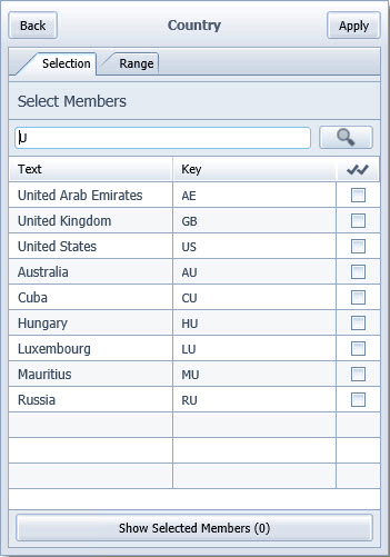
Figure 3
The filter line interface options for the Country dimension
I explain how to use the filter line component in a simple dashboard later, but first, I describe another new component—the navigation panel.
The New Navigation Panel
Before the release of SAP BusinessObjects Design Studio 1.5, you had the option to use the filter panel and configure it to also allow the user to change the navigation—for example, exchanging—swapping—dimensions for the rows or columns—but the look and feel was not really that of a true navigation panel. Now, with release 1.5, you have the new navigation panel, which provides users with a navigation experience that’s similar to the SAP Business Explorer (BEx) Web Analyzer or a Web Application Designer (WAD)-based dashboard.
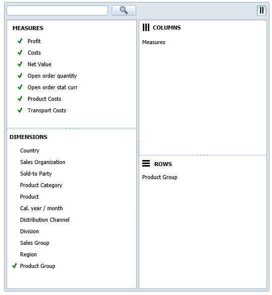
Figure 4
The new navigation panel display and options
Figure 4 shows the navigation panel with all the available features. Note that you see the list of Dimensions and Measures as well as an overview of which elements are being used in the Rows and Columns. In addition, you can right-click and use a context menu (Figure 5) to view an even larger set of functionalities.
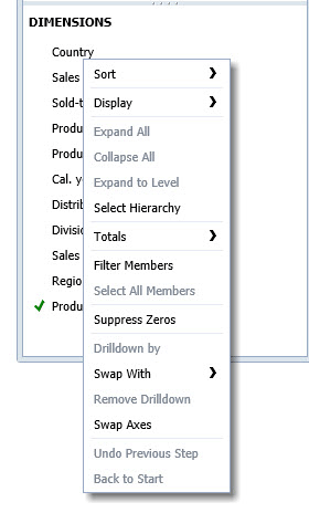
Figure 5
The context-menu options in the new navigation panel
The new navigation panel also enables you to search for a particular dimension or key figure and pause the interaction with the underlying data source. This new pause feature can be helpful in situations in which your network bandwidth is low. In that case, you use the pause feature and still interact with the navigation panel. Then, after you make all your entries, you remove the pause so that all steps can be executed in a single step toward the underlying data source. This feature reduces wait time.
In the Properties window of the navigation panel (Figure 6), note that the navigation panel has a Navigation mode and a List Only mode.
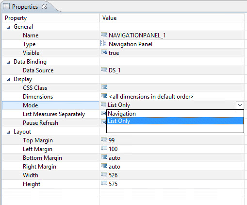
Figure 6
The Properties of the navigation panel
After you click the Navigation option, the screen in Figure 4 opens. This mode provides you with the context menu and enables you to exchange dimensions and key figures with rows and columns.
After you click the List only option in Figure 6, the List Only mode opens (Figure 7). This option does not allow you to change the row and column elements with a simple navigation, but instead, you must use the context menu to make changes.
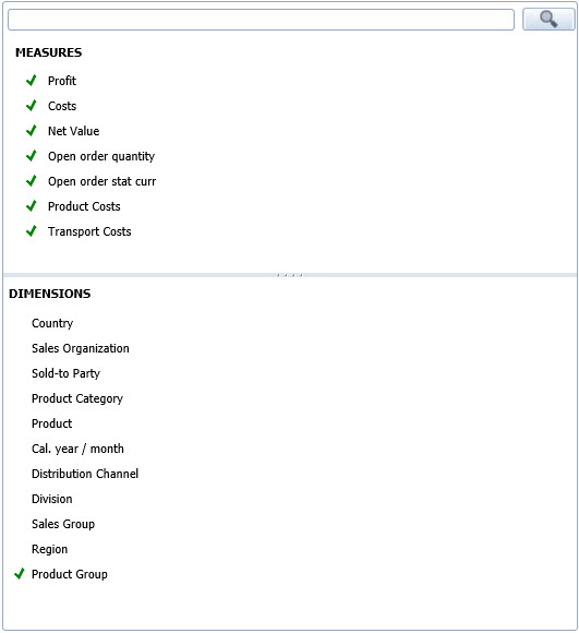
Figure 7
The List Only mode uses context-menu options only
Another advantage of the new navigation panel is that it enables dashboard designers to select which dimensions are shown to the user. This feature is shown in Figure 6, with the property Dimensions under Display.
Steps for Using the New Filtering Options and the Navigation Panel
In the next few steps I explain how to create a new SAP BusinessObjects Design Studio project that includes the navigation panel as well as the filter line component. For these steps, I assume that a BEx Query is the data source and I name the BEx Query QUERY1 as part of the next set of steps.
1. Start the SAP BusinessObjects Design Studio design environment.
2. In SAP BusinessObjects Design Studio, select the menu Application > New.
3. Click the Browse button and select a folder to save your application. Click the OK button.
4. Enter a name for your application.
5. Select iPad as the Target Device and click the Finish button.
6. Navigate to the Outline window (bottom left) of your new application and select the Data Sources folder.
7. Right-click the Data Sources folder and select Add Data Source from the context-menu options. In this example, as stated earlier, add a BEx query to the dashboarding project.
8. Add a filter line component from the Analytic Components to your dashboard.
9. Configure the Properties as shown in Table 1 for the filter line.
| Property |
Value |
| Top margin |
10 |
| Left margin |
10 |
| Bottom margin |
Auto |
| Right margin |
Auto |
| Width |
800 |
| Height |
50 |
Table 1
Filter line properties
10. Set the Data Source property to the previously added data source based on the BEx query.
11. Add the navigation panel component from the Analytic Components list to your dashboard.
12. Configure the properties, as shown in Table 2, for the navigation panel.
| Property |
Value |
| Top margin |
100 |
| Left margin |
10 |
| Bottom margin |
Auto |
| Right margin |
Auto |
| Width |
400 |
| Height |
600 |
| Mode |
Navigation
|
| Pause refresh |
True
|
Table 2
The properties for the new navigation panel
13. Set the Data Source property to the previously added data source based on the BEx query.
14. Add a chart component from the list of Analytic Components to the dashboard. Configure the properties for the chart component as shown in Table 3.
| Property |
Value |
| Top margin |
100 |
| Left margin |
450 |
| Bottom margin |
Auto |
| Right margin |
Auto |
| Width |
700 |
| Height |
600 |
Chart type
|
Column
|
Table 3
The chart component properties
15. Set the Data Source property to the previously added data source based on the BEx query.
16. Save and execute your new dashboard.
The new dashboard displays as shown in Figure 8. With just a few steps, you can enable the user not only to filter the data but also to navigate through the data and change it as shown in the chart.
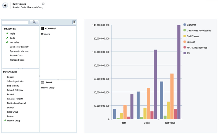
Figure 8
The new dashboard display
Next I show how you to use the new dashboard export option.
The New Options for Exporting a Dashboard
Another new component of release 1.5 is the ability to export a dashboard into an Adobe PDF file. The PDF export component is a so-called technical component, which means that the actual component is not visible to the user of the dashboard, but you are able to provide the functionality by configuring the component and adding the necessary scripting.
The PDF export component provides three different options for exporting the dashboard:
- WYSIWYG (what you see if what you get) mode: This allows you to export the entire screen.
- Specific panel mode: This option allows you to export a specific panel (based on the panel component).
- Report style mode: The report style export exports crosstabs and charts, but not components such as the filter line or navigation panel.
In the following steps I explain how to use the dashboard created in the previous steps, and how to add the option to export the dashboard to a PDF file.
1. Open the dashboard from the previous steps in SAP BusinessObjects Design Studio.
2. In the Outline tab of the application, navigate to the Technical Components folder and select it.
3. Right-click and select Create Child > PDF from the context-menu options.
4. Add a Button component to your dashboard, using the drag-and-drop method.
5. Navigate to the properties of the button and open the Script Editor for the OnClick property. You see three scripting options:
- Option 1: PDF.exportApplicationScreen() – This script exports the complete application screen into a PDF file.
- Option 2: PDF.exportPanelScreen(<panel>) – This script exports a specific panel component into a PDF file.
- Option 3: PDF.exportApplication() – This script exports the dashboard in a report style. The report style includes the crosstabs and charts, but not elements such as the navigation panel or the filter line component.
In this example, use the option 1 script: PDF.exportApplicationScreen().
6. Save the changes to your dashboard using the save option and then execute the dashboard using the menu Application > Execute on BI Platform.
Figure 9 shows the dashboard with the PDF Export button added. Now, when you click the button, you see a few options that can be configured before the PDF file is generated (Figure 10).
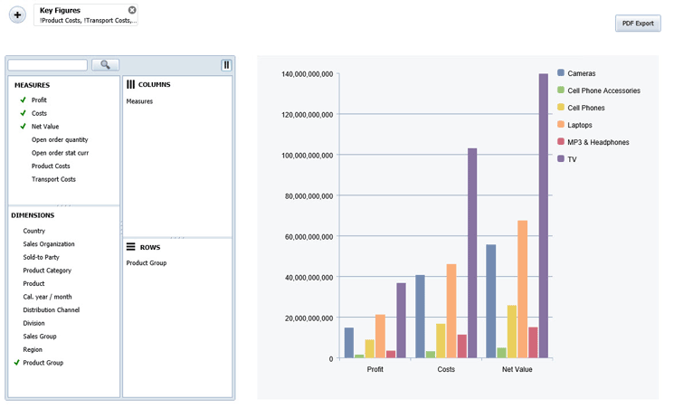
Figure 9
The dashboard with the new PDF exporting option
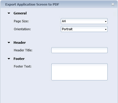
Figure 10
The options for exporting to a PDF file
Next I show how you can use the new back-end connection component.
The New Back-End Connection Component
Another interesting component of release 1.5 is also a technical component (similar to the PDF export). It is the back-end connection component. The back-end connection enables you to provide dashboard users with the ability to select a connection and a data source at run time (e.g., when the dashboard is executed). This functionality was already available before release 1.5, but it was more complicated and involved a lot of steps and a lot of scripting. With the introduction of this new back-end connection component, this functionality has become much easier to use.
Note
Currently (as of August 2015), the back-end connection component only supports SAP BW and
SAP HANA as data connections; Universe connections are not supported.
In the next steps I explain how to create a very simple dashboard that allows you to select the connection at the same time the dashboard is being executed—for example, to select a connection to SAP BW or SAP HANA and then to select the actual data source, such as a BEx query.
1. Start SAP BusinessObjects Design Studio.
2. In SAP BusinessObjects Design Studio, select the menu Application > New.
3. Click the Browse button and select a folder in which to save your application. Click the OK button.
4. Enter a name for your application.
5. Select iPad as the Target Device and click the Finish button.
6. Navigate to the Outline window (bottom left) of the new application and select the Data Sources folder.
7. Right-click the Data Sources folder and select Add Data Source from the context-menu options.
8. A Connection dialog window opens. Click the Browse button to search for the connection.
9. Select the connection entry that points to your system; for example, the SAP BW system.
10. Click the OK button.
11. In the screen that opens, click the Browse button to search for the Data Source field and navigate to the Search tab.
12. Search for a BEx query (in this example, the structure of the underlying data source is not relevant).
13. Select the query and click the OK button.
14. In the next screen that opens enter QUERY_1 in the Alias field for the data source to be added.
15. Navigate back to the Outline window and then to the Technical Components folder.
16. Right-click the Technical Components folder and, from the context-menu options, select Create Child and then Backend Connection.
17. Add a Crosstab component to the canvas from the Analytic Components options. Configure the properties for the crosstab component as shown in Table 4.
| Property |
Value |
Name
|
CROSS_TAB1
|
| Top margin |
20 |
| Left margin |
300 |
| Bottom margin |
Auto |
| Right margin |
Auto |
| Width |
800 |
| Height |
800 |
Data source
|
QUERY_1
|
Table 4
The crosstab component properties
18. Navigate back to the Outline window and select the Backend Connection component.
19. Open the Properties window (Figure 11) for the Backend Connection component.
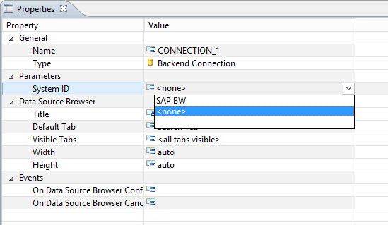
Figure 11
The Properties for the Backend Connection component
20. For the System ID property, select the system ID from the configured data source (e.g., = SAP BW).
21. Open the script editor for the On Data Source Browser Confirmed property and add the script shown in Figure 12.
var datasource = CONNECTION_1.getSelectedDataSource();
QUERY_1.assignDataSource(datasource.connection,datasource.type,datasource.name, true);
CROSSTAB_1.setDataSource(QUERY_1);
Figure 12
The script for the On Data Source Browser Confirmed property
22. Click the OK button.
23. In the Outline window screen that opens, select the top entry, which represents your application.
24. Open the Properties of the application, open the script editor for the On Startup property, and add the script shown in Figure 13.
CONNECTION_1.showDataSourceBrowser();
Figure 13
The On Startup property script
25. Click the OK button.
26. Save your changes and execute the application.
Following these example steps, you can now—before any data is shown—select which BEx query is shown in the crosstab component of the dashboard (Figure 14). This means that instead of creating multiple different dashboards you could use the new Backend Connection component to enable users to switch between different data sources without any involvement of the IT department.
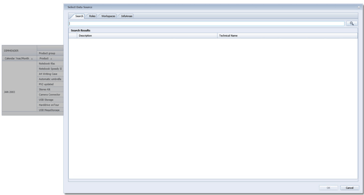
Figure 14
The new Design Studio dashboard display
Next I show how you can add maps to dashboards.
How to Add Maps to Dashboards
Another very interesting and important feature in the release of SAP BusinessObjects Design Studio 1.5 is the ability to create geographic visualizations. It can display these kinds of graphics three different ways:
- Polygons and shapes, based on a custom GeoJSON file.
- Points and markers, based on longitude and latitude information.
- Bubble maps, based on either longitude and latitude information or a custom GeoJSON file.
I discuss each of these map options in more detail in the following sections.
Note
Currently (as of August 2015), these maps are not supported when SAP
HANA is the platform for SAP BusinessObjects Design Studio. The maps are
also not exported as part of the PDF export option discussed earlier.
GeoJSON Object
GeoJSON is a format for encoding a variety of geographic data structures. A GeoJSON object may represent a geometry, a feature, or a collection of features. GeoJSON supports the following geometry types: Point, LineString, Polygon, MultiPoint, MultiLineString, MultiPolygon, and GeometryCollection. For further details visit: https://geojson.org/.
In this example, I describe the steps for how to use a GeoJSON file for a map of the United States, which is available here: https://eric.clst.org/Stuff/USGeoJSON. I use the file gz_2010_us_outline_500k.json (the 500K entry for the US Outline).
In addition, I also assume that the data source (in this example, a BEx query) provides a key figure and dimension entries for the United States.
1. Start SAP BusinessObjects Design Studio and select the menu Application > New.
2. Click the Browse button, select a folder in which to save your application, and then click the OK button.
3. Enter a name for your application.
4. Select iPad as the Target Device and click the Finish button.
5. Navigate to the Outline window (bottom left) of the new application and select the Data Sources folder.
6. Right-click the Data Sources folder and select Add Data Source from the context-menu options.
7. A Connection dialog window opens. Click the Browse button to search for the connection.
8. Select the connection entry that points to your system; for example, the SAP BW system.
9. Click the OK button. Click Browse for the Data Source field.
10. In the screen that opens, click the Browse button to search for the Data Source field. Navigate to the Search tab.
11. Search for a BEx query (in this example, the BEx query should provide a key figure as well as a dimension representing the United States).
12. Select the query and click OK.
13. After you selected the BEx query as data source navigate to the Outline window.
14. In the Outline window use a right-click on the new data source and select Edit Initial View from the context-menu options.
15. Ensure that the dimension for the US is placed into rows and then click the OK button.
16. Add a geo map component from the Analytic Component options to the application using a drag-and-drop method. Configure the properties for the geo map as shown in Table 5.
| Property |
Value |
Name
|
GEOMAP1
|
| Top margin |
20 |
| Left margin |
20 |
| Bottom margin |
Auto |
| Right margin |
Auto |
| Width |
1000 |
| Height |
1000 |
Table 5
17. In the Additional Properties screen that opens (Figure 15), set the Data Source property to the data source you added previously; in this example, QUERY_1.

Figure 15
Additional Properties
18. Set the Measure property to the value from your data source (Net Value in this example).
19. Click the icon on the right side of the Custom GeoJSON File property (hidden by the drop-down menu in Figure 15). This opens the screen in Figure 16, where you upload the file.
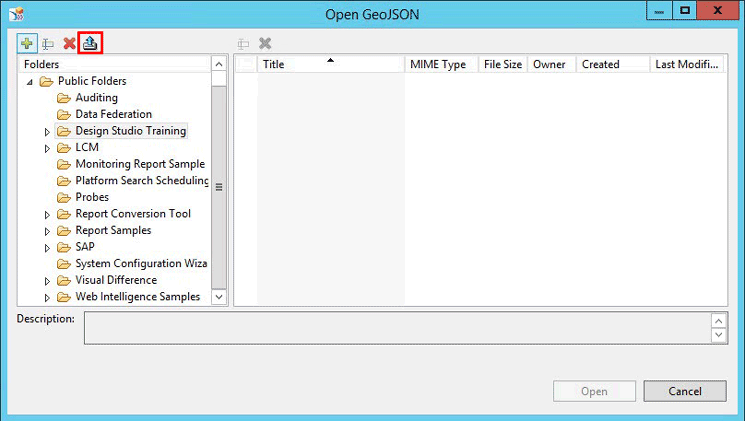
Figure 16
Upload the GeoJSON file
20. Select a folder in which to put (upload) the GeoJSON file.
21. Click the Upload icon (highlighted in Figure 16) to upload the GeoJSON file.
22. Navigate to the folder where you uploaded the GeoJSON file and select it.
23. Click the Open button to open it.
24. Set the GeoJSON Mapping Property to the value NAME which, in this case, represents the United States.
25. Set the GeoJSON Mapping type to the value Text.
26. Save your application and follow the menu Application > Execute on BI Platform to execute it.
The map that results should look like the screen in Figure 17.
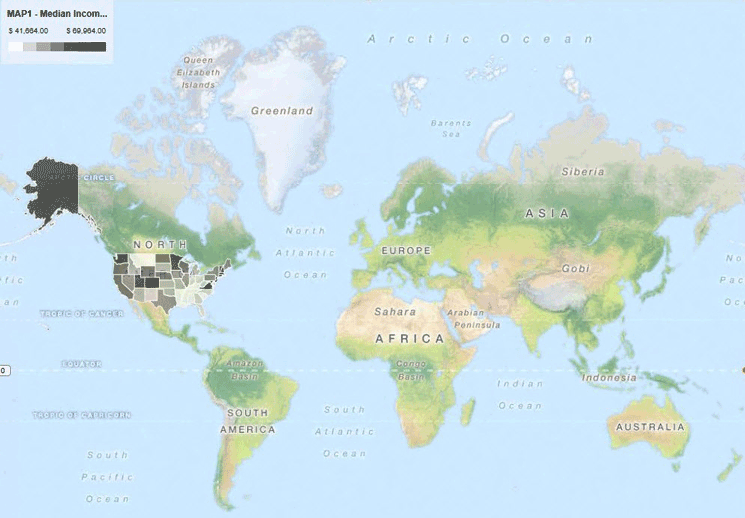
Figure 17
The new uploaded geo map based on the GeoJSON file
Product Roadmap Disclaimer
The descriptions in this article of
future functionality are the author’s interpretation of the publicly
available product integration roadmap. These items are subject to change
at any time without any notice, and the author is not providing any
warranty on these statements.

Ingo Hilgefort
Ingo Hilgefort started his career in 1999 with Seagate Software/Crystal Decisions as a trainer and consultant. He moved to Walldorf for Crystal Decisions at the end of 2000, and worked with the SAP NetWeaver BW development team integrating Crystal Reports with SAP NetWeaver BW. He then relocated to Vancouver in 2004, and worked as a product manager/program manager (in engineering) on the integration of BusinessObjects products with SAP products. Ingo's focus is now on the integration of the SAP BusinessObjects BI suite with SAP landscapes, such as SAP BW and SAP BW on SAP HANA, focusing on end-to-end integration scenarios. In addition to his experience as a product manager and in his engineering roles, Ingo has been involved in architecting and delivering deployments of SAP BusinessObjects software in combination with SAP software for a number of global customers, and has been recognized by the SAP Community as an SAP Mentor for SAP BusinessObjects- and SAP integration-related topics. Currently, Ingo is the Vice President of Product Management and Product Strategy at Visual BI Solutions, working on extensions to SAP’s product offering such as SAP BusinessObjects Design Studio and SAP Lumira. You may follow him on Twitter at @ihilgefort.
You may contact the author at Ingo@visualbi.com.
If you have comments about this article or publication, or would like to submit an article idea, please contact the editor.