Featured Content
Topics

Explore critical topics shaping today’s SAP landscape—from digital transformation and cloud migration to cybersecurity and business intelligence. Each topic is curated to provide in-depth insights, best practices, and the latest trends that help SAP professionals lead with confidence.

Regions

Discover how SAP strategies and implementations vary across global markets. Our regional content brings localized insights, regulations, and case studies to help you navigate the unique demands of your geography.

Industries

Get industry-specific insights into how SAP is transforming sectors like manufacturing, retail, energy, and healthcare. From supply chain optimization to real-time analytics, discover what’s working in your vertical.

Hot Topics

Dive into the most talked-about themes shaping the SAP ecosystem right now. From cross-industry innovations to region-spanning initiatives, explore curated collections that spotlight what’s trending and driving transformation across the SAP community.

Featured Content
Topics

Explore critical topics shaping today’s SAP landscape—from digital transformation and cloud migration to cybersecurity and business intelligence. Each topic is curated to provide in-depth insights, best practices, and the latest trends that help SAP professionals lead with confidence.

Regions

Discover how SAP strategies and implementations vary across global markets. Our regional content brings localized insights, regulations, and case studies to help you navigate the unique demands of your geography.

Hot Topics

Dive into the most talked-about themes shaping the SAP ecosystem right now. From cross-industry innovations to region-spanning initiatives, explore curated collections that spotlight what’s trending and driving transformation across the SAP community.

SAP Data Visualization

Upcoming Events

SAPinsider Las Vegas 2026
Mar 16-19, 2026Las Vegas, Nevada, NV

Related Vendors

Data Visualization for SAP Users: An Overview and Key Considerations

What is Data Visualization?

Data visualization is the concept of using pictures to explain data. Pictorial or graphical representations of information and data can be created through visual elements such as charts, graphs, and maps. Data visualization tools can make data more accessible to decision makers by presenting trends, outliers, difficult concepts, and new patterns in a visually appealing way. Data visualization is often considered a blend between science and art.

Data Visualization Tools and Capabilities for SAP Customers

SAP provides data visualization and analytics software with SAP Lumira.

Strong data visualization capabilities can also be achieved by integrating SAP Analytics Cloud into your business intelligence landscape.

SAP HANA can enable real-time in-memory computing to third-party tools and to activities such as data visualization. In this article, Deloitte writes about how you can adopt SAP HANA as a backbone for visualization applications.

Vendors including Qlik, SimpleFi Solutions, TIBCO, and Pyramid Analytics provide data visualization capabilities in their products.

Key Data Visualization Considerations for SAPinsiders

Appeal to the human mind and drive real user adoption. Mico Yuk, CEO of BI Brainz, has been in the data industry since before SAP was considered a leader in the BI market. She witnessed SAP’s acquisition of BusinessObjects and the Xcelsius visualization tool. In this Q&A article published in 2015, Yuk describes her initial passion for data visualization, the importance of being able to prove any number that you present, and the criticality of creating well-designed visualizations. “No matter how great the data, if the data visualization is poorly designed, no one will use it,” Yuk says.

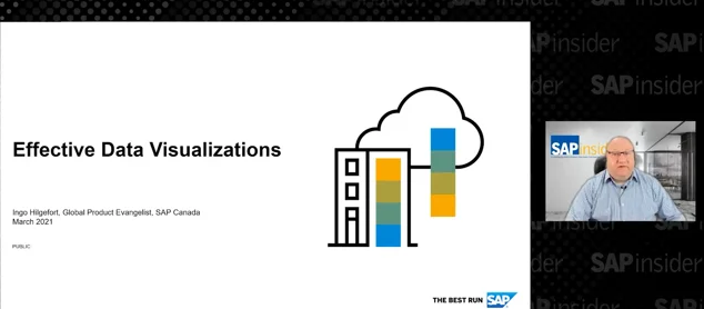
Solve problems and provide elegant solutions. In an SAPinsider event presentation, SAP’s Ingo Hilgefort, Global Product Evangelist, SAP Analytics Cloud, describes best practices for data visualization. One rule of thumb: Good design means never having to say “click here.” And, be aware of the impact of title, color, and orientation. These components can set the intension of your visualization and, when altered, set a completely different impression.

Consider color and contrast. According to Hilgefort, humans can only effectively differentiate around seven color steps. Therefore, selecting the correct color scheme for your message is important to avoid simply adding qualitative colors that might confuse your audience. A sequential color scheme, says Hilgefort, can be used to order values from low to high. He recommends a divergent color scheme be used when the values are ordered and there is a critical mid-point (e.g., an average or zero). And a qualitative scheme, he says, can be used when data falls into distinct groups (e.g., products) and requires contract between adjacent colors.

6 results
Evaluating Data Visualization and Business Intelligence (BI) ToolsJun 24, 2025  —  Data visualization and business intelligence tools enhance the understanding and analysis of data by simplifying complex information into accessible visuals and integrating diverse data sources for informed decision-making, thus driving efficiency and strategic growth in organizations.
1 minute read
Case Study: American Axle and Manufacturing Reaches New Heights With Insights From ParsableApr 8, 2025  —  Discover how American Axle & Manufacturing improved operational visibility and standardized work processes across plants with Parsable’s Connected Worker® platform. This case study highlights their journey to enhanced efficiency, quality, and frontline collaboration.
1 minute read
Leading practices for Data Visualizations in SAP Analytics CloudMay 26, 2021  —  SAP Analytics Cloud uses a library of visualizations that have never been easier to integrate with your existing planning and reporting data. With all these visualizations available, sometimes it is not clear which one is best suited for your requirements. This session will explore concepts and leading practices from the leading minds in the field of data visualization. See examples of how different data sets when combined with different visualizations dramatically influence the clarity of the story you are trying to tell. This session will explore the different visualizations offered in SAP Analytics Cloud as well as how to connect these visualizations to your data and how to link visualizations to each other to tell an integrated story.
1 minute read
Effective Data VisualizationMay 26, 2021  —  Learn best practices of dashboard design and data visualization in a detailed, practical, step-by-step, and ready-to-use way. Focus is placed on a common set of dashboard design rules, such as the usage of different visualization, colors, and text, as part of an overall dashboard design process. These best practices are contrasted with less successful design examples. The session is product independent. Key Business Benefits: - Attendees will receive a very practical overview and receive a detailed step by step material which can be applied right away as part of their next dashboarding project - Attendees will receive an overview on dashboarding best practices for building easy to consume dashboards - Attendees will receive detailed material that can right away be applied to their next dashboarding project
1 minute read
Effective Data VisualizationOct 20, 2020  —  Learn best practices of dashboard design and data visualization in a detailed, practical, step-by-step, and ready-to-use way. Focus is placed on a common set of dashboard design rules, such as the usage of different visualization, colors, and text, as part of an overall dashboard design process. These best practices are contrasted with less successful design examples. The session is product independent. Attendees will receive: - A very practical overview and receive a detailed step by step material which can be applied right away as part of their next dashboarding project - An overview on dashboarding best practices for building easy to consume dashboards - Detailed material that can right away be applied to their next dashboarding project
1 minute read
Bring Your Own Data VisualizationAug 3, 2016  —  

Across all lines of business, data drives the modern enterprise. As a result, user groups from throughout an organization often select the data visualization tools that best meet their needs. This strategy makes sense in the short term, but can make things challenging for IT when it’s time to upgrade the performance of these tools. Fortunately, there is a single platform that will speed up any third-party data visualization application: SAP HANA. Read on to learn how SAP HANA can be deployed as a universal engine for driving fast and efficient insights from data visualization tools. 

3 minute read