Learn the step-by-step process for creating tiles for dashboard reports within the SuccessFactors Dashboards 2.0 Reports functionality.
Key Concept
The SuccessFactors Dashboards 2.0 Reports functionality is a high-visibility tool for presenting data graphically. With its new features, you can now see data from the different SuccessFactors modules—not just performance and goals data—in different types of graphs and charts.
Dashboards 2.0 Reports functionality is a feature in the SuccessFactors suite that allows users to report data in charts. As an administrator, once you understand the new features of Dashboards 2.0 Reports, you can then create tiles and tile-based dashboards from scratch. In this article, the second in my three-part series of articles about SuccessFactors Dashboards 2.0 Reports, I cover the details users need to know so that they can create SuccessFactors Dashboards 2.0 Reports and share them with key people in their organizations.
SuccessFactors Dashboards 2.0 Reports is a high-visibility tool that is used not only by SuccessFactors administrators but also by executives and other general users. With Dashboards 2.0 Reports, you can complete tasks such as leveraging data from different SuccessFactors modules, putting dashboards into users’ homepages, and making dashboards that are mobile enabled.
Note
To enable Dashboards 2.0 Reports, if they are not already enabled, contact your SuccessFactors representative, customer support, or your SuccessFactors partner.
How to Build Tiles for Tile-Based Dashboards in Dashboards 2.0 Reports
In this section I cover the details for how to build dashboard tiles to use in Dashboards 2.0 Reports dashboards. First, I explain the role-based permissions and authorizations required for building dashboards. Second, I explain, step-by-step, how to build the tiles that make up a dashboard in Dashboard 2.0 Reports. In the third, and final, article in this series, I show you how to use these tiles to create a dashboard and how to share the new dashboard with other key players in your organization.
Role-Based Permissions and Authorizations
Before you can create tiles and dashboards to be used in SuccessFactors Dashboards 2.0 Reports, you first must have authorization to do so. As you might already know, Role-Based Permissions is the framework used in the SuccessFactors system to control the security structure. The functionality of Dashboards 2.0 Reports must be permissioned in Role-Based Permissions for it to be used (e.g., this means you have total control over who gets to create and manage Dashboards 2.0 Reports). To permission Dashboards 2.0 Reports functionality, follow these instructions.
In the SuccessFactors Home page, select the Admin Center option from the drop-down menu under your username (
Figure 1), which opens the screen in
Figure 2. Select the Set User Permissions option under Manage Employees, and then select Manage Permission Roles (not shown). This action opens the screen in
Figure 3, which gives you access to manage permission roles.

Figure 1
Select Admin Center on the SuccessFactors Home page

Figure 2
Select Set User Permissions in the Admin Center

Figure 3
The role-based permissions (Permission Role List) screen
Click the System Admin option on the left, and the Permission settings pop-up window in
Figure 4 opens.

Figure 4
The Permission settings pop-up window
Select the role to which you would like to give access to manage Dashboards 2.0 Reports. For this example, select the System Admin role. In the pop-up that opens in
Figure 4, under Administrator Permissions, select Manage Dashboards/Reports. The screen on the right expands and shows the permission options. Select the Analytics Tiles and Dashboards check box and then click the Done button.
You are now ready to manage Dashboards 2.0 Reports.
Note
All the other permissions you see under Manage Dashboards/Reports in Figure 4 control different reporting capabilities in SuccessFactors. These additional permissions are not part of the scope for this article.
How to Create Tiles
The first step in creating a report in SuccessFactors Dashboards 2.0 Reports is to create tiles. Tiles are the actual charts (and graphs) that make up a dashboard. In this example, I show how to create a dashboard with competency data in Dashboards 2.0 Reports. A dashboard is made up of a group of different tiles, and tiles are graphical representations of data.
Go to the SuccessFactors Home page (Figure 1). Once there, click Home (on the upper left) and then select the Admin Center option from the drop-down options that open (not shown). (The Admin Center is the screen in which administrators can control and configure almost everything in the suite.) Selecting the Admin Center option opens the Admin Center (Figure 5). Click the Reporting and Analytics option and then select Manage Dashboards.

Figure 5
Select the Manage Dashboards option in the Admin Center
This action opens the Manage Dashboard wizard (
Figure 6) in which you can begin building your first tile for the dashboard.

Figure 6
Open the Manage Dashboards wizard
After you click the Manage Standard Dashboards and YouCalc Files option, the screen in
Figure 7 opens. Here you can see all the stored tiles that already exist in the system. If you want to create a custom tile, click the Build Tile option on the top left.

Figure 7
Select Build Tile to start building a custom tile
This action opens the screen in
Figure 8 where you are prompted to select a domain. Each domain is based on a specific HR module, such as Employee Profile, Performance Management, or 360 Multi-Rater Subject, from which to pull the data that is to be included in the custom tile. Typically, this data is divided by module. In this example, choose the Performance Management option because you want your custom tile to include competency data.

Figure 8
Select a domain from which to gather the data for the new custom tile
In the screen that opens (
Figure 9), provide a name and a description for the new tile and click the Next button. (As a best practice, it’s always a good idea to provide a unique description for each new custom tile.)

Figure 9
Give a name and description to the new custom tile
A new screen opens (
Figure 10) in which you define the population that will be part of the report. In this example, you create a tile that allows the CEO to see the overall competency rating for the entire organization (all the competency ratings for all the employees in the company).

Figure 10
Select the details for the new tile
In the screen in
Figure 10, select Team View as the Report Type. This means that whoever is selected to be the head of the hierarchy can see all the employees in the organization (hierarchy); therefore, based on the level or title of the people selected here, they can see all the employees under them in the hierarchy.
In the Starting From field, search for the user (or users) who are to be the head of the hierarchy. In this case, since you want to see all the employees in the organization, select the CEO—Daniel Cortez. Since you’re selecting the top—the CEO—that means the hierarchy works from top to bottom and therefore, by default (when you choose the CEO level), includes all the employees
For Levels, select All Levels so that everyone in the hierarchy is included and can be viewed.
For the Division, Department, and Location fields, select the All values are selected option so that the entire population is included.
Leave the Include inactive users check box unselected because the inactive user data is not relevant for this dashboard.
In the DataSet section, you select the performance template. This means you are only sourcing data from that performance template. For example, if you have two performance templates (templates A and B), and you only want to look at competencies scored for template A, you would select the template that only pertains to information associated with template A. To select a data set, click the pencil icon in
Figure 11 to open the DataSet pop-up window (
Figure 12). Select the desired performance template from the list using the check boxes—in this case, Performance Evaluation—and click the Done button. (Note that more than one template can be selected at a time.)

Figure 11
Select a DataSet template

Figure 12
Select a performance template for the DataSet
The next step is to define the type of chart you would like to use (e.g., to be displayed). There are three kinds of charts from which to choose: line, pie, and column, shown in
Figures 13 to
15, respectively.

Figure 13
Line chart display
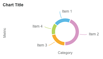
Figure 14
Pie chart display
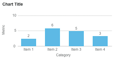
Figure 15
Bar chart display
Back in the screen in
Figure 11, click the Next button once you’ve made your required entries. This action opens the screen in
Figure 16, where you can choose which chart to use. In this example, select Column in the Chart Type field.

Figure 16
Select a Chart Type for the tile
After you select a chart type, a pop-up screen like the one in
Figure 17 opens in which you can further refine the chart details for the report. These details appear as columns in the chart. Select a category metric for the first column of your chart (in this example, Competencies) and, in the screen that expands on the right, select the data on which you want to report. In this case, choose the Overall Competency Rating Description option, and then click the Done button.

Figure 17
Select a category for the first column of the chart
Note
The concepts of categories and metrics (the X and Y axes) are very basic. Therefore, it is beyond the scope of this article to explain in detail how to construct a graph.
Next, on the left, select the Subject category for the second column and, in the screen that expands on the right, choose Subject User ID as your metric for the second column (
Figure 18). Using this metric, the system looks at the scores for each user and counts them to produce the chart.

Figure 18
Select a category for the second column of the chart
After you click the Done button, the final definitions should look like the ones in
Figure 19. (Note that, at this point, the system only shows an example graph or chart. At the end of the tile-building process, you see the final, real result of your settings.)

Figure 19
Review the chart’s settings
After you review your settings for the chart, click the Next button to save them.
The next step is to create a filter using filter groups. A filter group is used, for example, if you want to see the overall competency score for only one region. In that case, a filter group can be created to do that. Here’s how.
Once you click the Next button in
Figure 19, you are taken to the Filter page (not shown). Select the Refine Criteria option and then the Subject option. This opens the Define “Subject Location” Filter pop-up screen in
Figure 20. Make your selections (in this case, Amsterdam, Atlanta, and Bangalore) and click the Done button to save your filter settings. Now the report only looks at the employees in the regions you selected.

Figure 20
Select the regional filter settings for the chart
Note
You can create filters based on any fields available in the data set.
In this case, however, you don’t add any filters because you want the report to include the entire population. To do this, leave the Filter Group 1 definition blank and click the Next button (
Figure 21).
Note
As stated previously, to receive results for all the employees in the company, no filters are selected. However, in Figure 21, Subject Gender and Overall Potential Rating are selected as filters for demonstration purposes only.
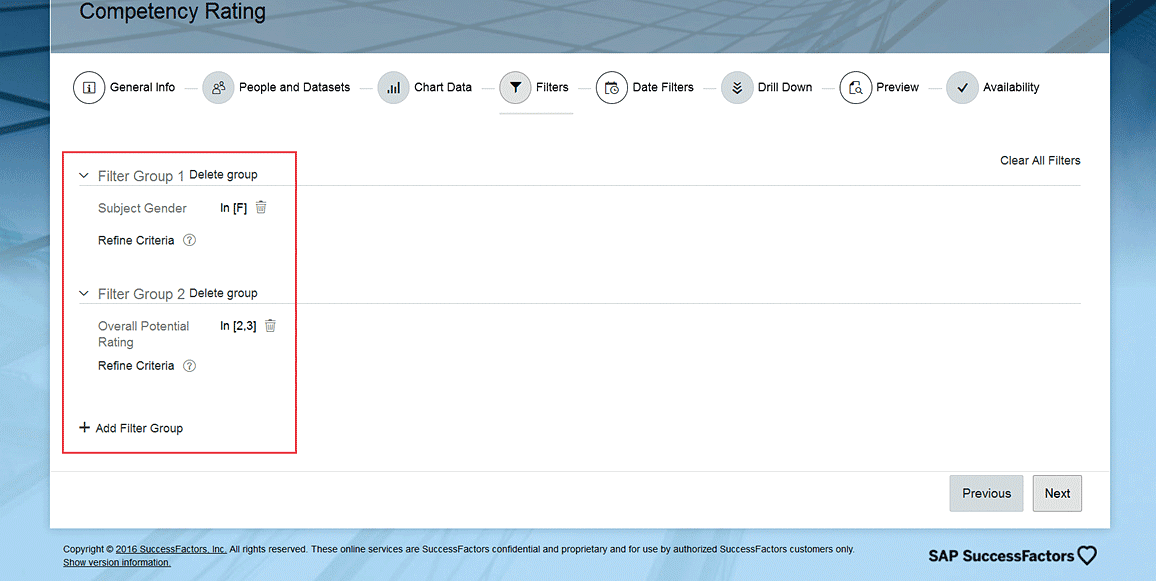
Figure 21
Select filters, if required, and click Next
This action opens the Data Filters page where you have the option to filter the displayed data by date—e.g., select the Enable Date Filter check box (
Figure 22).

Figure 22
The option to filter data by date
In this example, you do not add any date filters because you want to report on all the available data up to now (for the Performance Template you selected previously). So, leave the Enable Date Filter check box unchecked and click the Next button.
In the screen that opens (not shown) select the pencil icon

next to the Drill Down option on the left. This opens the pop-up window in
Figure 23 where you can select your drill-down column settings (more on the drill-down feature later in this article).

Figure 23
Select the options for drilling down into the data
The drill-down configuration (in tiles for the data that is to be displayed) is very important. As discussed earlier, this data is presented in a graph; however, once you click on the graph you can see details of the employees’ data for all the employees who are included in the report.
In this case, select the Subject City, Subject State, Subject Country, Subject Division, Subject Department, and Subject Location options under Columns. Then select all the Subject options under Selected columns on the far right. After you click the Done button, a preview of the chart (tile) opens where you can review the data display (
Figure 24). These selections are just examples of what information you see once you drill down (or view all this extra information about the population that composes, in this case, each bar in the tile).

Figure 24
Preview the tile’s settings and display
After previewing the display of the data that composes the tile, and before saving, you can modify any definitions or configurations to ensure that the data being reported on in the tile is accurate based on your configuration, filters, and definitions.
Click the graph and it expands, showing the details (
Figure 25). If you click any bar in the graph, you see all the detailed information about all the employees who are in that section of the graph (shown at the bottom of
Figure 25). The columns of information you see here are the same ones that you defined previously in the drill-down step (
Figure 23).

Figure 25
Review the details of the graph’s data
After you have finished reviewing the data and made any adjustments, click the Next button (not shown) and the Availability page opens (
Figure 26). Here you can make the tile active by clicking the Make Active check box. (If the tile is not active, you cannot use it or see it anywhere).

Figure 26
The Availability page where you activate the tile
In addition to making the tile active, you also can define whether you want to share the tile in the home page or in a mobile application. You do this by selecting the Homepage or Mobile check boxes. You can also select both options if you want. Make your selections and then click the Save and Exit button. This action opens a screen like the one in
Figure 27 where you can see all the available tiles, including the one you just created.

Figure 27
Review all the available tiles, including the new Competency Rating tile
Pablo Stuardo
Pablo Stuardo is a SuccessFactors Senior Consultant at Ernst & Young. He focuses on the entire SAP SuccessFactors suite and has supported and implemented a wide variety of projects for different clients at a global level. A native Chilean, Pablo is fluent in Spanish, and graduated from Georgia State University’s Robinson College of Business with a dual degree in Computer Information Systems and Finance.
You may contact the author at
pablo.stuardo1@gmail.com.
If you have comments about this article or publication, or would like to submit an article idea, please contact the
editor.