Learn the basic steps to use SAP BusinessObjects Explorer, including how to search for answers, explore the data, and use common functionality.
Key Concept
An information space is a collection of data that has context to it such that points in the data relate to each other (e.g., resort location revenue by age group). Information spaces serve as one of the cornerstones of BusinessObjects Explorer’s functionality.
BusinessObjects Explorer allows you to quickly and easily find answers to your questions, and then explore the data and use it as you need. I begin this article with a look at the functionality of Explorer to learn more about the tool itself, and then will leverage a standard universe that is delivered as part of the BusinessObjects Enterprise deployment, so that even without SAP NetWeaver Business Warehouse Accelerator, you can follow the steps and learn more about Explorer.
All steps and examples in this article are based on BusinessObjects XI 3.2 and BusinessObjects XI 3.1 service pack 2.
How to Create an Information Space
1. When you log on to BusinessObjects Explorer, the home screen shows all of the information spaces you can access (Figure 1).

Figure 1
BusinessObjects Explorer home screen
You can navigate to a single information space by simply clicking on the entry in the list, but you can also use the search option to search across all available information spaces. You can also create your own information spaces through a few simple steps.
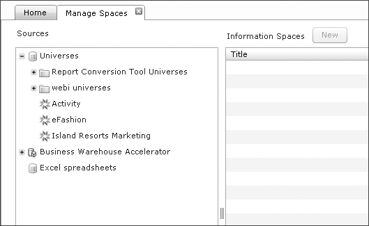
2. To do this, select the Manage Spaces tab (Figure 2).

Figure 2
Manage Spaces tab options
In the Manage Spaces area, you can create, edit, or delete information spaces. On the left side, a list of available sources is grouped into universes, Business Warehouse Accelerator, and Excel spreadsheets.
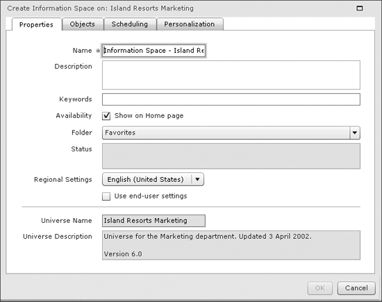
3. In my example, I use the Island Resorts Marketing universe and generate a new information space. To do this, select the Island Resorts Marketing universe in Figure 2, and click the New Button. The screen in Figure 3 appears.

Figure 3
A new information space
On the first Properties tab, you can define a set of general properties for your information space, such as Name, Description, a set of Keywords, a Folder for storage, and others.
4. Enter Information Space – Island Resort Marketing in the Name field.
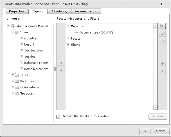
5. Click the Objects tab (Figure 4). Here you can select the objects from the source and include them in the indexing process, which includes the data for these objects in your information space. By default, there is a facet that combines all measures and one facet for each dimension/characteristic object that you will include. A facet is a panel that allows you to navigate within the members for a specific dimension/characteristic object (e.g., a list of countries from the source).

Figure 4
Information space objects
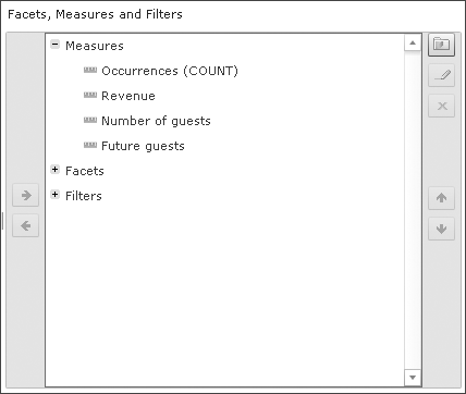
6. Next, add all available measures to the Measures facet (Figure 5). Then you can add the following dimension objects to the Facets item (Figure 6):
- Country
- Resort
- Sales person
- Service line
- Service

Figure 5
Adding items under Measures

Figure 6
Adding items under Facets
7. Click the folder icon in the top right to create a new facet group. A facet group combines several dimension objects into a group, which is then shown together in the BusinessObjects Explorer User Interface. You can think about combining dimension objects as cascading objects, or for those coming more from the SAP NetWeaver Business Warehouse side, think about compounded characteristics.
When using a facet group, the dimension objects are combined and you can only use them in combination. In my example, I create a facet group that combines all the dimension objects from the Customer universe class, with the dimension Age Group being the lowest level item. In this case, you cannot filter the data down to a specific Age Group without specifying the other dimension objects in this facet group.
8. Click the pencil icon in the top right to rename the new facet group to Customer.
Note
You can also use the pencil icon during the definition of your information space to rename the dimensions or measure objects to provide more business-oriented naming.
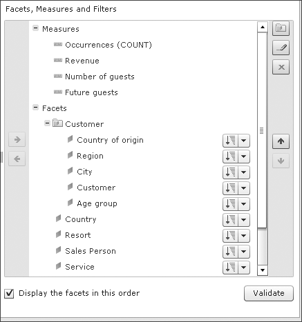
9. Add the following dimension objects to the Customer facet group (Figure 7):
- Country of origin
- Region
- City
- Customer
- Age group

Figure 7
Adding dimension objects to the Customer facet group
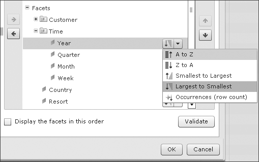
10. Check the box for Display the facets in this order option as shown in Figure 7. In addition to the option to group dimensions in the form of facet groups, you can also define the default sorting for each dimension object in your information space (Figure 8).

Figure 8
Sort the order for dimensions
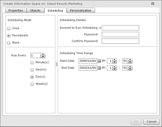
11. Next, click the Scheduling tab (Figure 9). Here you can define how often to set up the indexing process based on your source. If you integrate SAP BusinessObjects Explorer with SAP NetWeaver Business Warehouse Accelerator, the option to set up a recurring scheduling job is not as relevant as in cases where you leverage a universe as a data source.

Figure 9
Information space Scheduling tab
12. Under Scheduling Mode, select the None option for now.
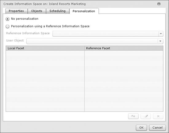
13. Click the Personalization tab (Figure 10). This tab defines a data filtering option based on another information space, which don’t discuss in this article. Leave the No personalization option selected and click the OK button, which adds the information space to the list (Figure 11).

Figure 10
Information space Personalization tab

Figure 11
List of available information spaces
14. Click the index now icon (right-most icon in the Actions column in Figure 11) to start the indexing process. After a short time (depending on the volume of data), the status of your information space changes and you are ready to explore the data.
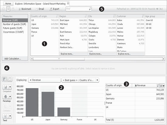
15. Click the Home tab, and then refresh the list of available information spaces. Then select the newly created Information Space – Island Resort Marketing. In Figure 12, you can see a default view of your information space, which consists of several areas:
- Bullet 1 lists facets that represent the dimensions you select when you create the information space, including Country of origin, Region, City, Customer, and Age group.
- Bullet 2 is a visualization of the data. BusinessObjects Explorer makes a proposal for the data visualization based on how many and which type of measures you select.
- Bullet 3 shows a table that represents the data that is being used for the visualization. In addition, you can use this table to define sorting and functions (e.g., a top 10 or bottom 10 selection).
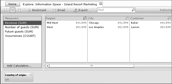
- Bullet 4 shows an empty area separating the data visualization from the facets, which shows any filters that you may create. For example, selecting the Country of origin value US will move the Country of origin facet to this area, showing the value US as a filter (Figure 13).
- Bullet 5, which shows a toolbar that allows you to export the data, email the information, or create a bookmark, which continues your navigation status so that you can share a URL with others and they receive the identical navigation status. In addition, the buttons on the far left of the toolbar allows you to configure the layout of your information space. You can choose to display only the facets, only the data visualization, or both.

Figure 12
Elements of the newly created information space

Figure 13
Using a filter value in facet navigation
An Example of How to Use Explorer’s Data
Let’s start exploring the data of your information space. In Figure 12, you see the facet group for Customer and the values based on the selected measure Revenue. In the data visualization section, you saw a comparison chart that showed US as the Revenue per Country of origin. Based on this information, you know that visitors from the United States generate the most revenue. Ideally, you want to understand more about the situation so that you can take the steps necessary to gain even more revenue.
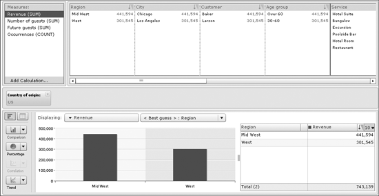
1. To begin this process, select the member US from the Country of origin facet, which then brings up the screen in Figure 14.

Figure 14
Selecting US to explore its data
At this stage, notice several items:
- In the middle area of your information space, the Country of origin facet is shown with the filter value US, and the facet has been removed from the top navigation.
- The data visualization has been updated and now shows the Revenue by Region.
- The Region facet now only shows values that are part of the selected value US.
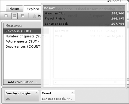
2. Use the scrollbar below the facet navigation to scroll to the Resort facet. During scrolling, you see the names of the facets in the form of a small pop-up window to make the navigation easier (Figure 15).

Figure 15
Facet navigation – note the pop-up window to make navigation easier
3. Next, select all members from the Resort facet. When selecting members in a facet, you can use the Ctrl button on your keyboard to select several single members and the Shift button on your keyboard to select a range of values. In addition, you can also click on the filtered value in the filter ribbon in the middle; a screen with a list of possible members is presented and you can select them (Figure 16).

Figure 16
Filter selection
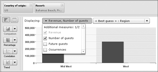
4. In the data visualization area, open the list of measures and check the boxes for Revenue and Number of guests (Figure 17).

Figure 17
Checking boxes for data visualization
5. Then set the second selection option to Resort.
6. Click the Comparison visualization chart icon along the left, and select Dual axis, which is the sixth option in the drop-down menu (Figure 18). In the table on the right side, the Bahamas Beach resort has the highest number of guests but the lowest revenue.
Let’s try to find out what the other two resorts are doing differently.

Figure 18
Comparison visualization chart
7. Uncheck the box for the Number of guests measure for the data visualization.
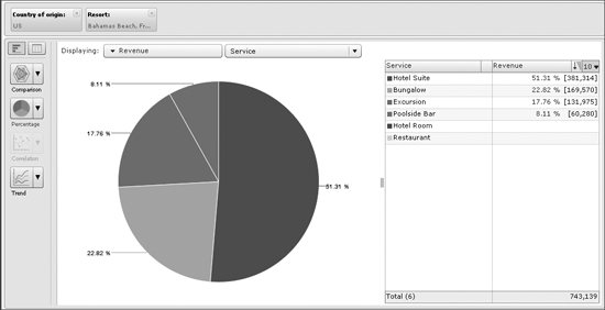
8. Select Service as the second option for the data visualization, and also select the Percentage option. The screen in Figure 19 appears.

Figure 19
Percentage chart for revenue and service
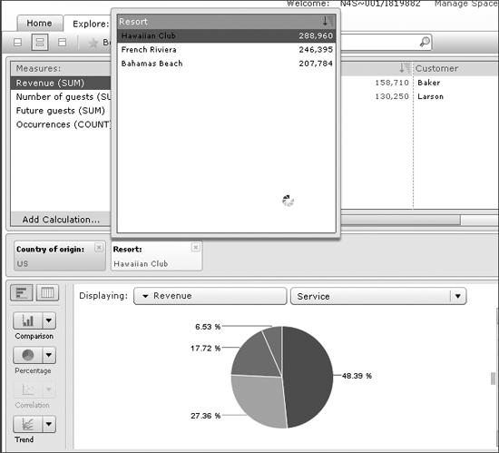
9. Click on the filter for Resort. You can now use the list of members in the window and your data visualization will change based on each selection as shown in Figure 20.

Figure 20
Viewing data by resort
By comparing the three resorts, you can see that the Bahamas Beach resort is selling (viewed by percentage) more Hotel Suite rooms than the other resorts but less Excursion and less Poolside Bar products. Let’s dig more into this information.
11. Select Number of guests under the Measures facet.
12. Set the Measure option for the data visualization to Number of guests as well.
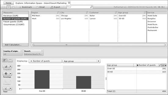
13. Set the dimension object for the data visualization to Age Group (Figure 21).

Figure 21
Further exploring the resort data
14. Select Age group Over 60 in the chart (Figure 22).

Figure 22
Select Age group Over 60
Then click the magnifying glass icon near the bottom right of Figure 22 to filter based on the selected element in the chart.
15. Now select Revenue in the Measures facet.
16. Set the measure for the data visualization to Revenue.
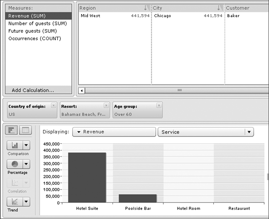
17. Next set the dimension panel for the data visualization to Service as shown in the bottom half of Figure 23.

Figure 23
Further filtering by Revenue and Service
What do the results suggest? Because the chart does not show any Excursion revenue and only a small amount of revenue for Poolside Bar, this might indicate that the Bahamas Beach resort has a higher percentage of visitors in the Age group Over 60 than the other resorts. To see if this is true, do the following:
- Remove the filter for the Resort facet from the filter ribbon
- Select Number of guests in the Measures facet
- Set the measure to Number of guests for the data visualization part
- Set the dimension to Resort for the data visualization part
- Then select the Percentage type of visualization
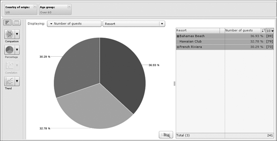
As you can see in the resulting screen in Figure 24, you can prove the earlier assumption and see that the Bahamas Beach resort indeed does have a higher percentage of visitors over 60 when compared to the other two resorts.

Figure 24
A pie chart of looking at data percentages
Sharing Explorer Data with Others
If you work for the company responsible for Bahamas Beach resort, you might want to share this information with the management team to better ensure the business focuses more on the different needs of the age groups that frequent each resort.
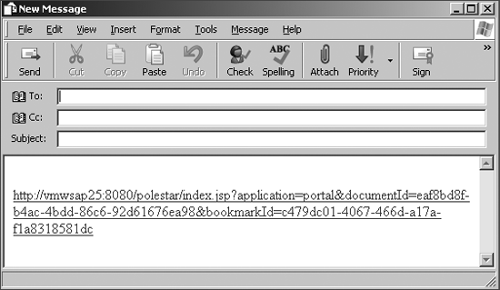
To share this data, click the Email icon in the main toolbar of Information Space – Island Resort Marketing (Figure 21). You are presented with a new email message that includes a URL to the information space in question, including the navigation status (Figure 25).

Figure 25
Generated email with a URL to an information space
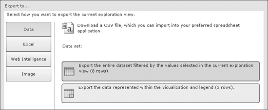
Now go back to the main toolbar of Information Space – Island Resort Marketing and click the Export icon, which brings up the screen shown in Figure 26.

Figure 26
Export option for information space data
At this point, you can use the buttons along the left to select between exporting the data to a CSV file (Data button), to Microsoft Excel, or to a BusinessObjects Web Intelligence report based on your information space. You can also create an image file based on the data visualization.
Let’s select the image option so that you can include the image in the earlier email message as a quick overview. To do so, select the Image option and click the OK button twice. Then save the image file to your local computer and paste it in an email message.

Ingo Hilgefort
Ingo Hilgefort started his career in 1999 with Seagate Software/Crystal Decisions as a trainer and consultant. He moved to Walldorf for Crystal Decisions at the end of 2000, and worked with the SAP NetWeaver BW development team integrating Crystal Reports with SAP NetWeaver BW. He then relocated to Vancouver in 2004, and worked as a product manager/program manager (in engineering) on the integration of BusinessObjects products with SAP products. Ingo's focus is now on the integration of the SAP BusinessObjects BI suite with SAP landscapes, such as SAP BW and SAP BW on SAP HANA, focusing on end-to-end integration scenarios. In addition to his experience as a product manager and in his engineering roles, Ingo has been involved in architecting and delivering deployments of SAP BusinessObjects software in combination with SAP software for a number of global customers, and has been recognized by the SAP Community as an SAP Mentor for SAP BusinessObjects- and SAP integration-related topics. Currently, Ingo is the Vice President of Product Management and Product Strategy at Visual BI Solutions, working on extensions to SAP’s product offering such as SAP BusinessObjects Design Studio and SAP Lumira. You may follow him on Twitter at @ihilgefort.
You may contact the author at Ingo@visualbi.com.
If you have comments about this article or publication, or would like to submit an article idea, please contact the editor.

