The first two parts of this series of three articles reviewed the motivations and the value-add of this new process for creating dashboards. In this is third and last part, learn the details about the final four steps, including the actual dashboard design phases and its roll-out to users.
Key Concept
The demand for shorter project timelines, combined with increasing requests for stronger data visualizations, require a new approach for creating dashboards. Using agile concepts and a design-thinking approach that involves stakeholders early in the project are key to ensuring the success of your next dashboard project.
After going through all the steps of the dashboard-design process, and after you have mastered the details and deliverables for each step, my goal is to make you confident that you can leverage these tips as part of your next project. Review and use the steps outlined in this article to help you become a more efficient and successful dashboard designer. An important aspect of this process it to fully incorporate the agile and design-thinking concepts. This means to review items early and often, gather feedback from your users early in the process and often, and include your stakeholders in a collaborative way so that they feel like part of the process and part of the solution: the final dashboard.
In the first four steps—observe and understand, define, ideate, and prototype (covered in my “
8 Simple Steps for Creating a Successful Dashboard (Part 2): Steps 1 – 4,”
BI Expert article)—I discussed how to gather all the requirements from stakeholders, defined the key performance indicators (KPIs) that are required as part of the dashboard design, and explained the importance of involving stakeholders by using a collaborative approach early in the process. With these final four steps (steps 5 through 8) I show how to take those prototypes and turn them into the real dashboards, and roll out the dashboards to all your users. An overview of all eight steps is shown in
Figure 1.
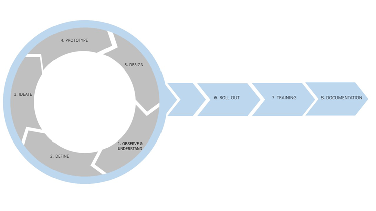
Figure 1
The complete eight-step process for building a better dashboard
Step 5. Designing the Dashboard
In the second article of this series, I ended with step 4, the prototype phase. As a result, the following items of the dashboard design were signed off on by the stakeholders:
- Which KPIs are going to be used and how are they defined?
- What is the overall dashboard layout?
- What are the navigation elements; for example, what available filter elements and drill-down navigations will be used?
- How will the dashboard be accessed—mobile, browser, or desktop?
- Are there any additional features that are required—for example, export capabilities?
With these items resolved, you can move on to step 5 and start the actual design of your dashboard. There are several important areas for this part of the process. I highly recommend that you develop your own standards for most of these areas so that your dashboard-design process follows a similar, standard approach and provides consistency. The more consistency you provide on the design approach, the better users are able to recognize dashboard elements.
Color and Visualization Standards
Visual effects and the way the data itself is visualized are critical aspects of your dashboard. In other words, the type of visualizations and the color choices are crucial aspects of the dashboard design, as well as where elements are actually situated on the dashboard.
As far as making other choices about visualization, there are some simple rules you can follow to make your next dashboard more successful. This list is not a complete list of dashboard-design recommendations, but it helps get you started on the path to make your next dashboard more successful.
Placement of Elements
When you start your dashboard design process, place the most critical information in the top left area of your dashboard, as most of your users will start reading from the left side (
Figure 2).

Figure 2
Think about the placement of elements and be consistent
Navigating from the top left, the second most important information goes in the top right (clock-wise). Finally, the third priority elements should be placed in the center of your overall dashboard, with the least important elements on the bottom right.
Using Color
When it comes to using color as part of your overall dashboard design, especially in charts that are part of your dashboard, ask yourself a very important question: What is the meaning or purpose of the color? If there is no obvious meaning or purpose for the color used, then it could well be that your dashboard would be a better designed dashboard without it.
Color, used as part of a data visualization, should always help the consumer of the information understand the information more quickly and better. For example, let’s assume your business is a car dealership, selling luxury cars. In this scenario, you want to display a chart outlining the sales revenue by car brand. Think about this for a second and ask yourself, which car brand would you associate with silver, black, or red? Most likely this color branding brings to mind certain types of cars—for example, silver for Mercedes, black for BMW, and red for Ferrari. So, in this case, colors have meanings, and you want to use this aspect to your advantage in the design of your dashboard. This question should be one that you ask yourself as part of your routine dashboard-design process.
Another important aspect of using color is the we, as humans, cannot differentiate a large number of colors—an important consideration when it comes to designing dashboards. As a result, you should think about which type of color scale to use—in this case, sequential, divergence, or qualitative (
Figure 3).
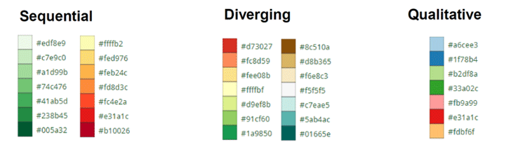
Figure 3
Types of color scales to consider
People can only differentiate confidently up to seven colors.
Figure 2 shows three common types of scales.
- A sequential color scheme should be used when outlining a value from low to high—for example, the sales revenue shown on a regional map with the color indicating the revenue volume for each region.
- A diverging color scheme is normally used to indicate a neutral point and values going in two directions—for example, an actual and budget comparison that shows values above or below the budgeted amount.
- A qualitative color scheme is used to differentiate distinct groups—e.g., sets of different products—for example, the revenue broken down by Product Group by color, with each color representing an individual Product Group.
As part of the overall topic of color, don’t forget about using corporate colors, logos, and styles in your dashboards. It important to use your corporate identity and a dashboard design that follows corporate standards when it comes to its look and feel.
Determining the Correct Chart
Another very important part of the dashboard design is to make sure that you select the correct chart type based on the type of information you are planning to present. An online tool I have found helpful for doing this is the free Chart Chooser tool (
Figure 4). You can find out more about it via this link:
https://labs.juiceanalytics.com/chartchooser/index.html.
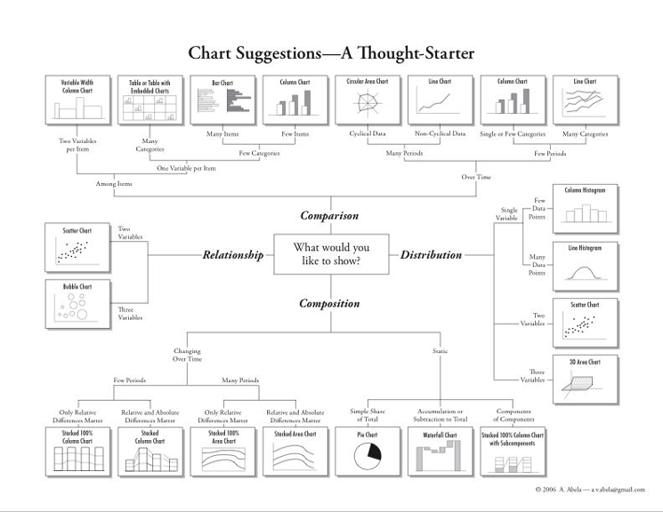
Figure 4
Use the Chart Chooser tool to select which chart is best for your dashboard design
Figure 4 shows the original Chart Chooser options. Each chart has a defined purpose and, depending on what type of information you looking to present, the tool helps you to make the right choice about how to display your data.
In addition to these important dashboard-design aspects, here are some additional tips:
- Ensure that the text and labels in the dashboard are readable. For example, X-Axis labels that are rotated by 90 degrees force users to spend more time reading those labels.
- Put in place some simple, standard rules to follow. For example, always display time-based information on a horizontal axis and non-time based information on a vertical axis.
- Consider adding a personalization option. For example, allow users to save their filter-values’ definitions and drill-down paths so that they can recall those definitions the next time they look at the dashboard. This ability to personalize saves users time and effort.
Designing Mobile Dashboards
Another very important aspect to consider is the mobile consumption of your dashboards. It is safe to assume that your dashboards are going to be displayed on mobile devices as well as on desktops. As a result, you want to ensure that you take into account the following as part of your design approach:
- Clarify if your dashboard should be a responsive dashboard design. This means that the look and feel of the display is changed based on the screen size and orientation. This part of mobile dashboards can have a major impact on the development time of your dashboard, so you should determine this as early as possible.
- Decide the main mobile devices that are going to be used. You should consider the three or four most commonly used devices in regards to screen size. It is not feasible to consider and test all types of screen sizes that your users might use, but you should consider the three or four most common devices used by your audience. Ensure that your dashboard works correctly on those not only from a technical point of view but also from a layout point of view.
- Last but not least, consider components with mobile-gesture support. For example, your dashboard chart should support mobile gestures, such as zoom and pinch navigation, to allow users to zoom in on and expand the chart’s details.
Technical Naming Conventions
In addition to these dashboard-design rules, you should set up technical naming conventions for your dashboard design team to use. Your dashboards will contain several objects, including charts, buttons, text labels, maps, and many other objects, and all of those should follow a clear naming convention. This way, when errors occur or items have to be replaced with updated content, you can quickly identify the relevant objects without searching for them. Set up a standard naming convention for your company to follow, and ensure that everyone is trained on how to use it and is using it correctly.
Dashboard Templates and Reusability
Other important factors of the design process are templates and the aspect of reusability. The ability to re-use specific chart layouts or a specific look and feel of a combo box or a table will lead to repeatable recognition of the design. This, in turn, helps users to easily recognize items and helps you save time during the design process. Consider creating your own library of dashboard templates as well as re-usable layouts as both increase consistency across all your dashboards and increase the overall efficiency on the design.
User Feedback and Documentation
There are two additional elements that should be considered when creating an overall dashboard design: user feedback and documentation. Your users should have the ability to provide you with direct feedback. Direct in this scenario refers to the option to deliver feedback when actually using the dashboard. This can be accomplished by incorporating a simple email option (link) on the dashboard. The second element is to incorporate documentation into the dashboard by offering users a context-aware help functionality. For example, provide a brief description on how the margin is calculated and which costs are considered. You can then make this help description available with a simple click when the user is reviewing a monthly column chart showing the margin broken down by month.
Once you’ve incorporated these useful tips into your dashboard-design process, you will notice an improved design and user experience. The result is that viewers of the dashboard data will be able to consume the presented information better and more quickly as the consistent usage of these rules will help them to more quickly recognize the information.
Tip!
Here is a partial list of some additional resources that I have found helpful for creating better dashboards:
Step 6. Dashboard Roll-Out
With the dashboard design finished, your dashboard is ready to go to the production environment. Here are some items to consider as part of the roll-out phase for your dashboard.
As part of the overall roll-out of your dashboards, you also want to communicate the availability of these new dashboards to all your key stakeholders. As part of this communication, you should include a brief outline of each of your dashboards that provides a quick overview on what type of information is included in the dashboard and what questions are being answered.
You should also review the usage statistics for your dashboards on a regular basis. By this, I don’t mean just your usual usage statistics (e.g., monitoring how many users are using your dashboard per day or week). Instead, go to the next level of detail and monitor specifically which parts of your dashboards are being used, and by whom. For example, your sales management dashboard shows a column chart with the weekly revenue for the last 24 weeks and a second bar chart shows the revenue broken down by product. Your usage statistic should not only show you how many users are viewing your dashboard per day, but also show who is viewing the weekly revenue and the revenue-by-product charts as these details provide you with valuable information.
Last but not least, the roll-out of your dashboard should not be considered the final step of your overall design process. The roll-out of your dashboard simply means that your design is now available to be viewed by a larger audience in the production environment. You should still ask for feedback on a regular basis, which brings up the last aspect of the roll-out step: direct feedback from users.
As part of the earlier discussion, in step 5, I talked about the importance of user feedback. I mention this again in this section because it is so important. At this point, you are rolling out your dashboards into the production landscape to a much larger audience. As a result, there might be requirements at this stage that were not part of the initial design. Because of this, you should make sure that your users have an option to provide you with their feedback directly, in a timely manner. I am also listing feedback this as part of the roll-out phase as it is, from a time point of view, something that becomes more relevant now and also impacts your design.
Step 7. User Training
When it comes to training users, it is very important that you consider the training needs of your team when the project starts. This is because the skillset of your dashboard-design team may need to be increased before the start of the actual design of the dashboards. As part of this, it’s important to not only consider the technical aspects for the training but also to consider data-visualization concepts as part of the team training program. In this way, the technical skillset of the team improves over time, as well as your team’s ability to create highly effective data visualizations.
To ensure that this happens, create a training plan that outlines the required technical and non-technical skills and ensure that these requirements are not ignored over time, as the skillset of your team is a critical part of the success in these data-visualization projects.
At this step, you also should discuss the training of your users, meaning the consumer of your dashboards. If, at this late stage, you still have to train your users on how to use the actual dashboards, then you did not adequately follow the first six steps to achieve your goal of delivering a highly effective dashboard. If you kept your design focus on creating simple and efficient dashboards, at this stage your users should not require extensive end-user training in order to use the new dashboard.
Step 8. Final Documentation
Although I discuss documentation last, this is not really the last step of the process. Documentation is something that should be an on-going process that flows across all these steps, and is relevant for the complete process. When it comes to documentation, consider these three main aspects:
- Document all your deliverables from each step in the process, and document each decision that has been made and each element that has been signed off by your stakeholders. In this way, you will have a complete and detailed documentation project history of your dashboard design.
- Create documentation for the dashboard itself from a technical point of view. By this I mean create a document that lists all the types of charts and other components, such as buttons, tables, stylesheets, listboxes, and so on, that are used as part of the dashboard design, and details how they are used. Such technical documentation helps when you come across issues with the dashboard and you need to find the root cause of those issues.
- Finally, consider providing your users with a context-aware online help as part of the overall dashboard design itself, providing your users background information on the measures and dimensions being used, or calculations being, to just provide two examples where such a context aware help functionality can add value for your users.
Summary
I would hope that after going through all the steps of the process and outlining the details and deliverables of each step you feel confident that you can leverage the process as part of your next project and use the steps outlined in the process to become more efficient and more successful in your next project. A very important aspect is to really incorporate the aspects of Agile and Design Thinking, meaning to review items early and often, to gather feedback from your users early in the process and repeatedly, and to include your stakeholders in a collaborative way so that they feel part of the process and part of the solution—your dashboard.

Ingo Hilgefort
Ingo Hilgefort started his career in 1999 with Seagate Software/Crystal Decisions as a trainer and consultant. He moved to Walldorf for Crystal Decisions at the end of 2000, and worked with the SAP NetWeaver BW development team integrating Crystal Reports with SAP NetWeaver BW. He then relocated to Vancouver in 2004, and worked as a product manager/program manager (in engineering) on the integration of BusinessObjects products with SAP products. Ingo's focus is now on the integration of the SAP BusinessObjects BI suite with SAP landscapes, such as SAP BW and SAP BW on SAP HANA, focusing on end-to-end integration scenarios. In addition to his experience as a product manager and in his engineering roles, Ingo has been involved in architecting and delivering deployments of SAP BusinessObjects software in combination with SAP software for a number of global customers, and has been recognized by the SAP Community as an SAP Mentor for SAP BusinessObjects- and SAP integration-related topics. Currently, Ingo is the Vice President of Product Management and Product Strategy at Visual BI Solutions, working on extensions to SAP’s product offering such as SAP BusinessObjects Design Studio and SAP Lumira. You may follow him on Twitter at
@ihilgefort.
You may contact the author at
Ingo@visualbi.com.
If you have comments about this article or publication, or would like to submit an article idea, please contact the
editor.