Explore critical topics shaping today’s SAP landscape—from digital transformation and cloud migration to cybersecurity and business intelligence. Each topic is curated to provide in-depth insights, best practices, and the latest trends that help SAP professionals lead with confidence.
Discover how SAP strategies and implementations vary across global markets. Our regional content brings localized insights, regulations, and case studies to help you navigate the unique demands of your geography.
Get industry-specific insights into how SAP is transforming sectors like manufacturing, retail, energy, and healthcare. From supply chain optimization to real-time analytics, discover what’s working in your vertical.
Dive into the most talked-about themes shaping the SAP ecosystem right now. From cross-industry innovations to region-spanning initiatives, explore curated collections that spotlight what’s trending and driving transformation across the SAP community.
Review some of the key functions of SAP Visual Intelligence based on its seventh Support Package, all of which make the application ready for you to exploit now. Included are helpful video clips.
Key Concept
SAP Visual Intelligence is designed for business analysts to discover and share insights from their data residing in personal, departmental, or enterprise-owned data sources without involving their IT department. SAP Visual Intelligence is a light-weight desktop application to connect to diverse data sources and merge data across different sources. It allows for cleansing, manipulating, and enriching the data before creating on-the-fly data visualization using a library of chart types. You can create trend analysis and forecasts using its predictive capabilities and share visualizations and resulting datasets with the enterprise and on mobile devices.
SAP Visual Intelligence (known already as VisI by some) is an intuitive self-service BI desktop application that doesn’t require any other SAP components. You may already own a license for this product, if you are a customer of SAP BI Suite and SAP BusinessObjects Business Intelligence, Edge edition, as it is included in many license deals. The setup.exe installs in two minutes on your desktop, and software upgrades can be made out of the application without any S-User logon at SAP Service Marketplace — just how a business user would expect it.
The product permits business analysts to discover trends and anomalies in their data and lets them drill down and filter to identify root causes via a series of on-the-fly data visualizations. Data can be accessed from and merged across diverse data repositories, be they personal flat files, departmental databases, enterprise repositories (e.g., SAP HANA in-memory databases), or SAP BusinessObjects universes.
SAP Visual Intelligence can stand on its own as an application. It doesn’t need project plans, consultant involvement, three-tier system landscapes, hardware orders, server components, costly training, semantic layers, design time, coding, scripting, or to be part of a larger BI implementation project.
SAP Visual Intelligence offers an easy way for SAP HANA users to gain more value from their investment: It allows for visualizing big data and discovering valuable insights in the granularity of the data being replicated from potentially any type of source system into SAP HANA.
Due to the rapid release cycles of SAP Visual Intelligence, a lot of outdated information is in the market. My article represents only a snapshot referring to version 1.0.7 and is very likely to be outdated soon. To keep up to date, refer to the latest release notes for SAP Visual Intelligence, which you can find by logging into the SAP Service Marketplace and clicking Support Package Stacks.
Figure 1 summarizes the capabilities of SAP Visual Intelligence, which follows this general process:
Acquire data from diverse data sources
Cleanse, manipulate, and enrich the data
Visualize the data
Share the resulting visualizations and datasets
Let’s look at these steps in detail.
Note
If you don’t own a license yet for SAP Visual Intelligence, you can download a free, 30-day trial license at www.sap.com/trysapvisualintelligence.
Figure 1
SAP Visual Intelligence solution capabilities map for version 1.0.7
Navigating the User Interface
Figure 2 shows the start screen of SAP Visual Intelligence. On the bottom, you find useful links to learn more about the product. Don’t miss the library of tutorial videos that get you started with the product quickly.
Figure 2
SAP Visual Intelligence start screen
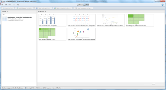
SAP Visual Intelligence saves your work in documents having file extension *.svid. These documents contain all of the visualizations you create from one or more data sources as well as local datasets containing a copy of all data. The navigation pane on the left side of the start screen provides lists of all your documents, data sets, and visualizations and lets you open the respective document via a mouse click. The Samples link in the left pane provides sample datasets and visualizations to learn from. I recommend watching the videos first, then playing with the sample datasets, and you’ll be ready for your first productive use of the product with your own data in your own business context.
From the top level menu, I want to mention Help > Check for New Updates. This kicks off a version update without asking for an S-User logon to SAP Service Marketplace or requiring SAP Download Manager — a rare feature in the SAP world.
To create a new document, click Documents in the left pane and select your first data source as explained in the next section. This brings you into the Prepare activity room as shown in Figure 3. There is also a Share activity room, which I’ll explain later. You can switch between the two rooms by clicking the respective buttons on the center top.
Figure 3
The Prepare activity room
In Prepare, directly below the main menu bar, is a group of buttons to control the data visualization mode (e.g., Data, Split, and Visualize buttons). In that same row on the right is another group of buttons to manage datasets (e.g., Add and Merge buttons). The data visualization mode controls what you see in the center pane (i.e., the data in a grid, facets, visualizations, or split among modes as shown in Figure 3).
In the left pane, you find the Object Picker to populate your visualizations by dragging and dropping data. In the right pane, you find the Manipulation Tools. You can collapse the Object Picker and Manipulation Tools by clicking the small blue arrows and enjoy the full size of your screen with your data. In the visualization pane, which is the lower part of the center pane in Figure 3, you find buttons to save and reset visualizations. Saved visualizations appear as thumbnails on the bottom.
Figure 4 shows the Share activity room. Below the menu bar you find buttons to export datasets to files and publish them to SAP HANA and SAP BusinessObjects Explorer. The Publish to StreamWork button allows you to publish visualizations, datasets, and entire documents to SAP’s on-demand collaboration platform, SAP StreamWork. Finally, there is a button to generate emails to send selected visualizations as *.png files.
Figure 4
The Share activity room
Below these buttons are two areas listing all datasets and visualizations contained in the current document. You need to select them first before you can export, publish, or send them. On the very bottom is the status line for both activity rooms. It shows statistical information of the current dataset.
Watch this video clip from SAP to learn more about the user interface for SAP Visual Intelligence.
Acquiring Data from Diverse Sources
The installation of SAP Visual Intelligence includes a transparent installation of a Sybase IQ database on your desktop. When you are acquiring data, it is loaded from its sources into so-called datasets residing in the local Sybase IQ database. SAP HANA online datasets are excluded here; they only contain connection data and require an online connection to the SAP HANA system. Consequently, SAP HANA datasets allow for read-only access to data residing in SAP HANA and don’t support merging data with other sources in the current release of SAP Visual Intelligence.
For all other data sources, changes to data happen in the local database, not in the sources from which the data originates. All visualizations are also based on the data in the local database. You can always refresh the data in the local database via menu path Data > Refresh Document.
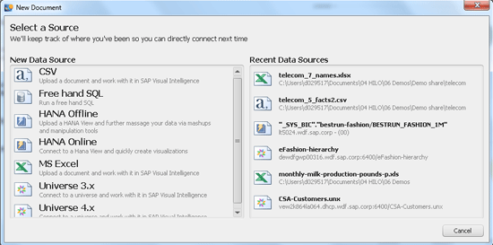
Click the New Document button in Figure 2 to go to the screen shown in Figure 5, which shows the available options for data sources in version 1.0.7 when starting a new document in SAP Visual Intelligence.
Figure 5
A new document always starts with selecting a data source
Let me comment on some of the options for data sources:
Free-hand SQL supports the databases shown in Figure 6. You need to download the respective drivers from the vendor’s Web sites and install them on your desktop. Watch this video clip from SAP to see how to download and install the drivers.
Figure 6
Connectivity to diverse databases is supported, but requires the installation of respective drivers
You can submit SQL statements to select the data you want to acquire.
You can also acquire data from SAP BusinessObjects BI 3.x and 4.x. The following limitations apply in SAP Visual Intelligence version 1.0.7:
No OLAP universes, only relational universes
No relational universes pointing to SAP NetWeaver BW systems
No type UNX universes with multiple source systems or returning multiple row sets
You can add multiple data sources without relation to each other by clicking the Add button shown in the upper right of Figure 3. This creates a new data source, as explained earlier.
Merging Data from Different Sources
You can merge data across two data sources of the same or different types via a key attribute. You start with the target dataset that contains the key attribute as a foreign key and click the Merge button in the upper right of Figure 3.
In the pop-up shown in Figure 7, select the lookup dataset (telecom_7_names.xlsx) and the key attribute in both datasets. You find the key attribute in the window below the Choose Key Column heading (on the left) and below the Choose Matching Column heading (on the right).
In Figure 7, the key attribute is Customer_ID. This operation appends the columns with customer information from the lookup dataset to the target dataset. As a result, you can relate revenue figures with customer data and find out how much of your revenue derives from customers whose contract expires in less than six months, for example. Figure 7 shows Postpaid_Revenue on the left and Contract_Expiration on the right.
Figure 7
Merging data from a lookup dataset into a target dataset via a key attribute
Cleansing and Manipulating Data
Business analysts rarely find the data exactly in the way they need it. Before they start visualizing data, they normally need to tweak it a bit. This includes cleansing, correction of typos, grouping, trimming, adding calculations, and more. SAP Visual Intelligence supports this with a drop-down menu on each column for basic operations, filters, sorts, manipulation tools, and a formula editor.
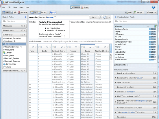
To do this, click the Data button in the top left corner (Figure 3) to display the data view. Now just select one or more columns in the data pane in the center part of the screen shown in Figure 8. The Manipulation Tools area shows the number and distribution of distinct values in the selected column on the top and, further below, the available Column Actions for the selected column.
Figure 8
Manipulation Tools and the formula editor
In the example shown in Figure 8, I select the Device column and have the following Column Actions available: duplicate, rename, split, remove, set text to lowercase or upper case, find and replace, fill, convert type, trim, and group values. For example, Find “” and replace it with “” can be used to cleanse data or correct typing errors within the selected column. If you select multiple columns, you can merge their values and create a new column.
In addition to these operations, you can use the formula editor, which includes many arithmetic functions and strings and Boolean operations. The formula editor shows up in the upper center part of the screen with the heading Formula (Figure 8).
In the example in Figure 8, I select the Device column and want to create a new column. I want the column to contain only the first word in the device name to extract the brand name and omit the model specification. Under the Attributes heading in the left pane, I use the function FirstWord(str, separator). I replace str with Device and the separator by the blank ‘ ’. The result is the new column next to the Device column on the right with name ‘FirstWord(Device)’. Be sure to now rename the column with a user-friendly name.
Enriching Data
Data enrichment is a fancy term for adding more structure to your data. SAP Visual Intelligence currently supports three types of data enrichments:
Semantic enrichments
Time hierarchies
Geographical hierarchies
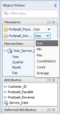
Semantic enrichments turn attributes into measures using the Object Picker. Measures are assigned an aggregation type such as Sum, Min, Max, CountDistinct, Count, or Average. This is how they show up in visualizations. For example, let’s choose Sum for the measure Postpaid_Revenue as shown in Figure 9. Then, that measure is visualized in combination with attributes such as Customer_ID always as the sum of all revenues originating from the same attribute value, as opposed to minimum, maximum, or average value. To learn how to create the visualization in combination with Customer_ID, see the section below, Visualizing Your Data.
Figure 9
The Object Picker includes a list of measures, hierarchies, and attributes
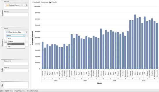
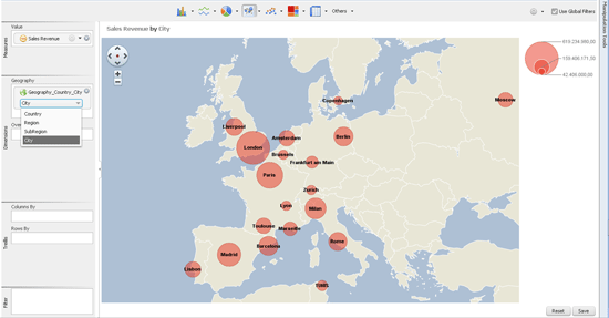
Time and geographical hierarchies are useful if you want to aggregate over or drill down into multiple hierarchy levels in your visualizations — for example, revenue per year, quarter, month, or day (Figure 10), or country, region, sub-region, or city (Figure 11). Original data in a column may be just be a date. With enrichment, additional columns are added to a dataset for year, quarter, month, and day. This permits you to visualize measures per year, and then drill into quarter, month, and day data.
Figure 10
Using time hierarchies, revenue data can be visualized per year, quarter, month, or day
Figure 11
Geographical hierarchies can plot revenue figures as bubbles in maps per country, region, sub-region, or city
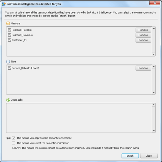
Visual Intelligence also proposes columns for data enrichment. Just click the Show button at the bottom of the Object Picker pane (Figure 3) and a pop-up shows all proposed columns for enrichment (Figure 12). You can remove columns if they are not adequate for enrichment, and then click the Enrich button to enhance the selected columns. In my example, the column Customer_ID may not be needed as a measure, unless you want to count distinct customers. Here’s another case: You may not find all columns in your data source that contain dates suitable for creating time hierarchies; you may need only the column stating the revenue date as a time hierarchy, but not the Last Saved column/
There is no solid science behind which columns should be turned into measures. It all depends on your use case.
Figure 12
The data enrichment wizard automatically detects columns for enrichment
In the case of geographical hierarchies, there is one additional step required to visualize your data in maps. The application verifies the geographical locations in your columns specifying countries, regions, sub-regions, and cities (as available in your data) and checks for ambiguities (e.g., two cities with the same name). It uses geographical reference data that is shipped with SAP Visual Intelligence and currently includes only cities with populations of more than 100,000.
If it can’t find a match of your location name with the reference data, you may need to check and change the spelling of that location name in your data using the Manipulation Tools. It is also possible that your city is too small to be included in the reference data. In such cases, data relating to unknown locations won’t show up in maps. You can resolve this by importing geographical location data from a file having latitude and longitude information of your location names specified.
For the details on using latitude and longitute information for your geographical maps, click this link to watch a tutorial from SAP: https://scn.sap.com/docs/DOC-33118
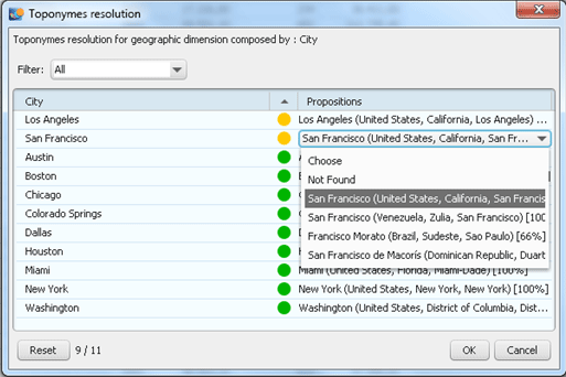
In the case of ambiguities, select the right location from a drop-down list (Figure 13). The system automatically detects ambiguities and shows them. For example, there is more than one San Francisco in the world, and you need to select the one that belongs to your data.
Figure 13
Resolving ambiguities in your location names
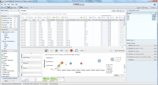
Visualizing Your Data
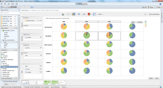
Creating visualizations is easy. You drag and drop measures and attributes from the Object Picker either right into the visualization pane in the center, or into the Chart Feeder next to the Object Picker. You do not need to do anything to activate the Chart Feeder. It is always part of the visualization view. There are four different feeder areas: measures, dimensions, trellises, and filters. Figure 14 shows an example for a trellis by column and by row. The same pie chart is repeated for data from four different years and six different product lines.
Figure 14
A trellis of pie charts
Select the chart type from the drop-down lists on the top of the visualization pane. The number in parentheses refers to number of different variations available for the respective chart type:
Bar charts (four)
Line charts (five)
Pie charts (three)
Geo maps (three)
Scatter plots (three)
Tree and heat maps
Tables
Radar chart
Box plot chart
Waterfall chart
Tag cloud chart
There are many ways to set filters. The easiest way is to multi-select — by using your mouse and pressing the Control button on your keyboard — entire charts in a trellis or data portions for drill down within charts. Then you click the Filter or Exclude button appearing in the upper right corner of the visualization pane (Figure 14). With the Filter button you keep only the selected charts or data portions, while the Exclude button deletes them from the current chart.
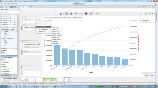
SAP Visual Intelligence can sort and rank the data in charts and add calculations to charts such as running sums, minimum, maximum, counts, averages, and moving averages (Figure 15).
Figure 15
Top 10 selling countries (bars) with a running sum (line)
Predictive Calculations: Trend Analysis and Forecasting
SAP Visual Intelligence supports basic predictive calculations as part of its license. SAP also ships SAP BusinessObjects Predictive Analysis; however, this is a specialized tool for advanced predictive calculations and is licensed separately.
In version 1.0.7, SAP Visual Intelligence comes with the basic predictive capabilities of forecasting and linear regression, a.k.a. trend analysis. The forecasting feature assumes that your data underlies a linear growth process superimposed by seasonal cycles of fixed length. Figure 16 shows the example of historic monthly milk production data in gallons per cow for the period of 1962 to 1975. I assume a linear upwards trend year-over-year and identify a seasonal cycle of 12 months — for example, cows give more milk in the summer.
The forecast needs actual data of at least two full consecutive cycles — the more data you have, the better the forecast gets — and a cycle length as an input parameter. SAP Visual Intelligence plots the forecast function over your actual data as a comparison and predicts one full cycle into the future (the year 1976 in my example). For more details about the forecasting algorithm, please refer to my SCN blog.
Trend analysis plots a straight line (e.g., a linear function f(y) = m x y + c) that fits your actual data best (Figure 16). It needs an extrapolation length (e.g., forecast horizon) as an input parameter. Predictive calculations are available in bar and line charts and work on time hierarchies as the x-axis only.
Figure 16
Historic monthly milk production data (bars), forecast (jagged line), and linear trend (straight line)
Sharing the Results
Sharing of resulting data sets and visualizations occurs in the Share activity room shown in Figure 4. You can share resulting datasets (e.g., datasets with cleansed and manipulated data) with the enterprise in two ways:
Information spaces to SAP BusinessObjects Explorer
Analytical views to SAP HANA, from which you can consume them with BI client tools
Figure 17 shows the milk production data from Figure 16 after publishing it to SAP BusinessObjects Explorer. Only the dataset is published in the current version, but no visualizations are created on top of them. That’s why calculations added in the visualization pane (e.g., running sums, forecasts, trends) don’t show up. Once a dataset is published to Explorer, it can be made accessible on mobile devices with SAP Mobile BI.
Figure 17
Monthly milk production data in SAP BusinessObjects Explorer
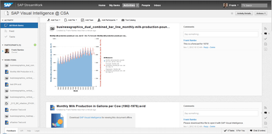
You can also publish data to SAP’s on-demand collaboration platform, SAP StreamWork. This supports datasets, visualizations, and entire documents (Figure 18).
Figure 18
Monthly milk production visualization with a forecast and trend posted to SAP StreamWork
Frank Rambo, PhD
Frank Rambo, PhD, is managing a team within SAP’s Customer Solution Adoption (CSA) organization working with customers in the SAP analytics area with the objective to drive adoption of new, innovative solutions. Prior to this position, he worked eight years for SAP Germany as a senior consultant focusing on SAP security and identity management. Before he joined SAP in 1999, Frank worked as a physicist in an international research team. He lives in Hamburg, Germany.
Review some of the key functions of SAP Visual Intelligence based on its seventh Support Package, all of which make the application ready for you to exploit now. Included are helpful video clips. Key Concept SAP Visual Intelligence is designed for business analysts to discover and share insights from their data residing in personal, departmental,…
Access exclusive SAP insights, expert marketing strategies, and high-value services including research reports, webinars, and buyers' guides, all designed to boost your campaign ROI by up to 50% within the SAP ecosystem.
Always have access to the latest insights with articles, Q&As, whitepapers, webinars, and podcasts. Gain the inside edge. The SAPinsider Weekly helps you stay SAP savvy. Access exclusive bonus materials, discounts, and more.