In this second of a series of three articles about the SAP Predictive Analytics toolset (previously marketed separately as SAP InfiniteInsight and SAP Predictive Analysis), learn about its Expert Analytics functionality. The first article covered the Automated Analytics functionality. This article focuses on how to use this more advanced toolset in the real world to discover hidden process improvements and potential profits.
Key Concept
SAP Predictive Analytics is a rapidly changing toolset used by data analysts to help them do their jobs more efficiently and accurately. With SAP Predictive Analytics, you can analyze such diverse topics as which bridge might collapse first or, as in the example used here, determine what type of customer might buy your products. SAP Predictive Analytics is really two unique experiences, with slightly different target audiences, rolled into one.
SAP Predictive Analytics is now one wrapper around what used to be two distinct tools, SAP InfiniteInsight and SAP Predictive Analysis. SAP Predictive Analytics incorporates SAP InfiniteInsight’s original functionality in its Automated Analytics tool, and the functions of Predictive Analysis are now included in the new Expert Analytics tool.
Automated Analytics Versus Predictive Analytics: Two Paths to a Common Goal
Automated Analytics is a toolset that SAP acquired from KXEN (previously marketed by both KXEN and SAP as InfiniteInsight). Expert Analytics is the SAP toolset that made up what was previously SAP Predictive Analysis.
In the first release, SAP Predictive Analytics 2.0, SAP created one shell that could launch either Automated Analytics or Expert Analytics. This shell allows companies to install just one tool—SAP Predictive Analytics 2.0—and deploy both experiences to use as they see fit. This is just a first step; tighter integration between these tools is planned for future releases, including the latest version, SAP Predictive Analytics 2.3. (Note: For the purposes of this article, I focus on the SAP Predictive Analytics 2.0 version.)
The main difference between these two tools is that the Automated Analytics tool’s graphical user interface (GUI) is more automated, but it offers fewer options. The Expert Analytics tool’s GUI, on the other hand, is less automated, but offers more power and flexibility. Other differences are in the actual algorithms used by each tool. When these tools were in separate products, the algorithms used were significantly different; this is less of an issue now. As of the 2.0 release some of the Automated Analytics’ algorithms can be deployed under the Expert Analytics mode.
What are some of the other differences between Automated Analytics and Expert Analytics? Automated Analytics is more what I call wizard based. It walks you through each screen in the process of data mining (i.e., getting the data, training, applying the model, and storing the results). You click Next and Next again to progress through the process.
The Expert Analytics GUI is less linear. It shows users the five phases in which to work in a typical data-mining project: Acquire Data, Predict Insights, Build Visualizations, Explore Data, and Share with your teammates. The subtasks that you can choose during each of these phases are more flexible than those offered by Automated Analytics.
Figure 1 shows the initial screen for SAP Predictive Analytics 2.0. Let me explain how the newer SAP Predictive Analytics acts as a launcher for the previously separate tools. Under Automated Analytics, if you choose any option (e.g., Modeler, Social, or Recommendation), it brings up what used to be the separately installed SAP InfiniteInsight GUI. In this example, I select the Expert Analytics option, and the GUI for the prior version (SAP Predictive Analysis 1.0) is launched (shown in
Figure 2). So now you have two tools in one. The latter option is the primary subject of this article.
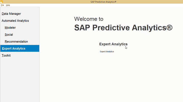
Figure 1
The SAP Predictive Analytics home page with the Automated Analytics and Expert Analytics options

Figure 2
The phases of Expert Analytics
A Real-World Use Case: Predicting Buying Behavior Using Expert Analytics
Before I get the meat of the article, I want to make a general observation. The area of data mining and predictive analysis once was the domain of a few mathematics experts who would work with IT professionals to cobble together data analysis. This is no longer the case, however, as now SAP Predictive Analytics (both the automated and expert modes) enables businesspeople to grow their core business knowledge with easy-to-use statistical algorithms that directly increase profits or reduce costs to solve everyday business problems. In the prior article, I demonstrated how use Automated Analytics with sales and customer attribute data to predict buying behavior. In this article I do the same thing, but this time using the SAP Predictive Analytics Expert Analytics tool.
The Expert Analytics welcome screen opens with the five phases that I mentioned previously (
Figure 2). One neat thing about the SAP Predictive Analytics 2.0 tool is that it has a built-in graphical analysis toolset that allows the display of the input or output data from the analysis algorithms built into the tool. A main part of the graphical display of the toolset currently shares the underlying code of SAP Lumira (for example, the storyboard Board feature). Although SAP Lumira and SAP Predictive Analytics 2.0 (and now 2.3) currently share code, they are separate products and do not contain the same features. This is because the target audience for users of predictive tools is not the same audience that needs to storyboard or dashboard data for management to view.
Next, I show how to get and prepare data to use for your predictions.
Step 1. Acquire and Prepare Data for the Predict Phase
In almost every case, the first step in any data-mining project is to acquire the data. In Expert Analytics, after you click the Acquire Data option (
Figure 2), the system prompts you to choose the source of your data-mining model’s data (
Figure 3). As you can see, the sources of data are vast. For example, as shown on the left side of the screen, one option is SAP HANA views, but other choices include generic Query SQL access to many databases, as well as SAP BusinessObjects Universes (which, in turn, can access data from almost anywhere). In addition, for easy access, any recently used datasets are shown on the right side (in this case, a few comma-separated values (CSV) files and an SAP HANA view).
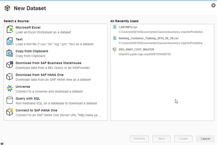
Figure 3
Select a new dataset to acquire data
After choosing the type of source for your data, you need to add the specifics. For example, what Excel XLS file, which SAP HANA view, or what universe is the source of the data to be mined? In this case, I select Text as my source. This action opens the screen in
Figure 4 in which the flat file data formats may be entered. For example, you can identify if the column names are listed in a header row and what kind of delimiter separates the data fields. You then provide the name and location of the dataset and click the Add Files button. The system automatically parses the file and the data at the bottom of the figure appears.

Figure 4
Add files and define the technical attributes for the new dataset
After you click the Create button, the data source is available for use (
Figure 5). You can review the data in the visualization or use it as part of a predictive model (the predict step, step 4, discussed below). If you select the Prepare phase you can improve the source data. In this phase use the icons at the top right of the screen (boxed in red) to join new data to your existing data or calculate new fields based on old ones. In addition, you can hover over a column name in the grid and click the gear icon next to it to filter, hide, rename, and manipulate the source data in a variety of ways as you prepare it to feed the predicting model.
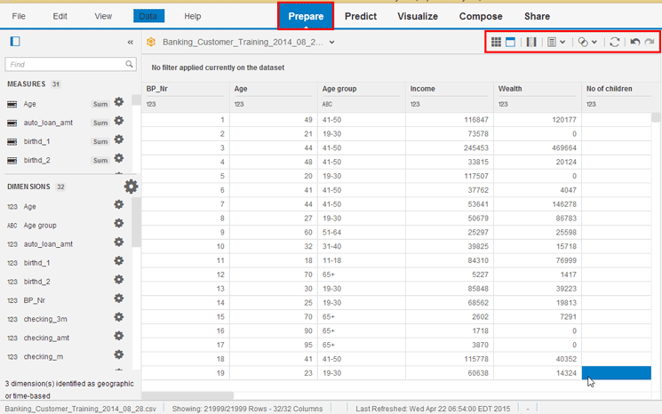
Figure 5
Prepare the data for use
After you have manipulated the data and have it the way you want, the next step is to review and verify it.
Step 2. Review the Data Using Visualizations
To go to the next phase, click the Visualize tab (
Figure 6). This phase is optional, but it is required more often than not before you get to the next logical step. This is because you frequently do not know the data that well at this point, and this knowledge is central later in the predict phase.

Figure 6
Analyze the source data
As mentioned previously you can visualize the data by using built-in tools. Under the Visualize tab in this example, use the plus-sign (+) icons to choose the auto_loan_amt measure for the Y Axis and the Age group attribute for the X Axis. You can then click the line chart visual from the chart types (above the measures) to visualize the data with this option, or pick another chart type in which to display the data (
Figure 6). The options here are numerous. Again, you can use the gear icons to filter data and to toggle to different chart types all in an effort to better understand the source data. Knowing your data is critical for understanding the modeling and the prediction phase results.
Step 3. Generate Prediction Rules
As mentioned in
my related article, most data-mining-related projects have two very technical phases. In the first phase, you need to feed the model data for which you know the outcome of some target variable. In the second phase, you then apply the logic created by the model to predict the target variable with a set of data where you do not know the outcome. With the Expert Analytics tool, these two tasks are done under the Predict tab.
For my scenario, take the data that you prepared above, which includes a churn flag (not shown), to identify customers who left the bank after some number of years. A numeral 1 in a record for the churn flag indicates they left, and a 0 means they are still bank customers. The goal is to apply a classification data-mining algorithm to the data to determine which customer attributes (influencing factors) might influence their decisions to leave the bank. You then apply these influencing factors via the tool to predict which potential new customers might stay with the bank for the long run and should be pursued.
Click the Predict tab, and the initial predict screen (
Figure 7) appears with just the icon representing the banking customer data in the left corner. Now expand the Algorithms node on the right and drag the Auto Classification object from the right to the model design window on the left. There are many more options—for example, if you need to manipulate the data further, you can expand the Data Preparation node on the right side, and maybe use a filter step or have the tool random sample the data using a sample node. However, in this case none of these tasks are needed.

Figure 7
Predict customer outcomes
Next, click the Configure Settings options (on the bottom right of
Figure 7). This action opens the screen in
Figure 8 in which you provide the details the Auto Classification Model requires.
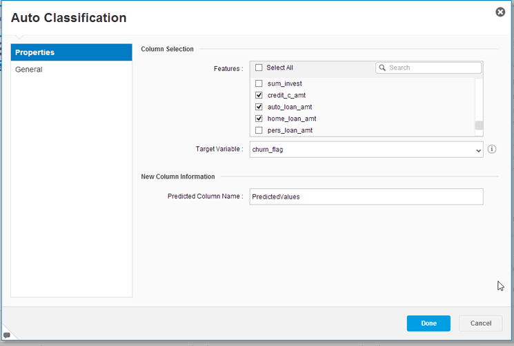
Figure 8
The settings for the Auto Classification model
In
Figure 8 select the Target Variable of churn_flag because this is what you are trying to predict. Also selected are some potential influencing variables that you select from the Column Selection section. These include credi_c_amt, auto_loan_amt, and home_load_amt. Another, more advanced option (not used here), is to allow the Predictive Analytics tool to help you decide which variables have the most influence. In this case, select the Select All check box so that the model runs with each possible influencer. (It is important to note that this option does add to the calculation time, but in this case, I think the extra time is well worth the data that will be mined.) Click the Done button and a screen like the one in
Figure 7 reopens. The options in this screen depend on the model you chose earlier. (To learn more about this phase and the options, you can attend SAP’s Predictive Analytics training classes.)
The next step is to execute the model. Click the play (run) icon at the top of
Figure 7 (the green, right-facing arrow icon boxed in red). The message in the pop-up screen in
Figure 9 shows that the results were successful.

Figure 9
The model is successfully executed
At this point, as the model’s logic has been generated, the next step is to look at the results. Click the OK button in the pop-up in
Figure 9 and the results appear as shown in
Figure 10.
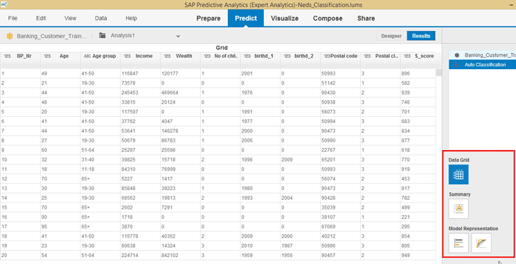
Figure 10
Review the modeling results
Just looking at the raw data contained in the screen in
Figure 10 is not that meaningful. However, by using the icons on the bottom right side of the figure (boxed in red), you can glean important information. If you click the Summary button, for example, the screen on the left of
Figure 11 opens with information related to the robustness and usability of the model.

Figure 11
A summary of the model results
Note
A detailed discussion of robustness and usability is beyond the scope of
this article, but to find out more, you can take the SAP BOII10 Class
or the newest class on Predictive Analytics 2.0 or 2.1. Another option
is to read the documentation about Predictive Analytics 2.0 here:
help.sap.com.
Figure 11
In addition, there is an icon in the Algorithm Summary section—the variable contribution chart icon (not shown in the figure). After you click this icon, a chart results that shows which variable (e.g., age, income, and so on) has the most influence in determining whether a customer would be likely to leave the bank. This helps you filter out variables that take up resources and make the model run more slowly, yet provide very little insight.
Now that the model has been executed, it needs to be saved so that a new analysis can be created using the math generated by the model on unknown data to predict the outcomes. Click the Designer button to return to design mode, select the Auto Classification object, and then click the Save as Model option on the right side of the screen (
Figure 12).
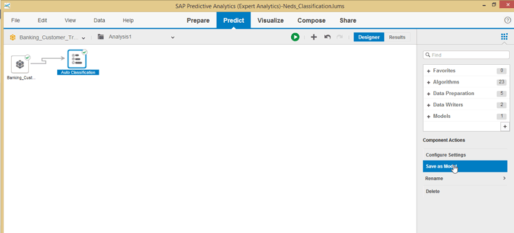
Figure 12
Save the result as a predictive model
In the screen that opens (not shown) provide a name for the model (neds_predict_model) and click the save icon. The new model is then stored in the model section of the tool as shown in
Figure 13.

Figure 13
The model is saved
Step 4. Predict Outcomes for Unknown Data
Now that the predictive model is created, the next step is to apply it. In my scenario, my fake bank purchased customer data from a wholesaler of data. The wholesaler provided information about a variety of banking customers and their banking-related attributes.
To get started, click the Prepare tab to return to the prepare phase and then follow menu path Data > Add (
Figure 14).

Figure 14
Add new data
The system responds exactly as it did in
Figure 3 and asks for the file or table containing the purchased target group data. For my example, you had an .xls file named Unknown churn that contained this data. Follow the same steps that I outlined in step 1 that are shown in
Figure 4 (but with a new file name). Then click the create icon and, armed with the new data source, click the Predict tab (
Figure 15).

Figure 15
Predict unknown churn by customer
The initial view of the Predict tab opens in design mode. It shows only the unknown churn dataset in the top left corner, as this is the starting point of the predictive phase. The next step is to drag the saved model over to the design window (on the left) from Models on the right side. This intermediate result is shown in
Figure 15.
After you select the model object (Neds_predict_model) from the design window on the right of
Figure 15, click the Configure Settings option below it. This action opens the screen in
Figure 16 in which you have to identify the fields from the .xls file for the predict model to consider. This step is necessary because you might have acquired data with a lot of fields, but the previous analysis might have identified some fields that have very little influence or relevance, and now you have the chance to delete them. Here the system also automatically creates a new column called PredictedValues.
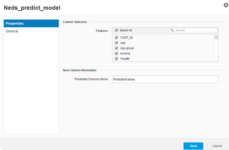
Figure 16
The configuration settings for applying the model and predicting the results
Because this is not a real-world example, for the purposes of this article, assume that the model predicts well. In the real world you should not just accept these results; instead, at this point you would run tests and pilot projects to verify that the predictions help you in some way make more money or otherwise improve processes. In this demonstration, click the Done button (shown in
Figure 16).
In this case, let’s skip the testing phase. The next step is to store the results with the new prediction. Expand File Writers on the right, select the CSV Writer option, and connect it to the model by moving it to the left side of the screen (
Figure 17). Then select the CSV Writer node object and click Configure Settings in the bottom right.

Figure 17
Add a CSV file output option to the model results
In the next screen (
Figure 18), supply a name for your file that will ultimately contain your predictive churn information for the customer data that you purchased. Because you used the CSV writer as your final node, your file was written to your PC (or network drive). If you used the JDBC driver, you could have stored the file as a table in a database, such as SAP HANA.

Figure 18
Prediction results of the CSV file options
Click the Done button in
Figure 18 and you’re returned to the screen shown in
Figure 17. Here you select the Designer tab, and click the play (run) icon to execute the prediction and save the results into the file that was defined in
Figure 18.
After successful execution, the system opens a screen with a results view of the Predict tab (
Figure 19). In this screen you can see how the model has predicted the behavior of the purchased customer data. Looking at the details of the results (column 3), you can see that customers 9223, 9226, 9229, 9233, and 9237 are predicted to be customers that might not churn. So if you can convince them to sign on as customers of the fake bank, you might have them as customers for a long time.
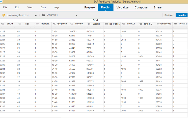
Figure 19
Prediction results (column 3)
Now that you have the results, you can further use the toolset to visualize the data and compose graphical storyboards describing the analysis you made, and then share them with colleagues.
Ned Falk
Ned Falk is a senior education consultant at SAP. In prior positions, he implemented many ERP solutions, including SAP R/3. While at SAP, he initially focused on logistics. Now he focuses on SAP HANA, SAP BW (formerly SAP NetWeaver BW), SAP CRM, and the integration of SAP BW and SAP BusinessObjects tools. You can meet him in person when he teaches SAP HANA, SAP BW, or SAP CRM classes from the Atlanta SAP office, or in a virtual training class over the web. If you need an SAP education plan for SAP HANA, SAP BW, BusinessObjects, or SAP CRM, you may contact Ned via email.
You may contact the author at
ned.falk@sap.com.
If you have comments about this article or publication, or would like to submit an article idea, please contact the
editor.