Learn how a Fortune 500 company leveraged the visualization and ad hoc analytical capabilities of SAP Lumira to get a holistic view of its Accounts Receivable (A/R) and plan for effective remedial action to shorten the receivables cycle.
Key Concept
SAP Lumira takes SAP BusinessObjects Business Intelligence (BI) self-service to a different level by making it easy for businesses to extract, prepare, and present data to business users in a highly visual manner, thereby helping accelerate analysis, trend-spotting, and, ultimately, speedy decision making.
Company XYZ, a Fortune 500 global manufacturing company, has long been plagued by poor collection of accounts receivable (A/R). In other words, XYZ regularly has large open A/R balances. This situation is called aging in financial accounting jargon and over time leads to understatement of income.
To analyze the data, my company recommended to XYZ that it take a manageable subset of receivables data from the vendor receivables table (BSID) of the production instance of the SAP ERP Central Component (ECC) 6.0 system. For the purposes of the prototype, it made the most sense to download the data dump to Microsoft Excel. Depending on the selection criteria you have used, you might end up with a large volume of data containing millions of rows. Because you know your data best and since this is a proof of concept (POC), you may want to limit it to one or two fiscal years or one or two company codes.
Now that the data is downloaded, I want to make sure that sensitive information is masked (in this case the customer name). For the actual customer POC, I keep it intact because analyzing by customer is one of the key criteria.
Data Preparation
Because this is a prototype, it’s a good idea to reduce the complexity and noise that is normally generated when you are working with a large volume of data. My experience with such POCs is that development teams often forget the overarching goal for a POC—prove out the possibilities. In the case of this POC, I decided to limit it to 1,000 records (e.g., 1,000 open [line] items). To make the visualization meaningful, I decided to level the playing field by identifying line items with the same payment term. I settled for N15, which, as the name suggests, means that the net due is within 15 days of the baseline date (and there are no discounts for early payments).
Step 1. Launch SAP Lumira
If you have installed SAP Lumira on your desktop, you can launch it directly. Look for the launch icon  and double-click it. After you launch SAP Lumira, you are taken to the home page. Because SAP Lumira is a rapidly evolving product, the home page may look different from the one shown in Figure 1.

Figure 1
The SAP Lumira home page
Step 2. Extract Data from a Spreadsheet into SAP Lumira
Your next activity is to extract data from the source and move it to the target. In this case, the source is the Excel spreadsheet, and the target is SAP Lumira. To extract the data from the source, click File in the main menu of Figure 1 and then click New in the list of options in the sub-menu. You now can select the type of data you want to extract from the screen shown in Figure 2.

Figure 2
Add a new dataset to SAP Lumira
Because the data resides in a Microsoft Excel spreadsheet, select the first option and click Next. This action enables you to select a file from your local drive (Figure 3).

Figure 3
Select your dataset
In the File(s) field of Figure 3, enter a descriptive name for the dataset (I blanked out the file name to hide sensitive information). You see the entire path in this field. Notice that SAP Lumira pulls in all the metadata as well as the entire dataset. This extract has a lot of columns (387 to be precise), and you can get this information by clicking the Show record count link on the right.
After you click this link, you receive a warning message about the large number of columns. A good practice is to deselect all the fields that are not relevant to the analysis. If you look at the BSID table in your ERP system, you notice that, other than about 15 fields, the rest are of little value to you for the type of visual analysis you wish to do. Note also that at this time I have not shown the records in Figure 3, but only the column names. (The screen in Figure 3 displays numerous records. Therefore, I used a truncated version of this screen for Figure 3.) Keep in mind these two points:
- If the first row of your dataset consists of column names, keep the Set first row as column names check box selected. Otherwise, this column is considered part of the data and affects your visualization.
- Give your dataset a meaningful name; you don’t need to stick to the default.
After you select your fields (e.g., Customer ID, Amount, City, Local currency), click the Create button (not shown) at the bottom of the screen in Figure 3. You are now in the Prepare tab of SAP Lumira. For this prototype, there isn’t anything I would recommend you do on this view, so you can click another tab (e.g., Visualize).
Step 3. Customize and Fine-Tune the Data
The data you have imported into SAP Lumira is now available for visualization. Before you do that, there is one small thing to do—your metadata (e.g., the column names) is available for you. You need to do some dragging and dropping of fields (i.e., dimensions and measures) from the left panel to your canvas on the right. Note also that SAP Lumira is smart enough to recognize which of these fields are attributes and which are numeric (key figures). This is shown in Figure 4.

Figure 4
Prepare for visualization
Notice that some of the field names sound technical and are abbreviated. As a business user, you would probably prefer to analyze data based on field names that correspond closely to the way you transact business. Some cleaning up can be done. It’s very easy in SAP Lumira. Let’s take the Crcy (3) field (Figure 4) as an example. You may want to remove it completely from your visualization since you already have a local currency field. Highlight the field and click the options icon  . From the context menu that opens, click Remove… (Figure 5). If you want to rename a field rather than delete it, click Rename… and enter the new name.

Figure 5
Remove a superfluous dimension
Note
A question I was asked by a few clients the first time I showed them the screen shown in Figure 5 is, “Why do the field names appear the way they do?” The answer may be obvious to a technical person, but business users may not know that SAP Lumira inherits these standard field names from the original description from the spreadsheet to which that data was downloaded, and this data, in turn, came from the standard SAP table BSID. SAP Lumira enables you to customize these names to meet your specific needs.
Now that you are familiar with the context menu, you can do the other clean-ups. In my case, I renamed a few fields and deleted some superfluous ones. This helped me put a better context to the data. For example, if PostalCode sounds like an odd term to you, then you can rename it; I like to use Zip Code. Figure 6 displays the customized and cleaned-up list of dimensions.
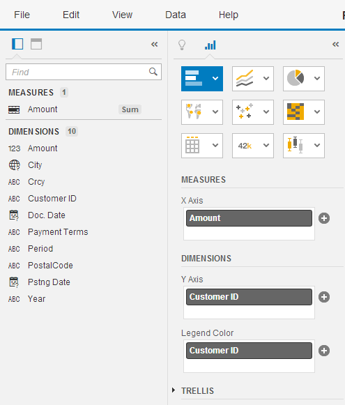
Figure 6
Dimensions after customizing and clean-up
Step 4. Configure Settings for Basic Visualization
SAP Lumira organizes all the attributes and puts them in the Dimensions bucket and puts all the numeric fields into the Measures bucket. I have used customer IDs intentionally instead of customer names in order to mask sensitive data. In the actual POC, I used customer names—that’s obviously a much more efficient analytical technique.
You want to drag at least one dimension to the X axis and one measure to the Y axis. Because the primary purpose of this dashboard is to analyze open A/R balances per customer, all you need to do is click the + icon and select the respective fields. SAP Lumira is smart enough to dump the dimensions and the measures in the appropriate axes based on the graph type selected. Because there are many different graph types that are available, it is up to you which ones you want to select; simply click whichever type you want. You can use SAP Lumira for experimenting. Because this analysis is essentially two-dimensional, I go with the default (bar chart). Figure 7 displays the visual that is generated. With one glance you can tell which two of your customers are the biggest laggards, and you can take immediate action. (When you mouse over a particular bar, the tool-tip text displays the actual balance.)

Figure 7
Dashboard displaying balances by customer ID
From this stage onward, you can let your creative genie out of the bottle (or make full use of your drag-and-drop and clicking skills, to be precise). Another query I like to do is open balances by year and period. It’s very simple. Because a pie chart may be a better visualization vehicle for this, I click the pie chart icon (Figure 6) and select the year and period as Dimensions and the amounts to be the pie sectors. The graphic shown in Figure 8 is generated.

Figure 8
Pie chart displaying outstanding amounts by year and period
With this kind of visual at your disposal, you can make some immediate conclusions. Period 10 of 2014 has the largest outstanding balance. The next logical step for you would be to do some more analysis. On the right corner of the screen in Figure 8, you see a bunch of icons. As you mouse over, the purposes of each are displayed. In this case, the first two are relevant. You can click the first icon (the up and down arrows) to sort by dimensions and click the second (rank) icon  to add or edit a ranking by measure. Both of them are fairly intuitive. The other recognizable icon is on the left and a little lower on the screen—it is the filter icon. The filter icon enables you to filter your results on a dimension of your choice.
Now suppose you want to add the customer dimension to your pie chart to analyze which of your customers had the highest outstanding balances during a certain period of a particular year. In this case, all you need to do is to click the + icon under Dimensions in Figure 8 and select the Customer ID dimension to be added. A new pie chart is generated, and as you mouse over this chart, you immediately know that customer 1976177 was the biggest violator in period 10 of 2014 with an outstanding balance of approximately $166,000. This is shown in Figure 9.

Figure 9
Pie chart enhanced with a customer ID dimension
You may now want to do some standard ranking of amounts by your current dimensions (i.e., year, period, and customer ID). Click the rank icon. You are then presented with options for ranking. I go with the top five as shown in Figure 10.
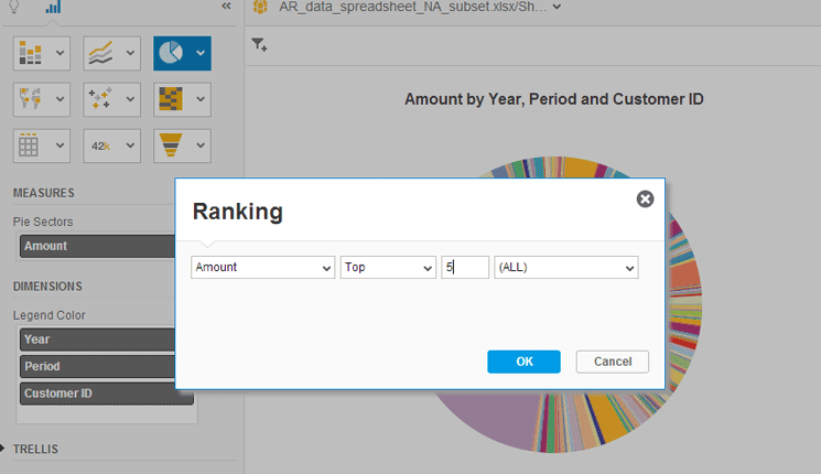
Figure 10
Create a ranked list of top amounts outstanding
Because Amount is the only measure, there’s nothing to change in that field, and because, in my example, you are interested in all the DIMENSIONS, leave the default (ALL) selected. After you click the OK button, the pie chart shown in Figure 11 is generated.

Figure 11
Pie chart display of the top five amounts with a combination of dimensions
You can see the legend explaining the top five segments of the pie chart conveniently placed on the right of the dashboard. When you mouse over your pie chart, you can see the amounts, or if you do not mind the clutter, you can set the display in the settings to Show Data Labels.
Step 5. Configure Settings for Advanced Visualization
Now I take my analysis a level deeper. One of the key requirements for this proof of concept is the ability to visualize the aging aspects (which in non-FI terms equates to how long an invoice has been unpaid since its due date). XYZ’s finance department is interested in strategic trends in aging rather than a line-item-level analysis. For the latter, there are voluminous ABAP reports that are generated out of the ECC system (which is the financial system of record). SAP Lumira helps spot strategic trends or the worst defaulters.
In your extracted data, you have both the posting date and the document date. Therefore, create a new calculated dimension in SAP Lumira for aging in terms of number of days elapsed between the current date and the posting date.
Now go back to the Visualize tab in SAP Lumira in Figure 9, place your cursor in the Posting Date field, and click the options icon. In the context menu, click the Create Calculated Dimension… option as shown in Figure 12.
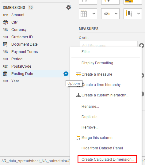
Figure 12
Create a new calculated dimension
After you click this option, a screen appears in which you can use a variety of functions and operators that you then assign to your calculated dimension (Figure 13).

Figure 13
Assign a formula to a calculated dimension
For those of you who do analysis using some type of software package, such a screen looks very familiar and self-explanatory. For those of you who are new, here are steps you need to carry out:
- In the Dimension Name field, enter a name for your calculated dimension.
- Scroll up or down the Functions panel to identify the functions you want to use. In my example, you need the CurrentDate() function. Double-click it and it appears in the Formula calculation panel.
- Add the necessary operator using your keyboard. Click the OK button.
Your calculated dimension is now added to the dimensions list. You still need to complete a couple of steps. Aging is not really a dimension, but a measure. However, you cannot create a calculated measure directly off dimensions. Therefore, you have to perform a workaround by first creating aging as a dimension and then making it a measure. Position your cursor on this new calculated dimension and click the options icon to open the context menu as shown in Figure 14.
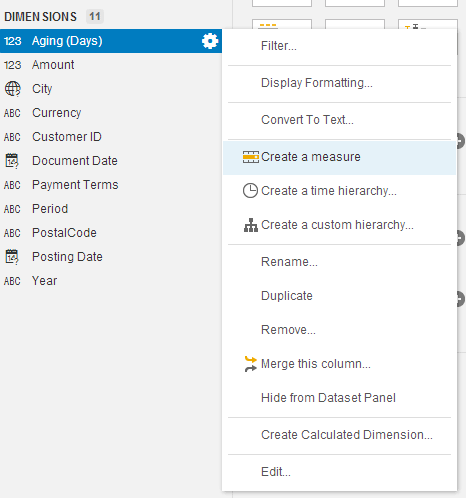
Figure 14
Clone a calculated measure from a calculated dimension
After you click the Create a measure option, a clone of your calculated dimension is created, but as a numeric entity or a measure (Figure 15).

Figure 15
Assign aggregation levels for a measure
Note
One major advantage you have with a calculated measure is the ability to select the type of aggregation. This is often a key component of analysis. Because calculated dimensions are considered attributes, you cannot do any aggregation. Note also that SAP Lumira does internal date conversions, so when you created the formula for aging, you really did not have to worry about converting the posting date and current date to a similar format. In traditional reporting (e.g., ABAP or SAP BW), a lot of time is expended by developers in converting from one format to another.
You are now ready to use your new calculated measure for visualization and analysis. Do not delete the original calculated dimension for aging—if you remove it, you also lose the calculated measure for aging.
The flexibility of SAP Lumira allows you to experiment and learn by trial and error. In a more traditional and rigid application, such experiments cannot be done on the fly and making changes would be time-consuming. For example, if you want to use aging as a dimension instead as a measure, and display elapsed days exactly as they are, select Aging (Days) from your list of dimensions instead of measures. This time, use a line chart and select measures (Amount) and dimensions (Aging (Days) and Customer ID) as shown in Figure 16.

Figure 16
Aging analysis by days and customer
You can see the aging range as well as the various trends. You also see at first glance that there are a few customers that have invoices that have aged for a combined 1,550+ days. You also see one big cumulative amount outstanding ($165,000) for customer 1976177 for a cumulative 265 days.
Anurag Barua
Anurag Barua is an independent SAP advisor. He has 23 years of experience in conceiving, designing, managing, and implementing complex software solutions, including more than 17 years of experience with SAP applications. He has been associated with several SAP implementations in various capacities. His core SAP competencies include FI and Controlling FI/CO, logistics, SAP BW, SAP BusinessObjects, Enterprise Performance Management, SAP Solution Manager, Governance, Risk, and Compliance (GRC), and project management. He is a frequent speaker at SAPinsider conferences and contributes to several publications. He holds a BS in computer science and an MBA in finance. He is a PMI-certified PMP, a Certified Scrum Master (CSM), and is ITIL V3F certified.
You may contact the author at Anurag.barua@gmail.com.
If you have comments about this article or publication, or would like to submit an article idea, please contact the editor.