Learn how to construct a new story in SAP Lumira Cloud based on an existing dataset and existing visualizations. Also learn how to modify the page settings for the story, and how to add both static and dynamic text to the story.
Key Concept
SAP Lumira Cloud, an end-user application within SAP BusinessObjects 4.1, provides enhanced data visualization and discovery capabilities. A major new feature of SAP Lumira Cloud is stories, which are groupings of visualizations that provide a way of connecting information in visualizations to one another. Stories are useful for analysis of visualizations and for sharing insights. Stories provide additional analytics capability over visualizations and allow for additional collaboration among users of the system.
SAP Lumira Cloud, part of the SAP BusinessObjects 4.1 application suite, offers data visualization and discovery capabilities. Fundamentally, SAP Lumira Cloud is a self-service user application that allows organizational analysts and decision makers to access, transform, explore, and visualize data in a highly-intuitive format.
Note
Click the following link to access a downloadable PDF version of slides from this webcast about BusinessObjects: “
A Sneak Preview of SAP’s BI Product Strategy and Roadmap.”
The SAP speakers focused mostly on BusinessObjects 4.1 Support Package 6
improvements (slide 30) but did mention that 4.2 is coming (slide 31).
The main themes were continuous improvement and simplification.
Stories in SAP Lumira Cloud bring additional impact to the data and individual visualizations. Stories allow for guided flow through connected visualizations and enhance the conclusions that can be inferred from the visualizations. Individually visualization provides some understanding of the data. However, connected within a story, multiple visualizations can provide a greater amount of understanding, can provide additional insight and impact, and can elaborate on points that may otherwise be overlooked.
Following these step-by-step instructions, you’ll learn how to compose a story in SAP Lumira Cloud based on an existing dataset and existing visualizations. In addition, I show how to modify the page settings for the story and how to add both static and dynamic text to the story.
Compose a Story in SAP Lumira Cloud
In this section, I demonstrate how to compose a story within SAP Lumira Cloud from existing visualizations. The first step in composing a story is to log on to SAP Lumira Cloud and click Visualization from the list of visualizations and datasets.
In this example, I click My Items in Figure 1, and then the efashion-Demo v1.0 Visualization from the My Items list. (SAP Lumira may be found on the Internet at: https://cloud.saplumira.com.)
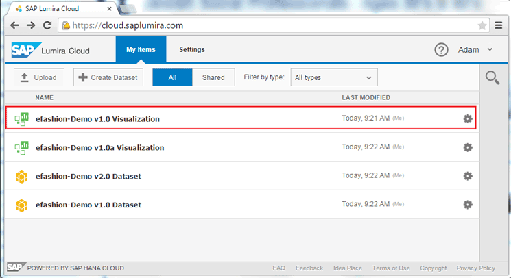
Figure 1
Open an existing dataset from My Items
In the screen that opens (Figure 2), click the Edit link at the top of the screen to edit the visualization.
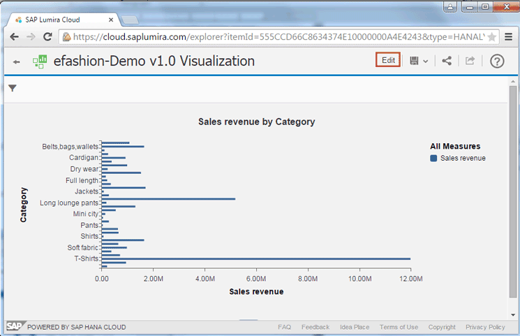
Figure 2
Edit the visualization
In the next screen (Figure 3) click Compose at the top of the screen to switch to the Compose workspace.
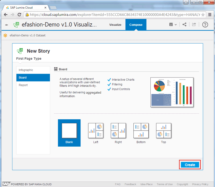
Figure 3
Open the Compose workspace
When creating the new story, the user can choose from a number of story types: infographic, board, and report. Infographics are visually compelling composites of shapes, images, pictograms, and colors used to convey a narrative message. Boards are a setup of several different visualizations with user-defined filters and high interactivity used for delivering aggregated information. Reports allow for different types of visualizations to be consumed and presented in a conventional format.
Each of the three story types also has a number of layout options, shown in Table 1.
| Story types
|
Layout options
|
| Infographic |
Blank
Standard
Overview
Detailed |
| Board |
Blank
Left
Right
Bottom
Top |
| Report |
Blank |
Table 1
Story types with layout options
Once you choose the story type and layout options, click the Create button in the bottom right of the screen (in Figure 3). In this example, I chose the board story type and the blank layout option. Then click the Create button and a blank story screen appears (Figure 4).
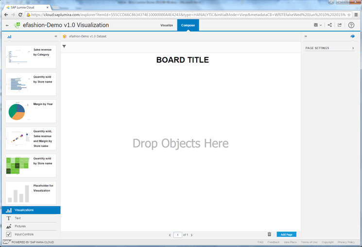
Figure 4
Open a blank story screen
In this next step, I want the fourth and then the fifth visualization thumbmarks on the left side to appear on the right, next to each other. So I drag-and-drop them to the right screen. Having the visualizations located next to each other within the story provides a good way of showing—and highlighting—data relationships. Then click each respective visualization thumbnail and drag it to the story creation zone, one at a time (Figure 5).
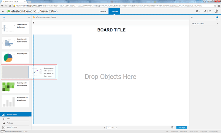
Figure 5
Drag and drop the visualization to the story creation zone
Once the visualizations have been moved to the story creation zone, the story now appears with two visualizations side by side (Figure 6).

Figure 6
Story screen with side-by-side visualizations
Next I want to filter the data in the story for the year 2006. This is done by adding the Year dimension as an input control to the story and then selecting the 2006 option. To view available input controls, click the Input Controls option on the left side navigation (Figure 7). The dimensions included in the visualization appear in the middle of the left side navigation. In this case Category, Lines, SKU Desc, Store Name, and Year appear and are now available as input controls (Figure 8).
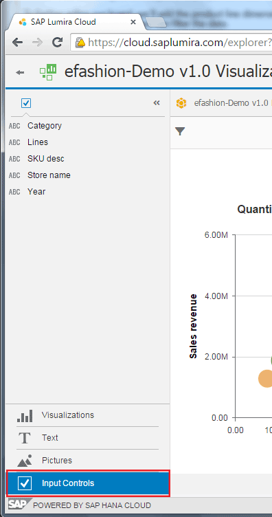
Figure 7
Open Input Controls to view the available dimensions
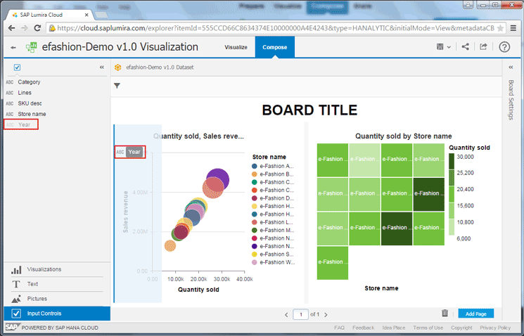
Figure 8
Drag-and-drop Year to the story creation zone
Click the dimension Year on the left of the figure and drag-and-drop it to the story creation zone on the right.
Now the dimension Year shows within the story creation zone with all the available years listed and with selection check boxes on the left of each. In this case, the years 2004, 2005, and 2006 are available for selection (Figure 9). Select the check box for the year 2006. At the top of the screen, Year now shows as a filter with the option 2006, and all the visualizations within the story will be filtered to only include data for the year 2006.

Figure 9
Select year 2006 to filter all visualizations for the year 2006
Update the Page Settings for the Story
It is also possible to modify presentation options for the story. In this section I show how to update the story’s title and turn the title on and off.
Let’s start by changing the title to something more relevant. Click the BOARD TITLE text in Figure 9 and change it to Store Product Sales (Figure 10).

Figure 10
Update the story title
Next, let’s modify some of the page settings for the current story. To view the current page setting options, click the chevron icon  on the right side (above Board Settings) to expand the page settings tab (Figure 11).
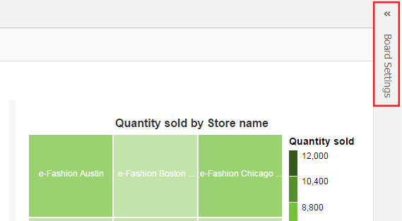
Figure 11
Expand the page settings tab
The page settings tab opens (Figure 12) where you can update the settings for the story. In this example, let’s change the Show Title toggling setting so that the title is no longer visible. Simply check the check box to the left of Show Title, and the title no longer appears on the screen (Figure 13).
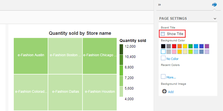
Figure 12
Hide the story title
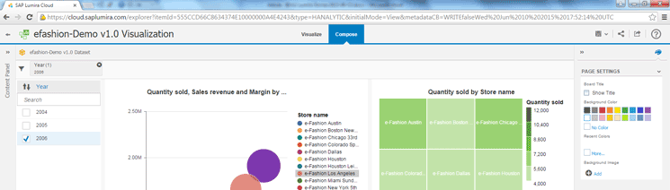
Figure 13
The title is not visible in the story
Next, let’s change the background color of the story, in this case, from white to light gray. Under the Background Color section, click the light gray square (Figure 14). Immediately the background color of the page is updated to light gray.
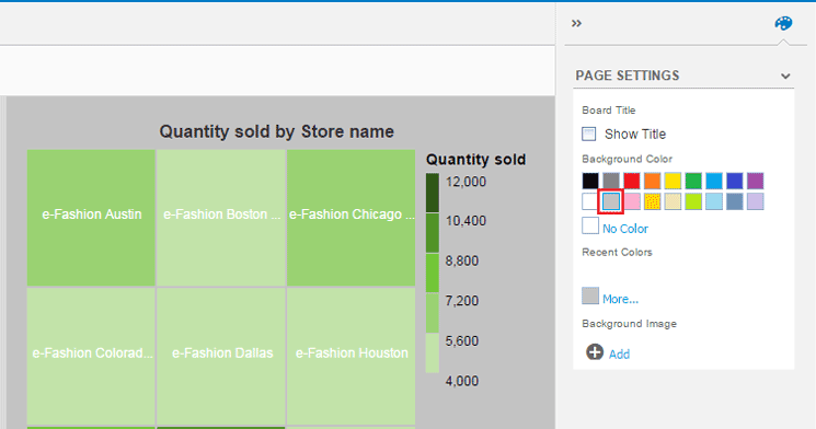
Figure 14
Change the background color to light gray
Add Static and Dynamic Text to Stories
To help describe the visualizations or provide more details to the story that cannot be shown within a visualization graphic, you can add text to a story. The text can be either static (i.e., never changes) or dynamic (i.e., the text changes when the data within the story is refreshed).
To add either, click the Text option on the left side (Figure 15) to view the text controls that can be included in the story (i.e., simple text, title, and note, on the top left of the figure).

Figure 15
View the available text control options
All three types of text controls act in the same manner, but have a different default font size and font type. The default font sizes and types for the different texts are listed in Table 2.
| Text control
|
Default font
|
Default font size
|
Default font type |
| Simple text |
Arial |
13 |
Normal |
| Title |
Arial |
32 |
Bold |
| Note |
Arial |
16 |
Bold |
Table 2
Default font, font size, and type for each text control
In this example, I want to add a note to the visualization. Simply drag and drop the Note option from the left over to the story creation area underneath the existing chart visualization on the right (Figure 16).

Figure 16
Add a Note option to the story creation zone
Once you drop the Note option in the story creation zone, the new Note text control appears underneath the visualization graphic (Figure 17).
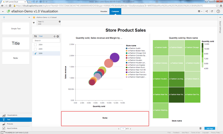
Figure 17
Add the text control Note to the story creation zone
Click the default text within the text control (i.e., the word Note) to update the text. In this case, I am updating the text to read Charts display Sales Revenue, Quantity Sold, and Margin by Store Name (Figure 18). This is an example of static text as the text always stays the same.
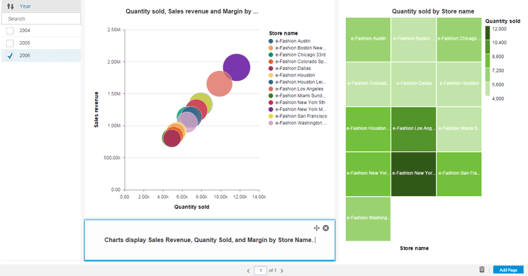
Figure 18
Update text within the Note box
To finish adding the static text, click the text box to expand the text properties on the right side (Figure 19). Using these settings, you can update and modify the text properties in a variety of ways.
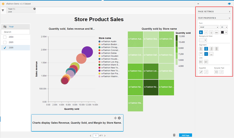
Figure 19
View text properties
The available text properties that can be modified are listed in Table 3.
| Text property
|
Text options
|
| Font |
Arial, Courier, Georgia, Times New Roman, Trebuchet MS, and Verdana |
| Size |
10pt, 13pt, 16pt, 18pt, 24pt, 32pt, and 48pt |
| Type |
Bold, Italic, Underline, and Strikethrough |
| Color |
Black, Gray, Light Gray, Red, Light Red, Orange, Light Orange, Light Yellow, Green, Light Green, Blue, Light Blue, Purple, and Violet |
| Alignment |
Left, Right, Center, Justified, Top, Bottom, and Middle |
| Lists |
Numbered List and Bulleted List |
| Hyperlink |
Add/Edit Hyperlink and Remove Hyperlink |
| Dynamic text |
Add/Edit Dynamic Text and Remove Dynamic Text |
Table 3
List of text properties available for modification
Next, let’s modify the existing text control to include dynamic text. Dynamic text is updated every time data is refreshed. In this example, I add a formula that adds the current date (in the format MM/DD/YYYY) to the existing text. On the right, under the TEXT PROPERTIES section, click the add/edit Dynamic Text icon  (Figure 20).
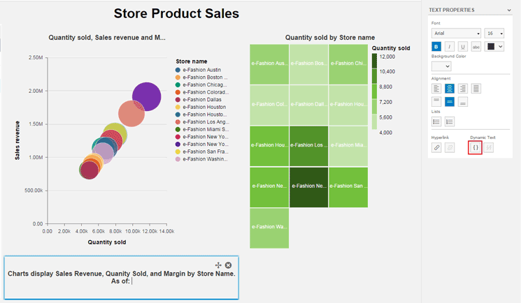
Figure 20
Add dynamic text
Once you click the icon, a new Edit Formula page appears (Figures 21). Here you enter a name for the new formula in the Formula Name field and type the formula in the Formula box. In this case, it is CurrentDate Formula and Month(CurrentDate()) = “/” +Dat(CurrentDate()), respectively (Figure 21). Within the formula, the plus sign (+) must be used to concatenate strings, and literal strings should be enclosed in double quotes (“ ”).

Figure 2
Edit the formula for the dynamic text field
At the bottom of the Edit Formula screen, there are three columns that assist in creating the formula: Measure Name, Functions, and Help. The details for each are shown in Table 4.
| Formula column
|
Description |
| Measure Name |
This is the list of available measures in the dataset used by the current story. Each of these measures can be added to a formula. |
| Functions |
This is the list of available functions that can be used to modify the formula. |
| Help |
This is the list of available functions that can be used to modify the formula. |
Table 4
Descriptions of formula columns
Once you’ve made your entries in Figure 21, click the OK button and control is returned to the story with the calculated formula being added within the text control (Figure 22).
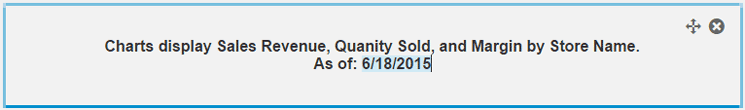
Figure 22
Updated text control with dynamic text included
Now the story includes two graphic visualizations: an input control that filters all of the data for the year 2006, and a text control with dynamic text included (Figure 23).
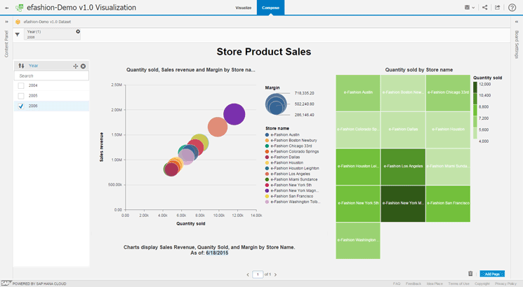
Figure 23
The completed story with visualizations, an input control, and dynamic text
Adam Getz
Adam Getz currently serves as a Manager, Business Intelligence for CGI Federal. In this position, he is leading a large business intelligence and data warehousing implementation for a federal client. He is a thought leader in the field of information technology and an expert in the deployment of leading business intelligence, database management, and data integration products. He has presented at a variety of local, national, and international events, including the 2006 BusinessObjects International Conference, 2007 Oracle BIWA Summit, 2008 Oracle Open World, and 2010 and 2011 ASUG SAP BusinessObjects User Conferences. In addition, Adam is the creator and main author of
bi-insider.com, a website, portfolio, and blog that provides rich technical and functional content to business intelligence and data warehousing professionals. He has also published numerous technology white papers that have focused on various topics within business intelligence and data warehousing. Adam currently serves as the chairperson of the Washington DC Business Objects User Group.
You may contact the author at
adagetz@yahoo.com.
If you have comments about this article or publication, or would like to submit an article idea, please contact the
editor.