Ameya Pimpalgaonkar shows how to design responsive SAPUI5 or SAP Fiori applications. SAP Fiori uses the SAPUI5 framework and therefore all responsive design techniques used in SAPUI5 can also be used while developing custom SAP Fiori applications.
Key Concept
Responsive Design is an approach that enables you to develop Web sites or applications independent of device size, resolution, and platform. It enables you to develop your Web page or application once and run it on devices of all types. SAP Fiori is a collection of usable and responsive enterprise applications developed especially for new age devices such as tablets, smart phones, and mobiles.
The longer you work with modern mobile applications, Web sites, and user interfaces (UIs), the more you realize the importance of the user experience. A lot has changed in development paradigms, design, and browser preferences. The recent growth of smart phones and mobile devices connected to enterprise systems marks the peak of this change.
Usability and user experience have been around a long time, but their scope was limited mainly to Web applications and Web sites. It is only recently that mobile application developers and enterprise software manufacturers such as SAP have recognized their importance and started investing in developing usable applications that provide a superior user experience. It is high time that we SAP developers understand the fundamentals of usability and the user experience, and strive to enhance the SAP application user experience.
I explain the fundamental principles of usability, user experience, and responsive design in the context of SAP. Understanding these concepts is imperative if you are working or going to work in SAPUI5 or SAP Fiori. I also discuss ways to design a responsive application, be it an SAPUI5 application or a custom SAP Fiori application. In this process, I spend time on the pillars of responsive design, such as viewport property, adaptive Cascading Style Sheets (CSS), and images. Remember, this is all going to be part of your SAPUI5 and SAP Fiori applications in some way.
Write Only Once
Gone are the days when you had to maintain platform-specific native applications. In fact, the trend is even slowly moving away from developing separate applications for desktop and mobile devices thanks to responsive design. With more applications adopting responsive design, the write-only-once approach is becoming popular. A lot of Web sites and mobile application developers already use this methodology to reduce overhead maintenance costs and provide an enhanced user experience. In short, this means write your application only once, and write it so that no matter what platform your users are on, your application renders smoothly.
Ethan Marcotte, credited as a father of responsive Web design, published an article
on this topic on A List Apart. In that article he notes that in recent years he has been meeting with more companies that demand an iPhone or Android Web site instead of an application. Similarly, in the application development space, companies are demanding one application that can be run anywhere.
What It Means for SAP
With the emergence of technologies such as HTML5 and CSS version 3 (CSS3), it has become imperative to match user experience with applications and Web sites developed with HTML5, CSS3, and jQuery. With SAPUI5, SAP took a major leap towards improving user experience. With SAP Fiori, SAP even went one step further and created responsive SAP Fiori applications.
The trend is obvious: Enhancing user experience and usability are some of the major focus areas for SAP. SAP has already released the SAP NetWeaver, mobile edition, which is an add-on component to the existing SAP infrastructure. It enables you to create multi-channel content that can be accessed from desktops and mobile devices. SAP NetWeaver, mobile edition is an example of create once, consume on multiple devices. Read more about it here:
https://www.sap.com/pc/tech/mobile/software/lob-apps/netweaver-mobile-portal/index.html. Check out demo images of SAP NetWeaver, mobile edition in action here:
https://scn.sap.com/docs/DOC-27263.
Pillars of Responsive Design
The major components that make up responsive design are grid layout, viewport tag, and media queries. In addition to explaining these three concepts in detail, I also place them in the context of SAPUI5 and SAP Fiori application development.
Grid Layout
If you have already worked on Web Dynpro Java, then you might be able to recall the different types of layouts used in Web Dynpro Java development. You must have used flow layout, grid layout, and matrix layout. I do not discuss flow layout in this article, but I will quickly revisit the grid and matrix layouts.
In Web Dynpro Java, grid layout is a layout that enables you to define your content in a 2D (two dimensional) grid in which you can define the numbers of columns and rows. Basically, with the grid layout, you restrict the rendering of your application to a specified number of columns and rows. Because of this restriction, some users were discouraged when using the grid layout in Web Dynpro Java development and preferred the matrix layout. The matrix layout enables you to render your content in a tabular form in which the number of columns and rows are not fixed. Further, with MatrixHeadData, you have the capability to wrap UI elements in a wrapper that provides consistent layout rendering on screens.
However, do not confuse grid layout in responsive design with that of Web Dynpro Java. In fact, grid layout in responsive design is an extension of the matrix layout. In a responsive grid layout, the entire screen is divided into fluid grids or columns, and the content is rendered across this grid in the number of required rows, as shown in
Figure 1.
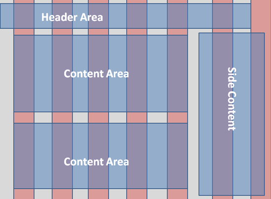
Figure 1
Responsive grid layout
Note
Although there are only seven columns (in pink) shown in Figure 1, in practice, the responsive grid layout is divided into 12 different grids and not seven. The image is only a representation of how a grid layout works.
Even though there is a limit to the number of columns in a responsive grid layout, it is recommended by design developers that you use between two to 12 columns for a better user experience. The reason for this is the percentage of the margin each column uses while rendering the application or a Web page. For example, if you decide to use 12 columns, the optimum percent of margin is 1.6 percent. That gives you approximately 20 pixels on a standard desktop screen. You can increase the margin percent, but make sure you never increase this beyond 10 percent. That is because if you set the margin percent even to 11, you end up having more margin than content displayed on the screen. That said, you are free to have more than 12 columns, but keep the optimum margin at 1.6 percent.
One obvious question is how you can translate the margin percent into SAPU15 so that you can design responsive SAPUI5 or Fiori applications. One simple and easy way is to use the width property of layoutdata for responsive layouts, available in SAPUI5. This property takes an integer value ONLY, and controls which UI element should be given preference to enlarge when the screen size changes.
Note
In a typical Web page, the grid layout is designed with CSS, but in SAPUI5 and SAP Fiori the approach is a bit different. In SAPUI5, you can specify the number of columns by the columnsM property of a responsive grid layout UI element. In SAP Fiori, a typical screen is divided into a number of 16x16 grids with no emphasis on the number of columns.
Viewport Tags
Viewport is a kind of meta tag that checks device resolution. However, viewport tags can only be used when your application is either browser-based or designed using hybrid Web container methodology. Note that you must define viewport tags in the INDEX HTML of your SAPUI5 application in order for them to take effect. Define the viewpoint in HTML as follows:
- <meta name=”viewport” content=”width=320”> // for a screen size of 320 or less
- <meta name=”viewport” content=”width=device-width”> // for the layout to match the device size
- <meta name=”viewport” content=”width=320, initial-scale=1” > // initial-scale sets the zoom level when the application is initially rendered. With this, the application will be rendered in a 1:1 scale and the application or UI will not be enlarged to fit the screen.
- <meta name=”viewport” content=”width=320, maximum-scale=1”> // With maximum-scale you can control whether the user will be able to zoom in on your application or not. If the maximum scale is set to 1, users will not be able to force zooming of your application.
Writing strict viewport tags can sometimes become inefficient. For example, if you define a viewport tag for a width of 320 and a user accesses your application on a device with a different width, then your application might not render in a responsive way. Therefore, it is best to set width as a device width and let the viewport tags change the screen resolution itself.
The code snippet, <meta name=”viewport” content=”width=device-width” initial-scale=1> // not only takes care of device resolution, but also controls zooming. When an application is rendered in device width, there is no need for zooming in to the application. On some devices or screens, user might like to zoom in and this has a direct effect on the rendering of the application. A simple zooming can be achieved with CTRL + Mouse Scroll.
Media Queries
A media query is a feature provided by CSS3 (although CSS version 2 also supports media queries) that enables your application to use different styles for different devices with different resolutions. Here is how it works in practice.
For example, you have a responsive SAPUI5 application or a Web page that is designed to run on any device or platform. The application contains a number of images of different sizes, or you want the application to render in a different font when accessed from a desktop or mobile device to enhance readability. This has become possible with media query. Refer to the CSS code in
Figure 2 to understand this more.
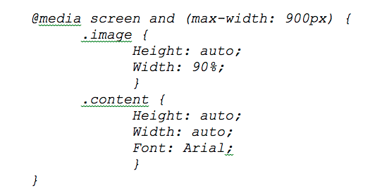
Figure 2
Enhance readability with responsive images and content
The CSS code in
Figure 2 is referenced when the screen size is 900 or less. Basically, media query works on top of the viewport tag. When viewport resolution is 900 or less, this CSS style is applied to your application, making sure that UI rendering is consistent and fits the screen correctly.
Similarly, you can write different CSS styles for different screen resolutions. For example, for a screen resolution of 480 pixels or less, you can set the width to 65 percent, or for a screen resolution of 300 pixels or less, you can set the width to 25 percent. This is similar to rendering an application on a desktop, tablet, and mobile device, respectively.
Unfortunately, Internet Explorer (IE) 8 and below doesn’t recognize media queries and it is very likely your application will break if an IE fix isn’t implemented. You can fix IE 8 and apply it through the use of media queries in JavaScript.
Click this link to download css3mediaqueries:
https://github.com/livingston/css3-mediaqueries-js.
Take a look at
Figure 3 to understand how this affects application rendering for different screen resolutions.
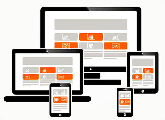
Figure 3
Responsive applications for different screen sizes (large screens can be 900 pixels, medium can be 480, and small can be 320)
These fundamental principles of a responsive design are common for Web page applications, and even SAPUI5 and SAP Fiori applications. Understanding these principles is important to understanding how responsive design is translated into SAPUI5 and SAP Fiori applications.
Responsive Design in SAPUI5
Using media query and viewport tags isn't enough to write a responsive application in SAPUI5. This is especially applicable in the case of a table UI displaying a number of columns. SAP table UI elements are designed to display large amounts of data. Even if you write a media query in your UI5 application, you cannot really control the display of a table UI element.
However, the SAPUI5 framework has provided almost everything needed to design a responsive application. The SAPUI5 framework offers column hiding and row pop-in options that react to the size of the device and change the table rendering automatically. However, before I get into advanced level UI controls, let’s start with responsive layouts.
The SAPUI5 development framework has provided separate responsive layouts that you can use for different use cases. In addition, there are other UI components that you can use to make your applications responsive. For example, the SplitApp UI element for mobile is another example of what SAPUI5 has to offer.
SAPUI5 Layout Elements
Following are the responsive layouts available in the SAPUI5 framework:
- ResponsiveLayout
- ResponsiveFlowLayout
- ResponsiveGridLayout
All these layouts are attached to a form so that the UI elements used inside the form elements can be made responsive. You can specify width, weight, and linebreak for each UI element inside the form element. These properties are extended by layoutdata of each layout in SAPUI5.
ResponsiveLayout
ResponsiveLayout is the basic layout that is used when designing responsive SAPUI5 applications. When you use ResponsiveLayout, at run time the SAPUI5 framework actually renders ResponsiveFlowLayout. ResponsiveFlowLayout lays out UI elements one after another. Basically, UI elements are set side by side. If you have used ResponsiveLayout at the parent level, you can further use ResponsiveFlowLayout to control child containers and width and linebreaks of child elements inside it. Perhaps you can relate this to a matrix layout in Web Dynpro Java, in which you use matrix layout as a parent layout and further control UI rendering with the matrixhead data of the layout set.
Note
Each layout contains formContainer that further contains formElements. Refer to the pseudo-code in Figure 4 to understand how you can work with ResponsiveLayout.
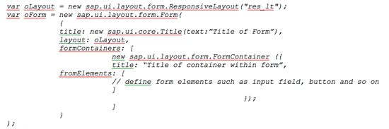
Figure 4
How to work with ResponsiveLayout
Figure 5 shows the hierarchy of ResponsiveLayout, the form element, the containers within the form, and the UI elements inside the form container.
Figure 5
ResponsiveLayout hierarchy
ResponsiveGridLayout
ResponsiveGridLayout is another responsive layout that you can attach to the form UI element. Compared to ResponsiveLayout, this layout offers a number of control attributes – for example, Linebreak, column count, and GridData. With this layout, you can control the spans of the UI element and linebreaks.
ResponsiveFlowLayout
As its name suggests, ResponsiveFlowLayout adds UI elements in an expandable full-width row. It lays down all the UI elements one after another, and when the space between two elements is too small to render, the layout automatically shifts the next UI element to a new row. Take the example of a contact form. When there is not enough space available to render a UI element, the next UI element is shifted to a new row.
However, if the first UI element isn’t designed in a way to enlarge in the empty space left by the UI element that’s been shifted to a new row, the application experience isn’t consistent. This is when control attributes such as minWidth, width, and weight come into the picture. minWidth is a control attribute of ResponsiveFlowLayout that sets the minimum width for a UI element in pixels. The width control attribute takes an integer value and defines which UI element should be stretched when another UI element is shifted to a new row. For example, if you define a width of 2 for an input element and 1 for a button, it is the input element that is stretched when the screen size is changed and not the button. Obviously, nobody would like to see an enlarged and stretched button instead of an input element.
In sum, you can choose whichever layout you want to use in your application design according to your needs. However, remember that ResponsiveFlowLayout adds UI elements one after another, while ResponsiveGridLayout enables you to use rows and columns in your application. Note that ResponsiveLayout internally uses ResponsiveFlowLayout. So choose wisely.
Complex UI Controls for Responsive SAPUI5 Application Design
Responsive design in SAPUI5 isn’t just about responsive layouts. There is a much more to responsive controls than just using responsive layouts. In this section, I discuss the following responsive elements in brief, but I discuss SplitApps and Responsive Tables in a bit more detail:
- SplitApp
- Responsive Table
- ResponsivePopover
- Responsive Refresh
- Responsive Grid
- Responsive Container
SplitApp Elements
The SplitApp element is a subclass of the Split Container. The Split Container uses two navigation containers. When the screen size is relatively large, SplitApp uses a master-detail approach to display the content. However, when the screen is small, as in the case of mobile devices, SplitApp switches to use only one navigation container. The other container is not displayed until the user performs a swipe or touch-induced action on the screen. This not only enhances the usability of your application, but also enables your application to react to a change of screen size.
A simple example of a SplitApp-based application is an email inbox. When you are running an email inbox application on a desktop or tablet, there is an ample screen size available for SplitApp to use both the master and the detail container. On such a screen, SplitApp displays the master container that shows a list of emails in your inbox and another part of the screen shows details of the selected email from the list. You probably have experienced this when viewing emails in Microsoft Outlook on a desktop. In Outlook, you usually have a list of emails displayed in the left pane, and selected email content is displayed in the right pane.
On the other hand, when using the same app on a mobile device, SplitApp now switches to one container and displays only the list of emails, and detailed email content is displayed only when you click a specific email from the list. This is a great way to make your multi-screen application responsive.
Following are three modes of SplitApp control:
- ShowHide Mode: This mode uses the master-detail approach but hides one of the views when the user changes the screen resolution. For example, when the user rotates the screen, this mode automatically hides the master view.
- Popover Mode: In this mode, the mast view isn’t hidden. Instead it is displayed in a separate popover when the user changes the screen resolution
- Stretch Mode: In this mode both master and details views are shown by default
SplitApp Application Demo
There is no need to create a separate demo to understand how the SplitApp-based application works. A demo SplitApp is already available as a part of the SAPUI5 Demokit. Click the following URL to see the application in action:
https://sapui5.hana.ondemand.com/sdk/test-resources/sap/m/demokit/splitapp/index.html.
If for some reason you cannot access the link,
Figure 6 shows a screenprint of the SplitApp-based application demo.
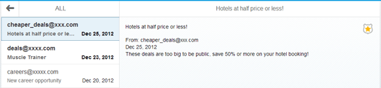
Figure 6
SplitApp-based responsive application (image courtesy of SAPU15 Ondemand Demo)
Responsive Tables in SAPUI5
At the start of this section, I briefly discussed how viewport, meta tags, and CSS properties are not enough to design responsive table UI elements in SAP UI5. When you design a table UI for displaying data on mobile devices, you always have to adjust the design to suit the small screen size. SAPUI5 provides responsive tables and a pop-in display to help you present large data effectively.
ScreenWidth – A Property Similar to Viewport
Responsive Table UI elements in SAPUI5 come with an attribute for column control that works, though not exactly like viewport tags, in a similar way to the viewport device-width attribute. When you are not sure about the screen size or width of the user’s mobile device, you can rely on this attribute to ensure that column hiding works consistently with the screen size.
Suppose that you have designed an application to display flight details. You know that flight number and time are two of the most important columns that you want to display all the time irrespective of screen size. These columns could then be placed with highest priority so that these columns are not hidden when screen size is reduced. You can do that with following attributes.
minScreenWidth: This is the minimum width you want to display a table without breaking into pop-ins – for example, 500 pixels. When the device screen size is smaller than 500 pixels, the table automatically breaks down into pop-in displays that hold the rest of the columns. However, most of the time when the application is being designed, you do not precisely know the screen size. In that case, use the following value to set the minimum screen-width attributes: minScreenWidth: Tablet OR minScreenWidth: Desktop OR minScreenWidth: “”.
When the value is set to Tablet, the UI only reacts to standard tablet sizes. When the value is set to Desktop, the UI might not react to a change in screen size when switched to a mobile device. In the end, if you just want the UI element to take care of the responsive changes, set the blank value as shown in the minScreenWidth
“”.
Prioritize Column Display With demandPopin
demandPopin is the attribute that enables you to control and prioritize the column display. For all columns you want to display on priority, set the demandPopin attribute as shown here:demandPopin: false
For all other columns, set demandPopin to true so that these columns are hidden and can be still accessed by navigating to the Popin menu.
So far I have discussed the capabilities of the SAUI5 framework enough so that you can use it to design a responsive application. A complete discussion of every UI element is out of the scope of this article, but I have presented most of the responsive design concepts in the SAPUI5 framework, so you can now design your first responsive SAPUI5 application. Next I go on to discuss responsive design concepts in the context of SAP Fiori.
Responsive Design in SAP Fiori
In a responsive grid layout that Web sites implement, usually a Web page or an application is divided into a number of columns. However, in the case of SAP Fiori, the screen is divided into a 16x16 pixel responsive grid layout. This is most suitable for a 48-pixel touch area, as is the case for mobile and smartphones. For SAP Fiori, SAP has adopted a new measurement standard called root em (rem). A 1x1 rem is equivalent to a 16x16 pixel screen area. An application designed with this measurement works well on all devices.
Do not assume that SAP Fiori never uses 12-column responsive grids. In fact, SAP Fiori makes the best use of both responsive grids and rem-based layouts. Take a look at
Figure 7 to learn more.
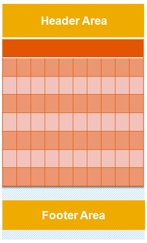
Figure 7
SAP Fiori screen design
Almost every Fiori application is built with a basic framework that contains a header area and a footer area. You can divide the rest of the screen into 1x1 rem grids. The header area is used for displaying application navigation. The footer area is used for user actions and buttons.
sap.m Control Library
Responsive design in SAP Fiori mainly comes from the sap.m control library. The majority of the Fiori application uses the sap.m control library to create a responsive Fiori application. Another control that contributes to the responsiveness of Fiori applications is sap.m.SplitApp control, which changes the application display according to screen size. In addition, sap.m.shell is used in an SAP Fiori application to show or hide screen elements (for example, the logout link is hidden when the screen is small).
Although a discussion about all the sap.m controls is out of the scope of this article, I mention a few sap.m controls (below) that, in my opinion, are important and a bit different from the UI controls discussed in the SAPUI5 section of this article.
sap.m.ResponsivePopover
The sap.m.ResponsivePopover control works in a similar way to a normal popover. However, when the screen size is less than a tablet, it switches into stretch mode and changes into sap.m.Dialog with the stretch set to true. The control dialog is used to halt user interaction and to display important information in a popover or, in this case, a dialog. In case you are not familiar with how a typical popover looks, see
Figure 8.
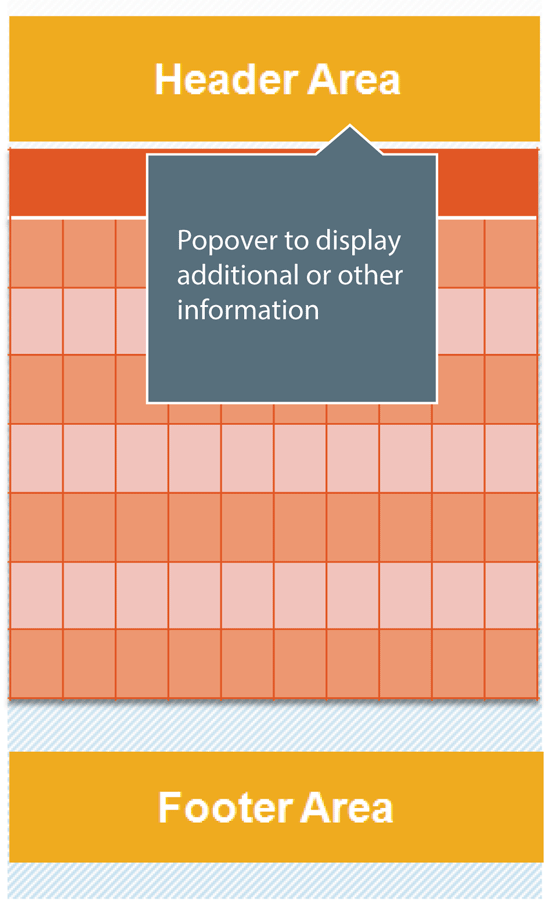
Figure 8
Typical popover
sap.m.Shell
The sap.m shell control wraps the application into a root frame where you can display additional UI controls such as a company logo or a logout link (
Figure 9).
figure 9
Use of shell control
Figure 9 shows an application wrapped inside a shell control. You can see the logout link at the top right and some other icons on the left that are part of the root shell UI. In addition, a company logo is displayed at the top left. In sum, most of the responsive design support comes from sap.m control library and other UI elements just discussed.
The SplitApp discussed earlier applies to SAP Fiori, too. In fact, there aren’t any responsive design principles and techniques that are exclusive to SAP Fiori. As SAP Fiori is based on the SAPUI5 framework, all the responsive design principles of SAPUI5 apply to the development of SAP Fiori applications as well.
The takeaway is that when you think of designing a responsive SAP Fiori application, think of using the sap.m control library and other responsive techniques discussed in the SAPUI5 section of this article. To learn more about sap.m controls, click the following link:
https://sapui5.netweaver.ondemand.com/sdk/#docs/api/symbols/sap.m.html.
Worth Noting
Now that I have discussed responsive design, it is important to understand that responsive design isn’t limited to what I have mentioned thus far. There a few other important concepts that can contribute to responsiveness of your application and enhance user experience that I list in the following section.
Platform-Specific CSS Classes
The SAPUI5 application framework provides separate CSS classes for different platforms that you can use to style UIs on specific devices. For example, you might want the application title to be displayed with a 15-pixel font size. You can use CSS classes to set the font size for each device so that the application experience is consistent. The classes are as follows (do not remove the hyphen when you use these classes in your application):
- sap-ios
- sap-android
- sap-winphone
- sap-bb
Grid Designer Tool
Designing a grid system for your application can be cumbersome. In fact, even if you spend a lot of effort designing a flawless responsive grid, testing such a grid on various devices can be troublesome. You might need to keep tweaking the grids many times before you finalize the design. To make life easier, SAP is planning to release a tool called Grid Designer (
Figure 10). With this tool, you do not need to specifically code the grid system in your application. Instead, you can use the Grid Designer to design the grid and test its responsive behavior. This tool is still in beta and isn’t available to end users yet.
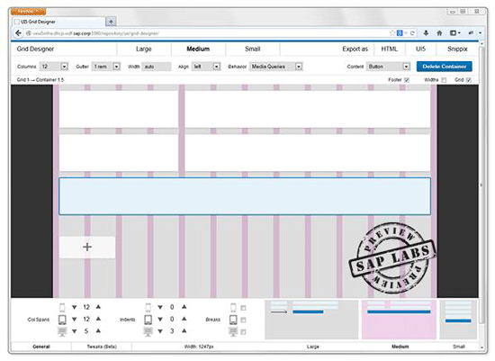
Figure 10
Grid Designer Tool (image courtesy of Experience SAP)
Pull-to-Refresh Feature
This feature is already used by many news and magazine applications to display the most recent content to users (
Figure 11). Users simply swipe their touch screens to refresh and pull up the most recent content. The advantage of using this feature is that you add more space to your display screen because you don’t have to display the refresh button. In addition, with this feature, your application only downloads the most recent or new content rather than already downloaded data. The pull-to-refresh feature is quick and enhances user experience.
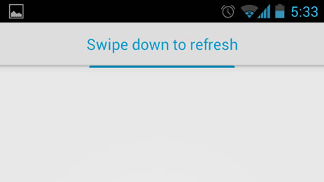
Figure 11
Pull to refresh content
The following link explains in depth the working of the pull–to-refresh UI element in general:
https://www.androidpatterns.com/uap_pattern/pull-to-refresh-2. The sap.m.PullToRefresh library enables you to use this feature in your SAPUI5 or Fiori applications. This UI control is hidden by default in the case of SAPUI5 or Fiori applications, but is visible when users scroll down the screen long enough.
Images on Screen with Retina Display
Displaying consistent images can be a problem on devices of different sizes and resolutions. Especially with the Apple Retina Display feature you have to be more cautious when manipulating images in your SAPUI5 or Fiori application. On devices with retina display, image quality is very important. Therefore, you need to be careful with image resizing to provide a consistent user experience. Unlike separate CSS classes, there are not any CSS classes or HTML tags to manage image-rendering on Apple devices with the retina display feature. Retina display uses a very high pixel density to display images. In most cases, retina displays consume twice as many pixels as other devices.
To display consistent images, always use the sap.m.Image control provided by the SAPUI5 framework that automatically selects the density of the image depending on which device is used. This is perhaps the most important control to note. This control provides a feature called densityAware that tells the image control whether there is a density-specific image variant available. If set to false, your application does not display a different image variant.
The takeaway is that you should not underestimate the importance of image display in your SAPUI5 or Fiori applications.
Responsive design isn’t limited to the UI controls and libraries discussed in this article. Once you understand the fundamentals of responsive design and what UI controls you have in SAPUI5 and SAP Fiori, it is very likely that you will discover new implementations of a UI control. Be on the outlook for which UI elements you can use to make your application more usable and to provide a consistent user experience across all platforms and devices.
Ameya Pimpalgaonkar
Ameya Pimpalgaonkar is a senior SAP architect. He specializes in SAP Netweaver Portal, SAP BPM, BRM, MDM, and SAP Mobile. His interests include UI and front-end technologies, SAPUI5, Responsive Design, and integration of modern technologies with SAP UI. He has also worked on HTML5, CSS3, and jQuery. Ameya is also a certified usability analyst from HFI, USA.
You may contact the author at
ameya85@gmail.com.
If you have comments about this article or publication, or would like to submit an article idea, please contact the
editor.


 Premium