SAP Lumira allows you to directly connect to SAP HANA analytic models to create geospatial maps and infographics. Learn the steps required to make use of this new feature with the help of an example scenario.
Key Concept
SAP Lumira empowers business users to create and visualize their data in infographics and reports, reducing their dependency on technical experts.
SAP Lumira is a new product focused on business end users who want to speed up decision making. It allows users to quickly analyze the data and create engaging visualizations. Users can create infographics and reports in a self-service way. The massive real-time data from SAP HANA and visualizations from Lumira help companies make accurate and timely decisions.
SAP Lumira allows you to create visualization in four steps:
- Prepare
- Visualize
- Compose
- Share
Sample Scenario
I have imported analytic views from SAP HANA to show infographics and a geospatial map on a sample Facebook-user scenario in SAP Lumira (
Figure 1). Developers can further analyze the data according to business function and industry.
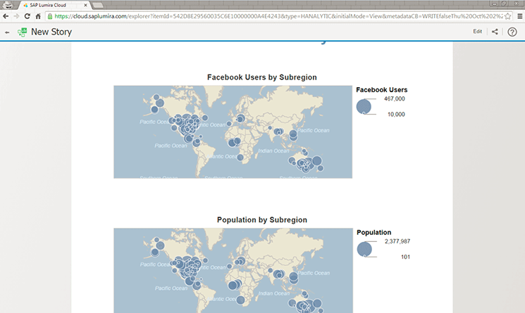
Figure 1
Infographic at Lumira Cloud that shows Facebook users and country population
SAP Lumira Software and Settings
First install SAP Lumira desktop from the
Lumira web site and create an account at
Lumira Cloud. You also need to create an account at
ArcGIS Online to connect Geo Maps to SAP Lumira. Currently you can create a free account at both web sites.
To enter the ArcGIS account details in SAP Lumira, go to the SAP Lumira desktop and follow menu path File > Preferences > Geo Map Service. Geo Map Service connects ArcGIS with SAP Lumira (
Figure 2).
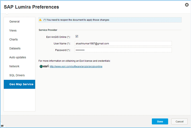
Figure 2
Enter ArcGIS credentials
The last step is to link the SAP Lumira desktop with SAP Lumira Cloud (
Figure 3). Click SAP Lumira Cloud in the left menu of the SAP Lumira desktop to enter the credentials. The setup is now complete and you can start working on the SAP Lumira desktop.
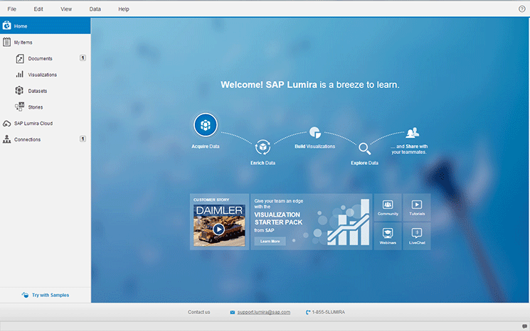
Figure 3
Initial screen of the SAP Lumira desktop
Prepare
SAP Lumira allows users to prepare data according to their requirements. They can perform functions such as create measures or geo hierarchies and combine columns. If the data is refreshed due to a column addition or deletion or any other change, then the system automatically applies the changes to the visualizations. I have imported data from the analytic view of SAP HANA to create a visualization.
Step 1. Import Analytic Views from SAP HANA to SAP Lumira
To import the views in SAP Lumira, go to the SAP Lumira desktop home page shown in
Figure 3. Click the Acquire Data button to go to
Figure 4.
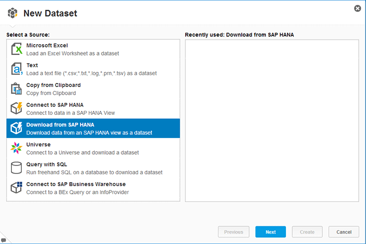
Figure 4
Select the source for data acquisition
Select Download from SAP HANA and click the Next button to go to
Figure 5.
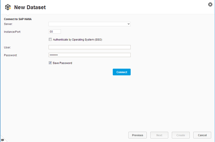
Figure 5
Enter SAP HANA system credentials
Enter the system credentials and click the Connect button to connect to SAP HANA. Once the system is connected, click the Next button to go to
Figure 6.

Figure 6
Select the analytic view
In
Figure 6, select the SAP HANA analytic view whose data will be imported to SAP Lumira. The next screen (
Figure 7) shows the Measures and Dimensions of the analytic view. Select the measures and dimensions that you require for the visualization. Click the Create button to go to the Prepare tab in
Figure 8.
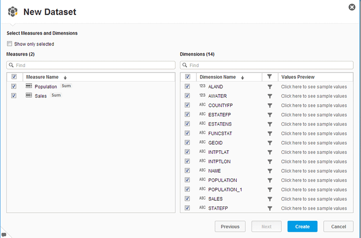
Figure 7
Select measures and dimensions

Figure 8
SAP Lumira data preparation
The data fetched from the analytic view is now available in SAP Lumira. This is the first step of the SAP Lumira report process.
Click the NAME dimension in the left of
Figure 8. NAME is used to show a location on maps. Clicking NAME opens the Filter window. Click by Names as shown in
Figure 9 to open the pop-up window in
Figure 10.
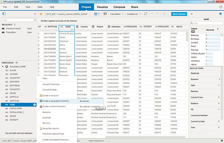
Figure 9
Create a geographic hierarchy
The NAME column has the name of all the regions, which are then mapped to the correct country. If some regions are unresolved then you can make a correction from a list of recommendations by selecting the most probable value from the drop-down (
Figure 10). Click the Done button once the geo hierarchy process is complete.
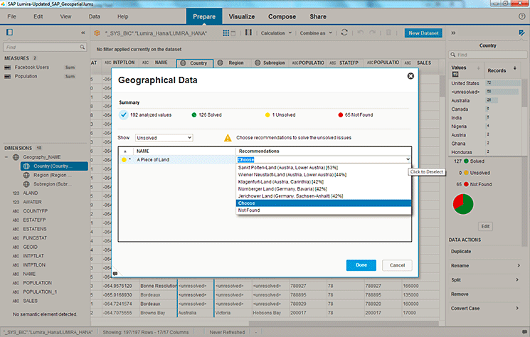
Figure 10
Create a recommendation for unresolved names in the geo hierarchy
Visualization
Once the data is prepared, the next step is to create the visualization to convey your insight to customers, stakeholders, and the business. SAP Lumira allows you to create visualizations by drag-and-drop functionality. It reduces the dependency on IT and if there are any data changes, they are automatically reflected in the visualization. Click the Visualize tab (
Figure 8) to go to
Figure 11 to start creating the graphs and maps.
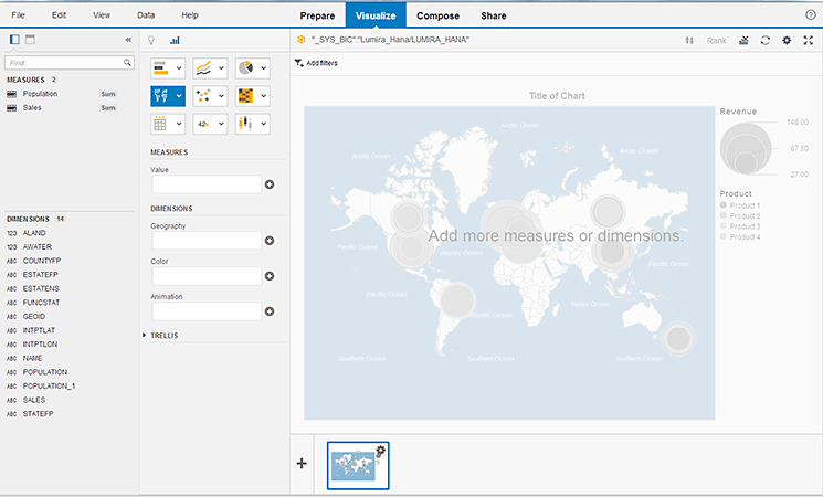
Figure 11
Initial Visualize screen
I have created three visualizations for my scenario of Facebook users:
- Geo Map
- Line chart with two Y-axes
- Geo Bubble Chart
Geo Map
Click the highlighted geographic icon in the middle of the screen shown in
Figure 11. Then click Geo Map in
Figure 12 to create the blank geographic map (
Figure 13). Note that the Geo Bubble Chart is always highlighted when you click the geographic icon. When you select Geo Map it is then highlighted in light blue.

Figure 12
Click Geo Map

Figure 13
Initial Geo Map
In
Figure 13, drag the Subregion hierarchy from the left to the Geo Dimension box, which takes you to
Figure 14. The pointers shown are the location of the sub regions. The map is populated automatically. If you select the Cluster adjacent markers check box then nearby pointers are grouped together with a total count of clustered pointers. In
Figure 14, for example, a circle with the number 39 means that 39 nearby pointers are clustered.
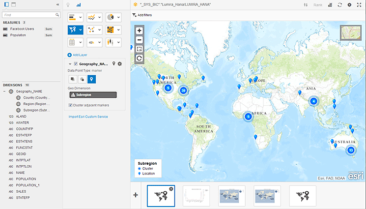
Figure 14
Enter the geo dimension in the Geo Map
Line Chart with Two Y-Axes
In
Figure 14 click the plus icon on the bottom of the screen, which takes you to
Figure 15.
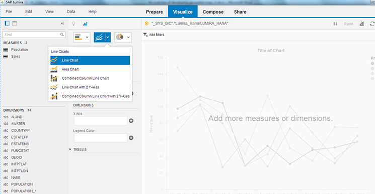
Figure 15
Click Line Chart with 2 Y-Axes
Click the highlighted line charts icon in
Figure 15 and then select Line chart with 2 Y-Axes to go to
Figure 16.
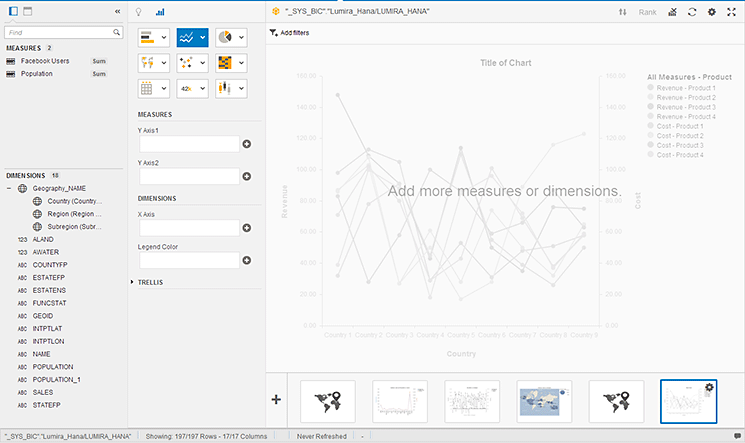
Figure 16
Initial line chart
Enter the measures Facebook Users and Population by dragging and dropping them in each Y axis field, respectively, and the dimension Country in the X axis field, which populates the data (
Figure 17). The graph shows the population and Facebook users by country in the right of the figure.
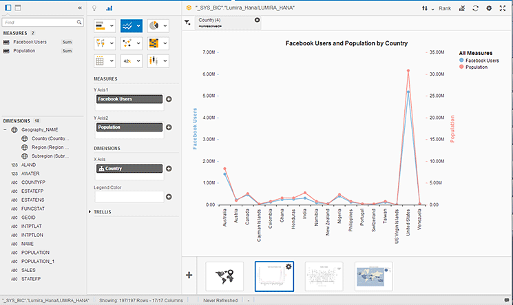
Figure 17
Enter dimension and measures to visualize
Geo Bubble Chart
In
Figure 17 click the plus icon on the bottom of the screen and then click the highlighted geographic chart in
Figure 18. Select Geo Bubble Chart to create a blank chart as shown in
Figure 19.
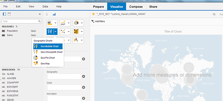
Figure 18
Select Geo Bubble Chart
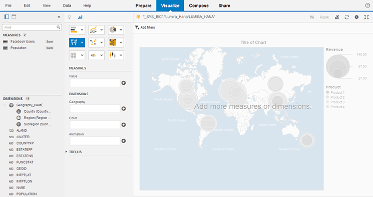
Figure 19
Initial Geo Bubble Chart
Drag-and-drop the Population measure into the Value field and the Subregion dimension into the Geography field (
Figure 19). The chart automatically shows the region’s population on the map on the right (
Figure 20).
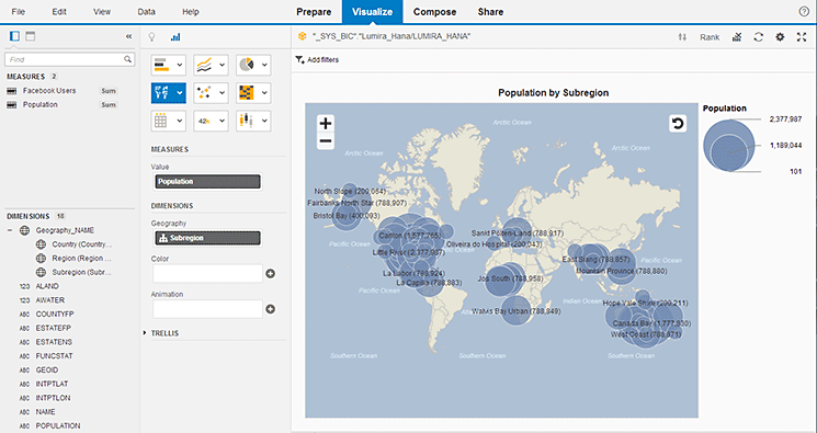
Figure 20
Enter Population value and Subregion dimension
In the same way, create the other Geo Bubble Chart for Facebook users.
Now you have organized and consolidated your insight in visualization without writing a single line of code. The visualize step is complete. To start the next step click the Compose tab at the top of
Figure 20 to go to
Figure 21.
Compose
You can create an infographic from the visualizations to help the business and customers to understand your information quickly and clearly. Select the Infographic button and then the Create button in
Figure 21. This opens the screen shown in
Figure 22.
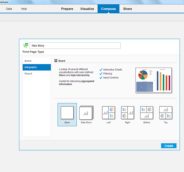
Figure 21
Create an infographic

Figure 22
Arrange visualizations
Drag-and-drop the visualization figures shown above the highlighted Visualizations tab in
Figure 22 from the left pane to the right side of the page to create a story that is easy to understand. Once the infographic is created you can preview it by clicking the Preview button in
Figure 22 to go to
Figure 23.

Figure 23
Tablet preview
Preview is shown in three options (
Figure 23):
- Desktop Preview
- Table Preview
- Mobile Preview
Share
The infographic is complete and can be shared with the business and customers. You have multiple options to share the insight, such as publishing to SAP HANA, SAP Lumira Cloud, or SAP Lumira Server. Users can choose the option according to their requirements. Just click any of the options such as Export as file, Publish to SAP HANA, or Publish to SAP Lumira Cloud to share the infographic. I clicked Publish to SAP Lumira Cloud for my sample scenario (
Figure 24).

Figure 24
Share the infographic
My SAP Lumira Cloud account is selected by default, which I explained earlier in the “SAP Lumira Software and Settings” section.
If you want to use another account to publish the infographic, then you can do so by connecting as a different user (
Figures 25 and
26). Click the Next button in
Figure 25 to go to
Figure 26. Click the Publish button to publish the infographic to SAP Lumira Cloud.

Figure 25
User credentials to publish to SAP Lumira Cloud

Figure 26
Publish to SAP Lumira Cloud
The infographic that shows Facebook users by region is now available on the SAP Lumira Cloud account as shown in
Figure 1.