Learn how a large enterprise benefited from the rollout of a customized mobile financial dashboard integrated with Oracle’s Hyperion Financial Management System (HFM), SAP Business Warehouse, and SAP BusinessObjects dashboards and mobility.
Key Concept
A financial dashboard displays an enterprise’s most summarized financial data in the form of key performance indicators (KPIs) combined with visual components that foster effective decision-making.
Consider a scenario in which a Fortune 200 global enterprise (to be referred to as XYZ Inc.) has a multitude of technologies supporting business operations. This company constantly acquires other companies, and therefore the number of systems and technologies continues to expand. Although the company uses many SAP applications — mostly in supply chain and business intelligence or analytics — it also uses applications from SAP’s competitors or technologies from companies that collaborate with SAP to provide solutions.
For example, the financial planning and analysis (FP&A) department uses Oracle’s Hyperion Financial Management (HFM) for budgeting and consolidations. XYZ had also invested heavily in SAP BusinessObjects over the last two to three years in addition to its continued investment over the past many years in the upkeep of SAP Business Warehouse (SAP BW).
Both business and IT had been acutely aware that the company had barely realized the combined potential of these tools. My company stepped into this void to work closely with our stakeholders both in finance and IT to identify, propose, design, and deploy an application that would satisfy almost all the criteria that these departments had set forth. This application is the mobile financial dashboard that my team built for the FP&A users.
I share with readers the solution my team proposed to FP&A personnel, how we established a compelling business case, the advantage of adopting a lean agile methodology, and the lessons my team learned.
The Approach: A Hybrid of HFM and SAP
When my team and I approached senior leadership in FP&A to completely understand its requirements, we found it wanted an aggregated view of the data in the form of key performance indicators (KPIs), easy access to these KPIs, disseminating these KPIs in a centralized manner, and the ability to visualize and drill down for deeper analysis. The KPIs in question included sales or revenue, SG&A, days sales outstanding, and working capital turns.
XYZ used a manual approach of downloading the KPIs into a spreadsheet and emailing them to the desired audience or creating PowerPoint slides and adding commentary on deviations or items that needed attention. Another important fact that came to light was that the FP&A team was not concerned about the technology that we would use to deliver our solution. This was not surprising because most business users across various industries and geographies have the same attitude toward technology: they don’t care as long as it gives them what they need.
Note
A disclaimer here: HFM has a full-blown BI solution. However, it was not within the scope of our engagement to question whether XYZ had researched the BI capabilities of HFM or not. Similarly, neither did the scope of our engagement entail starting a discussion on how SAP’s Business Planning and Consolidation (BPC) could be a viable option for XYZ.
Figure 1 shows the solution in a nutshell. Basically, both financial master data and planning and forecasting data from HFM are provided via flat files on a regular schedule to SAP BW. Various calculations, transformations, and aggregations are then applied to the data in BW. This data is made available to SAP BusinessObjects (Dashboards) via a direct connection (i.e., Business Information Consumer Services [BICS]). When dashboard users access these KPIs from their desktop PCs, laptops, or iPads, the dashboard communicates to BW as needed and BW provides information to the dashboard as appropriate.
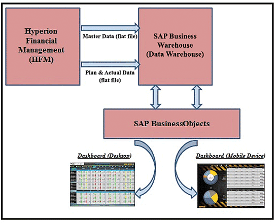
Figure 1
The dashboard solution
My team followed an approach that was intended to keep things simple, provide FP&A with a solution that leveraged existing technologies, and above all meet their needs in every possible way.
Various options were considered for the exchange of information between HFM and BW. Direct connection between these two systems using DBConnect and UDConnect was proposed. Another option was to use SAP Data Services for extracting, transferring, and loading of HFM data into BW. However, XYZ and my team decided on the flat-file approach for two reasons:
- XYZ does not allow direct connection to HFM as a corporate IT policy.
- Because of the way the data is structured in HFM, it’s easier to extract the pre-defined aggregation levels in HFM than to extract the base data and aggregate it in BW.
FP&A would supply my team with the master data and transaction data (planning and actuals data) in flat files and at an agreed-upon frequency. My team would upload these flat files into the data warehouse (i.e., SAP BW). It was very important for us to understand each field in these flat files so that we could create the corresponding fields (InfoObjects) in SAP BW with the correct data type and the right calculations, if any.
SAP BW would be used as the data staging and warehousing layer. This decision was made because SAP BW in XYZ Inc. is on the path to becoming the enterprise-wide data warehouse. It made sense to upload the HFM data to SAP BW. Also, many of the KPIs had calculations that we did not want to be done in the dashboards layer because of performance reasons. Pushing these calculations to SAP BW InfoCubes made perfect sense.
My team would use BusinessObjects Dashboards (formerly known as Xcelsius) as the dashboarding tool. Among other considerations, Dashboards’ Excel-based look and feel made our finance users comfortable and was a more compelling proposition than SAP Design Studio. My team kept the dashboard as lightweight as possible by pushing calculations, complexity, and volumes to the underlying layers. There would be two versions of the dashboard — one for the desktop and the other for mobile devices. This was to provide those users who wanted to access this information on their iPhones or iPads without their having to use their laptops.
The solution consisted of the following technical components:
- The last three years’ actuals plus current year forecast data
- Thirty financial entities available for selection by user
- The source data (i.e., from HFM) had more than 650 columns that needed to be parsed
- The dashboard included four different views, was powered by 15 (BEx) queries in SAP BW, and the time granularity of the data was monthly
Establishing the Business Case
Establishing a business case that is compelling enough to excite a company’s departments is a daunting proposition in this day of dwindling budgets and the desire to do more with less. Also, the time factor cannot be emphasized enough. No one today has the patience to wait for many months (let alone a year or two) before seeing an end product, and a business wants to have regular input into how the end product behaves and into its look and feel. Our dashboard use case was most compelling because it satisfied these criteria. Here’s what XYZ Inc. liked about our use case:
- We proposed a proof of concept that would give the finance department a reasonably good approximation of their requirements in an extremely compressed time frame of about five weeks; the lessons that we learned helped us cut down our development time for the production version.
- The dashboard would be risk-free for the FP&A department. It was almost as though we were offering XYZ’s FP&A department a free trial version of the dashboard with an option to reject it. In the event that XYZ did reject the prototype, its investment would be very limited.
- Although a dashboard that is available on a desktop is a far more visual experience than having to sift through countless records in a report, users prefer the mobile version of it because mobile devices are ubiquitous today. Dashboards tend to look better on mobile devices such as iPads and they also engender quicker use of dashboards than with a desktop or even a laptop. Our approach of incorporating mobility with very little incremental cost was a winning proposition.
- The dashboard would give FP&A the right rationale to streamline its KPI calculations. Indeed, during our proof of concept as well as later, FP&A was not only able to streamline their KPI calculations but also prioritize them and eliminate those that were redundant.
- From a technical perspective, we were not proposing any new tools. We would be using all available tools. And based on our initial sizing exercise, we did not anticipate the need for additional hardware to accommodate current or future data volumes. Therefore, it meant that no new hardware or software needed to be purchased.
Proof of Concept
Even though the solution sounded attractive to FP&A, the FP&A team wondered if my team could give its team an advance preview of the solution with a limited set of data, basic functionality, and a few wireframes. The prototyping approach is well suited to applications that can be developed rapidly. A dashboard deployment would certainly fall in that category. Companies tend to expect their implementation partner to invest in a prototype, especially in this age of shrinking IT budgets. XYZ was no exception because they were fully on-board with our solution and therefore felt that this initial investment on our part would pay off adequately.
XYZ Inc. expected us to make this investment, and we did. However, we set expectations up front with our stakeholders on the scope of this prototype:
- We would upload two flat files of FP&A data from HFM directly into BusinessObjects dashboards.
- This data would be limited to two quarters of a particular fiscal year.
- We would not house this data in the SAP BW data warehouse.
- Requirements gathering would be completed within a maximum of one week inclusive of a few sessions with key business users.
- XYZ would provide us with all the data fields in scope and any calculations or formulas for derived fields.
- Because XYZ did not have a particular dashboard look and feel in mind, we would propose two to three separate wireframes for consideration.
- We would need one point of contact from the business that would respond to our questions and help resolve open issues quickly.
- Testing and validation would primarily be done by the business point of contact. To turn around a quick prototype, any elaborate testing involving multiple individuals would not be considered.
- Volume and stress testing were not in the scope.
Based on these assumptions, my team was able to project a completed prototype of four weeks’ duration.
Agile Methodologies
When you are implementing BI components and applications, you can try a hybrid approach that incorporates agile and ASAP methods. Especially when implementing SAP BusinessObjects or any of its components (or deploying a set of reports or dashboards using SAP BusinessObjects tools), you can use an agile approach quite effectively.
Figure 2 is a conceptual representation of how my team leveraged a customized version of an agile approach to quickly design and deploy our financial dashboard.
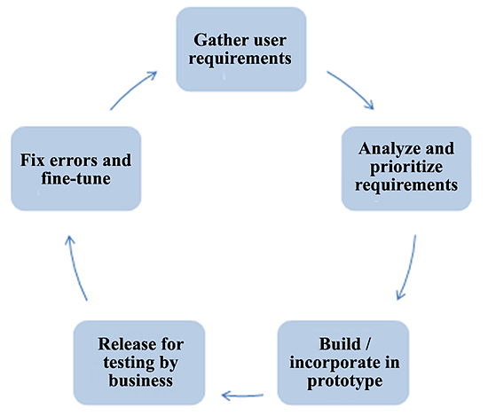
Figure 2
Applying agile methodologies to dashboard design and rollout
In business terms, this highly iterative approach of ours involved the following key steps:
- We would have two to three days of initial requirements-gathering workshops in which we would try to get the big picture as well as the specific needs to the extent it would be possible.
- We would concurrently start designing the functionality leveraging the initial prototype we had already put together.
- For each discrete piece of work, we would demonstrate it to our business point of contact for testing if appropriate, validation if needed, and any tweaks or changes as necessary.
- We would then incorporate these changes, if applicable (revise), and incorporate additional requirements.
Lessons Learned
It was a reasonable assumption on our part that we would learn quite a few valuable lessons on this project. Here are the ones that I would like to share with you:
- A proof-of-concept should be considered as a first phase of your overall project.
- Minimize the amount of data loaded to the dashboard’s memory.
- Push as many complex calculations and logic as possible to the data warehouse (SAP BW) layer and minimize them at the dashboard layer to improve performance.
- Do not overload your mobile devices by doing parallel loading of multiple queries and components.
- It is good practice to enable debugging functionality on mobile devices and review the logs to troubleshoot errors.
- Spend more time designing or developing the functionality; the look-and-feel, although very important, should be considered a lower priority.
- Many controls that work on the desktop version of dashboards do not work in the mobile version. Make sure you identify the ones that work for mobile devices and only use those for the desktop version.
- Keep the number of rows times columns displayed on the dashboard to a bare minimum. If needed, generate the crosstab (query) in SAP BW (BEx).
- Try to minimize the number of visual components on your dashboard and try to reuse them as much as possible.
- Even with the same dashboard, the mobile version may behave differently than the desktop version. You may therefore have to do some trial and error.
- Try to minimize embedding too many images. The image of the company logo should be enough. If you are in a situation where you must include a few images, choose no more than the two most appropriate ones.
- Remember you need to keep the size of your dashboard file (.swf) as small as possible. Add only the visualizations that truly add value and exclude the rest. We had added some extra controls in our earlier iterations to provide users with some convenient options, but these significantly increased the size of the dashboard file, causing it to take more time to generate. Users do not want convenience at the expense of speed.
A Look at Our Dashboards
At this time you might be wondering what our dashboard looked like.
Figure 3 displays the dashboard landing page. Users have the option to select their options (i.e., their regions and time slices). Note that the restriction of selecting a maximum of eight entities is not a technical one, but rather, it is determined in conjunction with XYZ to limit the user’s ability to view data to a logical maximum. (Please note that for the sake of client privacy, I have replaced the client’s logo with our company’s logo.)
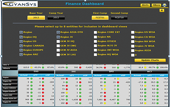
Figure 3
Financial dashboard landing page
In
Figure 4,
you shall see the KPIs arranged by month.
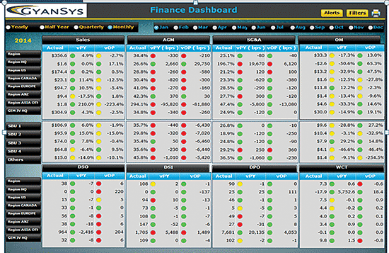
Figure 4
Monthly view of financial dashboard
Users have multiple ways to view the dashboard data by combining various values of the time and region dimensions. At the most granular level of the time dimension, users can choose to view monthly data and at the highest level, users can choose to view data on a yearly basis. For example, if you select the Region view and monthly for the time dimension, users get to drill down to the components of each KPI for that month and year.
A good dashboard always enables users to filter so that they can focus their attention on the most important aspects of the data. The ability for users to detect deviations is a key purpose of a dashboard. This ability is directly related to how well you have configured the alert thresholds. As we proposed in the early stages, users might want to set their own alert levels.
Figure 5 shows the sliding bars that help financial analysts set their own alerts after clicking the Alerts button. This feature was highly appreciated by users due to the tremendous amount of flexibility it provided them.
Figure 4
Monthly view of financial dashboard
Anurag Barua
Anurag Barua is an independent SAP advisor. He has 23 years of experience in conceiving, designing, managing, and implementing complex software solutions, including more than 17 years of experience with SAP applications. He has been associated with several SAP implementations in various capacities. His core SAP competencies include FI and Controlling FI/CO, logistics, SAP BW, SAP BusinessObjects, Enterprise Performance Management, SAP Solution Manager, Governance, Risk, and Compliance (GRC), and project management. He is a frequent speaker at SAPinsider conferences and contributes to several publications. He holds a BS in computer science and an MBA in finance. He is a PMI-certified PMP, a Certified Scrum Master (CSM), and is ITIL V3F certified.
You may contact the author at
Anurag.barua@gmail.com.
If you have comments about this article or publication, or would like to submit an article idea, please contact the
editor.