Gain a better understanding of business application interface design. Find out how to design and develop accessible, easy-to-use business applications your users will love.
Key Concept
Usability refers to Web site user interface designs that are a collection of pages consisting mostly of static information content, images, and videos with interactive functionalities. Many successful Web sites implement interface designs as part of usability principles. However, few success stories explain how the business applications benefited from usability concepts. Business applications (which are highly interactive and perform specific business tasks) are good candidates that can benefit from adoption of usability principles.
Business applications should be easy to use because most users naturally dislike complexity in tools and software. Unfortunately, many business applications focus more on the business functionality performance instead of the user interface (UI) design. In contrast, simplified applications not only increase user confidence, they also increase productivity without companies having to invest much on training costs and development efforts.
I will show you how to improve the UI and usability of your business applications. This information is useful to almost all organization levels, particularly the enterprise solution architect group, business analysts, and developers who actively participate in the design and development of business applications. I provide straightforward guidelines and quick checks to help you develop UI design patterns that are suited to your business applications. Refer to the sidebar “Usability Adoption Program” to find out about the different levels of usability to consider when working on business application UIs.
Usability Adoption Program
Many companies realize a number of critical advantages by adopting usability principles in business application development. You can design usability programs for three distinct levels:
- Level 1: At this level, you have a usability group with a team that has adopted user-centered design (UCD) methodology. This group not only participates in the product development life cycle, it also generates usability best practices, standards, and guidelines. The group has an overall responsibility for UCD deliverables and plans as well as their integration into the development plan.
- Level 2: At this level, you have UCD project team of UI designers to participate in the application development process. This team is responsible for the total user experience design of the project. It performs all necessary activities based on UCD methodology including end user interviews, heuristic usability assessments, fidelity prototypes, wireframes, and usability tests.
- Level 3: At this level, the developer community applies the usability standards and guidelines to generate an interface design that matches user expectations. This approach is suitable to small applications that act as extensions to existing SAP applications.
Business Application Interface Designs and User Experiences
Business applications that are highly interactive and perform specific business tasks are good candidates for the adoption of usability principles. These applications require a higher level of involvement and knowledge of the system on the part of the users. They use the application as a tool to perform critical business tasks in their daily work. In the end, they cannot easily discontinue using the application and switch to another if they don’t like how it’s working, as is the case with Web site applications.
First, I’ll explain what makes a good interface design for business application and what the typical end user experience is. Take, for example, the development process for an employee leave application. Functional specifications define the requirement as:
- Three types of leave (privilege, sick, and casual leave)
- The leave date (from date and to date)
- The leave reason (description text)
The application should post input data to the back-end database for further approval.
The developer designs an application screen that has input UI components for the from date and to date, one combo box for the leave type, and one text area for the leave description. At the end, the developer includes a Submit button to submit the user inputs.
Now let’s examine what the users said about this interface design:
- As I read the screen, I was looking for leave types
- My cursor default location was not clear. I need to drag it and place on the leave type
- The date fields do not indicate the date format to use
- I want to apply leave only for one day. I’m confused because I am unsure which date box I should use or if I need to use both
- The input area for the description field is too small
- I click the Submit button and nothing happens. I click the button again and again and still no response from application screen.
- I want to change the dates and apply for another leave type with another reason
- I want to cancel an earlier leave
Although the functional specifications address all the business requirements for the tasks, what’s missing is interface design. The developer did not consider end user interactions and expectations.
In the next section, I discuss more about the effects of business application interface design and how you should involve end users in the design. I also discuss elementary usability attributes that are generally absent in application interface designs.
How Business Application Interface Design Fails to Match User Expectations
Poor application interface design can affect the application’s use, productivity, and efficiency. Here are some areas where business application interface design often fails.
Note
This discussion focuses on usability principles. Details about the user-centered design (UCD) process for the application development life cycle it outside the scope of this article.
Application Design Assumptions Around Business Task Execution
Most business applications are designed with the assumption that the end user is familiar with business processes, terms used in process steps, and a certain degree of manual task execution with interaction experience. Designs based on these assumptions only benefit experienced users. A novice requires specialized training to be able to use the application as intended.
Complex Application Layout and Navigation
Business tasks can be complex and lengthy, involving many steps and dependencies. The tendency is to address such lengthy tasks in one application, which not only reduces efficiency and productivity, but also increases demand for special skill sets.
Lack of Consistency and Familiarity
Poorly designed applications often have inconsistent UI elements, layouts, navigation, color schemes, and system response against user actions. For example, the system should respond to a successful task completion by notifying the user in multiple ways, such as with a message displayed in the screen status area or in a pop-up dialog box, or by opening a new screen with messages. One notification design should be followed for all functionalities of the business application because inconsistency creates confusion when the same user works with multiple applications for a business area.
Poor System Feedback
System feedback, error prevention and recovery (to help users take corrective actions), and acknowledgements of system responses are critical parts of interface design. Unfortunately, they generally are lower priority while designing business applications. Many business application responses are more technical in nature and less informative. For example, the system display message “Data posted successfully in database” does not mean as much to a user as “Business document (Purchase Order, Sales Order) created successfully.” Often, poor system feedback confuses users in critical situations.
Comprehensive Information about Business Task Execution
Giving low priority to the development of in-line or context-specific help is a shortcoming of business applications. Such help features can greatly aid end users in crucial stages of execution steps, especially when handling complex tasks.
Personalization
Very few business applications consider personalization, which can drastically improve user efficiency. An example of personalization is allowing users to prioritize what transactions are listed on the top item main menu or on the landing page and providing shortcuts to perform tasks.
Poor Understanding of the Available Implementation Choices
All SAP products are configurable. Apart from basic functionality configurations, enough flexibility is provided to achieve a good user experience using simple configurations. For example, in the employee portal in SAP ERP, content configurations are provided for the landing page, its layout, and content. Many implementations fail to make use of such configuration options, so companies end up with custom solutions that make things even worse for the end user experience. Custom applications developed as extensions on which to base SAP product functionalities often do not follow usability standards and guidelines in the base product and thus fail to produce a similar end user experience to the base product.
Lack of End User Involvement in the Design Process
Often, the end user is out of the picture until the business application is ready for use. Involvement of users at every stage of application interface design and testing is critical to the application’s success. Functional and technical teams run unit and regression tests, but these tests mainly focus on the application’s performance against specific inputs. These tests typically do not focus on the usability aspects of the application. The next section provides a number of guidelines to improve usability.
Note
These guidelines are primarily used in usability discovery, design, and development phases. Verify your application repeatedly in every stage of the development. Remember that all guidelines are context specific. If you feel that a guideline does not apply to your situation, it's okay to ignore it. When you share these guidelines with the design team, you can identify the design strengths before you launch into the problems. Your user experience design must fit into the total context in which the user is using your application.
Improve the System Status Visibility
To improve system status visibility, you need to consider the header, icons, images, and color scheme that you use in your application.
Header
The header should convey the who, what, when, and where of the content it describes. For example, instead of using a section label called “Personal information” use “Enter your personal information here.”
What to do:
- Provide appropriate headers and titles to help users learn complex tasks more easily
- Consider differentiating headers by using larger fonts and different label colors that contrast with the content background
Avoid:
- Using confusing, trendy, lengthy, or otherwise misleading titles that are difficult to interpret and understand
- Using technical terminology for header text unless it is critical
Icons
The combination of the icon image and the related action must be unique and consistently followed in the application interface.
What to do:
- Use simple icon images that appear clearly when rendered in the appropriate sizes. Refer to Microsoft’s guidelines for icons and the SAP Design Guild recommendations for sizing information
- Use simplified images that are symbolic and not photorealistic. Use universal imagery that people easily recognize
- Ensure that icons used for actions have the appropriate visibility property value set on click and unclick actions
Avoid:
- Using similar icon images for different purposes
Images
Pictorial presentations can improve understanding, but selecting the wrong pictures can detract from the user experience.
What to do:
- Always use the appropriate image for the given context. For example, form-based data entry transaction images may not work with mass data entry (tabular) transactions.
- For complex business tasks, include an introductory explanation using static graphics or animation. However, enable users to skip this introduction once they are familiar with the application.
- Provide alternative meaningful display text for placeholder boxes. Web pages render textual information first and images later. If the user has a poor connection to the network, often the images never load completely. Alternative display text for image placeholders helps users continue their tasks.
Avoid:
- Using images that are difficult to read
- Using images that don’t seem connected to their labels
- Using irrelevant pictures that detract users from the message
Color Scheme
An appropriate color scheme is easy to interpret and conveys a consistent message.
What to do:
- Ensure that color schemes follow a conventional color pattern. For example, high sales figures are highlighted with green and poor sales figures are highlighted with red (Figure 1). Use a style sheet to keep track of color use.

Figure 1
Conventional color pattern
Avoid:
- Using incorrect color schemes that can cause serious problems. For example, do not make an input box with a gray background because most people think that a gray background means the field is not editable.
Design Qualitative Content
System messages, business task execution instructions, and related action details must be simple, natural, and in logical order (
Figure 2).
Figure 2
Sample instruction text with highlights for fast reading
What to do:
- Ensure that every business application screen has (at the very least) information about what to do and how to do it, rather than what to avoid doing
- When users are expected to rapidly read and understand prose text, use black text on a plain, high-contrast, non-patterned background
- When users must read a lot of information, use lowercase fonts and appropriate capitalization to ensure the fastest possible reading speed
- Structure the content so that it describes an action or task in a logical sequence of information
- Display prerequisites as part of the instruction message. Mark them with bullets and list separately
- Draw attention to specific parts of a screen when appropriate by using moving or animated objects, size differential between items, images, brightly-colored items, and varying font characteristics. However, use these attention highlights sparingly.
- Use bullet lists, brackets, border lines, background colors, sub headings, and font styles, sizes, and colors to clearly identify emphasized text. Figure 2 displays textual information in a paragraph, which allows the user to skim the emphasized words only to quickly grasp the message.
Avoid:
- Using acronyms and abbreviations that could be unfamiliar to the user
- Showing large chunks of information running on multiple lines. When this occurs, you run risk of the text blending together. Break the information up into sections to make it easier on the eyes.
- Using different ways to highlight the same information on one page
- Using movement or animation that is not relevant or useful. This can annoy the user. If movement continues after attracting attention, it may distract from the execution of business task.
Form-Based Data Entry
Business applications with dozens of fields for input information need consistent layout for all input fields along with a standard sequence for these fields. Elements for input fields include tooltip icons, mandatory field indicators, field labels, separators (e.g., :), input field boxes, search icons, and format guidelines (
Figure 3).
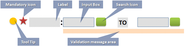
Figure 3
Input parameter with element details
What to do:
- Always provide labels as well as clear input directions for each input field
- Wherever possible, provide default values for the input fields
- Make sure the input field is only as long as needed for the input
- Always place the cursor in the first data entry field
- Use a consistent data entry input elements sequence (Figure 3)
- Provide essential action buttons for the data entry form (Figure 4)
- Design action buttons that support data entry operations such as SEARCH, SUBMIT, CREATE, DELETE, RESET, CLOSE, and CLEAR
- Design an appropriate UI for single and multiple selections of input values. Appropriate use of radio buttons, check boxes, drop-down boxes, and list boxes can speed up input entries.
- Design data entry transactions to minimize use of the Shift key
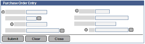
Figure 4
Data entry form layout (two column layout)
Avoid:
- Positioning input parameter elements close to other input parameters. Otherwise it might be difficult to read the form.
- Displaying message lines that do not indicate which data entry input field caused an error. This forces the user to keep guessing which input field might be the culprit.
Table Layout Base Data Entry
Repetitive data entry is generally handled using table UI. Simple but effective use of table UI design can increase task execution speed with less effort.
What to do:
- Identify mandatory columns and place them first from left to right
- Use column header labels that clearly indicate the data requirements in the columns. Provide an appropriate tooltip to guide users about the format for the data.
- Provide inline format or default values in respective records fields
- Wherever possible, use basic UI elements to speed up data entry. For example, use drop-down lists, radio buttons, date selectors, and check boxes.
- Provide auto-tabbing functionality to allow users to move through the fields smoothly
- Ensure that table display is consistent in data entry and reporting mode
- Support mass data modifications with a system acknowledgement of the number of rows affected
- Ensure that error messages related to a set of records include the record numbers for quick identification
- Implement table scroll so the column header is always visible
- Operations such as sorting and searching should be provided only for required fields
Avoid:
- Free or paginated scrolling that loses column and row references
- Operations such as sorting and searching should be provided only for required fields
Mass Upload Data Entry
Mass data upload enables faster data entry. Generally applications allow mass data upload via Excel, comma separated value (CSV) lists, or text files. Using the appropriate upload sequence helps the user reduce errors and perform quick operations (
Figure 5).
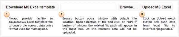
Figure 5
Mass data upload operation sequence
What to do:
- Provide help text that guides the user to uploading mass data
- Always provide an Excel template file download feature that guides the user to enter the data in the required field sequence and data format. This helps users avoid potential errors when uploading data.
Avoid:
- Using an improper grouping of UI elements that does not clearly convey a typical upload sequence. For example, in Figure 5 if you place the Download MS Excel Template button next to or immediately before the Upload MS Excel button, you can confuse the user about the correct upload sequence.
Search Functionality
Unlike Web sites, business applications are designed to facilitate the search for business information, which enables the user to quickly identify and correctly use input data for a business task. Proper use of search functionality can help users quickly search data (
Figure 6).
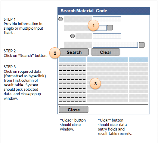
Figure 6
Three-step approach to search functionality design
What to do:
- Encourage combinations of inputs that lead to more accurate results and reduce result records. For example, to search for an employee, provide First Name and Last Name as input parameters.
- Always use the first column of the result records table to represent the values and order (ascending or descending) that the user wants
- Design system response as messages that will help users when no match is found for the given search criteria
- Appropriately design the action buttons’ visual properties to avoid accidental hits that can slow your system down
Avoid:
- Designing multiple pop-up screens for nested search operations. Multiple pop-up screens cause the end user to lose focus, which results in users becoming disoriented trying to follow the navigation.
- Using too many columns in the result record table. Those may not be of interest to the users and they reduce system performance.
Business Application Screen Layout Design
SAP business application screen layout designs are based on well proven layout patterns. A basic understanding of these patterns can help you build better applications.
What to do:
- Place the most important and frequently used features and functions close to the center of the screen, not in the far left or right margins
- Place primary items consistently and preferably on top of the screen
- Identify which content is not needed often, such as an advanced search option. For this content, use the collapse and expand display function or the skip feature.
- Establish the importance of information from high to low and place the information on the screen accordingly. For example, prerequisites documents such as Vendor Invoice copy should appear higher on the screen.
- When multiple steps in a task flow over multiple screens, provide a map of the steps so users can tell where they are in the process. Bread crumb UI is popular and widely used for this.
- Use consistent alignments across all screens. For example, all error messages should align left. All action buttons related to tasks should be on the bottom left of the section or page.
- If a screen is only for reporting or display purposes, show only the relevant data to the users and provide them sort and filter options. Structure the screen layout so users can easily see similarities, differences, trends, and relationships within the data.
Avoid:
- Designing page layout design that requires horizontal scrolling
- Displaying too much information that a user might ignore
User Orientation Through Navigation
Not all business tasks follow a sequential execution of activities. Depending on the status of execution parameters, tasks may need to follow various navigation paths.
What to do:
- Always label your navigation clearly
- Provide links for navigating to home, previous, and next screens
- Use navigation link labels that clearly differentiate between internal and external links. External links should clearly indicate to the user that clicking the links takes them to different applications.
- Design navigation that enables users to return to the application’s first screen or landing page no matter where they are in the process
Avoid:
- Using auto progress to the next screen design, which prevents users from correcting inputs on previous screens
- Displaying internal and external links in the same navigation feature
Select the Correct UI and Use It Correctly
In the UI design process, you should clearly define necessary UI elements and their properties.
What to do:
- Carefully select hyperlink and action buttons for the appropriate purposes. Hyperlinks indicate navigation whereas buttons indicate actions. Use closely matched links, labels, and destination targets, which provide the necessary feedback to users that they have reached the intended page. For example, a link with the label “Click here to exercise more payment options in the payment section of this form” clearly indicates destination and purpose.
- Use text links rather than image links as a first choice
- Make text links long enough to be understood, but short enough to minimize wrapping
- Display a series of related items in a vertical list rather than as continuous text. Order items so that important items are at the top of the list. Make lists easy to scan and understand.
- Use bullet lists to present items of equal value and numbered lists if a particular order to the items is warranted
Avoid:
- Using action buttons for toggles
- UI items that are not clickable should not have characteristics that suggest they are clickable. For example, avoid underlining plain text so that it does not look like a clickable hyperlink. Similarly, provide sufficient cues to clearly indicate to users that an item is clickable. If any part of an image is clickable, ensure that the entire image is clickable or that the clickable sections are obvious.
- Using input UI components for display-only data
- Using interface design that opens too many levels of pop-up screens
- Using check box controls to activate a negative operation.
- Featuring embedded links that use the surrounding text to add clues about the link’s destination. Users tend to ignore the text that surrounds embedded links.
System Responsiveness
In some scenarios, business applications run slowly as a result of unavoidable technical difficulties. That can annoy users if you do not let them know that it is an expected system response. The following precautions can help in those situations and improve user confidence.
What to do:
- If the back end takes over the processing, make sure to provide immediate feedback to the user. For example, use a Flash message that states “We request your patience, we are verifying stock availability” on top of the screen when a user clicks an item from a catalog.
- Always use an appropriate visual change that acknowledges when users click action buttons. For example, when a user clicks the Submit Leave Application button, the button’s background color changes.
- Design appropriate busy, working, and progress indicators that indicate the background process status
- Design message text that quantifies progress either in percent complete or by the number of actions completed. For example, you can use a progress bar in the status area to show how many records are complete out of the total number of records.
Avoid:
- Using static images for wait or similar messages because that approach does not provide enough information to the user, such as how long the wait period is
- Displaying technical information about application background processing details. Such information does not help the user understand what’s happening.
Although I’ve provided general guidelines, certain technical constraints may make it difficult to follow some of them — for example, designing a progress bar that indicates system back-end activity for a number of records modified as against total number of records under modification. In that case, the developers and designers should try to achieve a balance between the technical capabilities and usability. A guideline list can be a reference for a designer analyzing an existing application. The list can act as a tool for crafting an interface design and can serve as a checklist for developers when they are creating a new set of applications.
These guidelines are for applications that aim to achieve business tasks performed by internal user communities such as employees, buyers, planners, and finance and business analysts, and external users such as suppliers or customers. However, the scope is not restricted. You can enhance the guidelines further depending on your needs. Having a guideline helps to ensure you make the right decisions the first time around and reduces the possibility of errors and costly mistakes when building the application.
Sandesh Darne
Sandesh Darne is a senior lead for the Consulting ERP Practice at L&T Infotech, India. He leads a group of senior consultants whose primarily focus is on SAP upgrades and SAP usability consulting services. He also directs the SAP NetWeaver Portal and the SAP Center of Excellence, which focuses on excellent practices in organizations. He is certified in SAP NetWeaver Business Warehouse 3.5. He has also worked in the product development department of L&T Infotech where products such as ZoomUP, eALPS, and CodeReview were built and used as accelerators for SAP upgrade projects.
You may contact the author at
sandesh.darne@lntinfotech.com.
If you have comments about this article or publication, or would like to submit an article idea, please contact the
editor.