Learn how to use SAP Lumira in conjunction with a geographical information system (GIS) to easily and efficiently carry out geographical/geospatial analysis. Learn how to more effectively answer data-related questions using geospatial analysis.
Key Concept
The best visualization tools available offer
map/geographical information system (GIS) features. Such applications integrate data with geographic information (such as city, state, country, latitude, longitude, and so on) to provide a way to visualize and analyze data. SAP Lumira has enhanced its offerings in its latest releases and now provides users the ability to incorporate GIS functionality.
A picture is worth a thousand words, as the old adage goes. And no picture is more powerful than the one that incorporates maps (assuming your data contains geographical components). In this article, I provide step-by-step directions for incorporating Geographical Information Systems (GIS) capabilities into your BI data, sharing details how to build geospatial analysis capabilities in your enterprise using SAP Lumira.
In my previous
BI Expert article, “
Enhance your Visualization and Analytical Capabilities with for Accounts Receivable Aging Using SAP Lumira,” I wrote about how a Fortune 500 company used the visualization and analytical capabilities of SAP Lumira to get a better handle on its sub-optimal accounts receivable (A/R) tracking process. That was the first step in Company XYZ’s journey from having a virtually non-existent analytical framework to using SAP Lumira’s visualization and analytical tools for business users. The second step in the company’s evolution entailed the introduction of geospatial capabilities that enable users to see the various geographical components of the data on a map, which is discussed here.
Note
The SAP Lumira-specific screen prints in this article are from
version 1.28. Enhancements to SAP Lumira are being made rapidly, so it
could be that newer versions may be available by the time you read this
article.
While SAP Lumira only has basic, pre-packaged GIS capabilities as of
the current release, there are many ways you can circumvent this
limitation. And what does this really mean from a user perspective?
Let’s try and understand this in the next section.
Note
SAP has made incorporating GIS capabilities easy by collaborating
with third parties. Just last year, SAP formalized a relationship with
ESRI (maker of the ArcGIS GIS tool). It announced its partnership with
ESRI for the SAP HANA platform as well as the GIS extensions to SAP
Lumira (
https://global.sap.com/news-reader/index.epx?category=ALL&articleID=23255&searchmode=C&page=1&pageSize=10).Other GIS applications/tools (such as Galigeo) also work in tandem
with SAP Lumira. I’m using the ArcGIS tool as the example GIS software,
but using ESRI is not the only way to realize advanced GIS functionality
in SAP Lumira.
How Does SAP Lumira Work with GIS Tools?
How SAP Lumira works with GIS is a question that I’m asked frequently by business users. The answer is shown in
Figure 1.
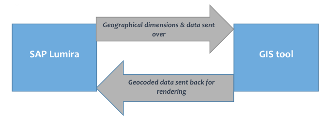
Figure 1
Interaction of SAP Lumira with GIS tools
Basically, after you create your dimensions and select the GeoMap chart type, the system calls the GIS server. The geographical data that is passed along (such as street address, city, and country) is then validated against the GIS’s comprehensive databases. All the validated data is then geocoded and sent back to SAP Lumira for rendering. For the business user, this entire process is hidden and it appears as though it is one application.
Introduction to the Data
For this article, I am using the same dataset I used for
my previous article for the sake of continuity. Here are the key aspects of the dataset:
- I am using accounts receivable (A/R) data from the SAP ERP Central Component (ECC) table for open A/R items (table BSID). The data includes geographical data elements such as city, state, Zip Code/postal code, and so on.
- Sensitive components of the data, including customer names, are masked.
- I have truncated the original dataset to a manageable 1,000 records. The primary objective of this initiative is visualization and not volume.
- The addresses in the data are real in order to get accurate geocoding results.
First, you need to provide to SAP Lumira the information about which GIS server you are using. Once you’ve done that, when you launch SAP Lumira and choose the Preferences menu item, you see the pop-up window shown in
Figure 2.
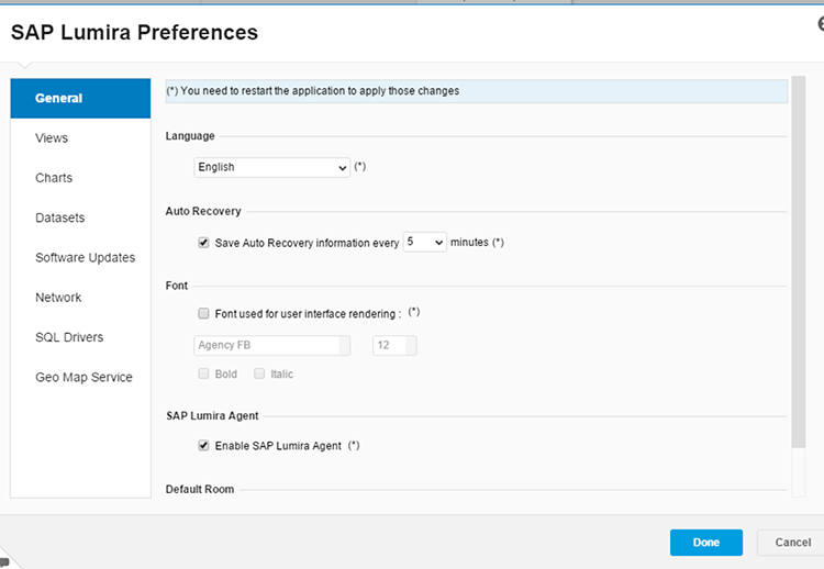
Figure 2
Setting up preferences in SAP Lumira
Click the Geo Map Service link and the screen shown in
Figure 3 opens.

Figure 3
Provide credentials for connecting to your preferred GIS server
Check the box next to your preferred GIS server (Esri ArcGIS Online, in my example) and enter your credentials. These are the same credentials you used to create your GIS server account. After you have done that, click the Done button and you’re taken to the SAP Lumira application. Once you are inside, the next step is to extract your data.
As stated previously, I’m using the A/R dataset that I used for my previous article. I will not walk you through the steps for extracting the data, other than to say that this data has geographical dimensions such as street name, city, zip code, and country. These will be the inputs to the GIS server where the necessary geo-coding is done for the data, and then the geo-coded data is sent back to SAP Lumira.
Ensuring Data Readiness
Before sending the data off for geographic rendition, you should do a final check of your data to make sure that the afore-mentioned geographical data elements (such as address) are indeed in your extracted dataset.
Figure 4 shows the fields I selected for visualization. Note that this dataset has quite a few geographical fields. It does not have latitude and longitude information but for your initial analysis, this amount of information is sufficient.
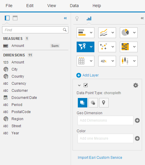
Figure 4
Set the data dimensions for the visualization
SAP Lumira automatically flags the city, country, and region as geographical dimensions (noted by globe icons under the Dimensions section in the left of
Figure 5). The next step is to select a geographical chart type. You do this by clicking the map icon

, and selecting from the drop-down options that appear. As of the current release of SAP Lumira (version 1.28), you have the choice of one of four options, as shown in
Figure 5.
Figure 5
The initial geo-map display
In this example, I selected the Geo Map option, which invokes the GIS tool you’re using. You can select one of the other three options but those options are less powerful since they are native to SAP Lumira.
Note
One common glitch with this step, especially when you are using it for
the first time, is a connection failure to the GIS tool’s server. Make
sure that your connection settings are correct. You need to configure
these using the following navigation: File > Preferences > Geo Map
Service.
Readying and Fine-Tuning Geographical Metadata
Now that you are connected to the GIS tool, you need to map the geographical dimensions in your dataset to correspond to your tool’s geographical dimensions so that the GIS tool can do the geo-coding for you and render the geographical data on the map. For this, you need to create a geographical hierarchy. To be able to map geographical fields in your hierarchy that SAP Lumira has not identified as geographical dimensions, place your cursor on one such field. In this example, I place the cursor on the Street field (
Figure 6). Right-click and select Create a geographic hierarchy… and then the By Names option.
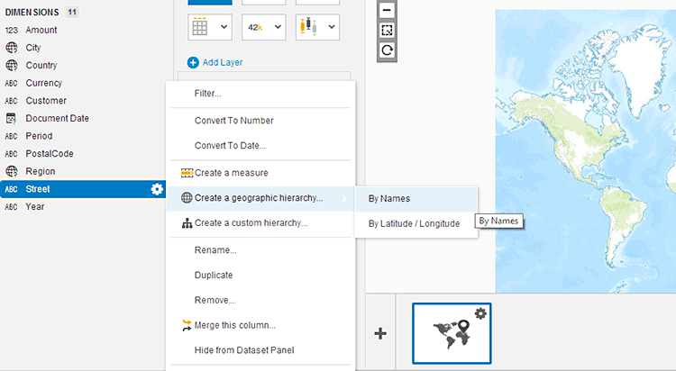
Figure 6
Create a geographical hierarchy by name
A pop-up screen opens (
Figure 7) where you select the appropriate options from the drop-downs for each field. Note that you are free to experiment with these fields and map different fields than what is shown in the figure—you might discover something new. In this example, I’m using the logical geographical hierarchy. Once you’re satisfied with your selections, click the Confirm button.

Figure 7
Add the dimensions to create a geographical hierarchy
This opens a screen like the one in
Figure 8, where you can see a summary of the output.

Figure 8
Validate the output of geographical data
Here you can view the data and get a snapshot idea of the overall content of the data. In this case, I choose to sort the data by Not Found. In this dataset of about 18,000 records, SAP Lumira identified 1,059 unique addresses and validated 507 of these. However, as you can see, the SAP Lumira system was not able to validate some of the addresses and flagged those as Not Found. Review the data and it should quickly become evident why these have failed validation. Some typical issues are missing street names or the street names that are in an incorrect format. Go back to the source data and correct any inconsistencies, and then refresh the SAP Lumira system with the now-clean data.
Note
Almost each time I have set up similar prototypes for companies, I’ve
come across issues with bad geographical data (or sometimes even bad
customer or vendor master data). This is always an eye-opener for the
company and has helped them realize the truth of this phrase in data
analysis: Garbage in, garbage out. This realization also often leads to
implementing corrective measures quickly, thereby resulting in more
accurate visualization and analysis and a better use of SAP Lumira.
Basic Geospatial Analysis
Now that you have created a geographical hierarchy, this new dimension is available to you for selection. Back in the screen in
Figure 5, expand the Add Layer section and make sure the check box underneath it is checked. Then select choropleth as the Data Point Type. Starting the basic geospatial analysis at the highest level (e.g., country), drag and drop the country dimension from the geographical hierarchy on the left into the geographical dimension on the right. Since you are analyzing A/R amounts, add the measure Amount to the Color dimension box for meaningful visualization. Once you’ve made your selections, the map is refreshed automatically and a screen like the one in
Figure 9 opens with the geographical map created using your GIS tool.
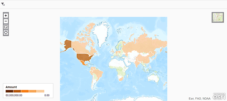
Figure 9
Geographic display based on A/R amounts per country
So what does this map show, exactly? A lot, actually. Here some of the key things that can be deduced from looking at this graphic:
- North America has the highest outstanding A/R balance.
- It is clear that, based on this data set, the only very large country where the company is not showing any business at all is Australia.
- Mouse over the map and you can see the outstanding balances per country are displayed. You can now analyze the magnitude of these balances and determine the corrective action that needs to be taken.
Create a Bubble-Chart Visualization Based on Location
Now let’s go one level deeper and create a visualization based on city, and let’s switch from the choropleth chart type to the bubble chart type (where points on the map are displayed as bubbles). This time, select City from the Geo Dimension field drop-down options (created from the geographical hierarchy you created earlier). To control the size of the bubbles, you need to assign measures using the Size field. In this case, Amount is the only numeric field, so select this field. A cool feature of this map functionality is that you can control the color of the data points on the map by selecting one of your dimensions. Since this analysis is centered on A/R balances, it would be appropriate to visualize the amounts on the map color-coded by document date. Drag the Amount field from the left and drop it to the Color field (below it). The map on the right refreshes automatically, and you can see the change on the right of
Figure 10.

Figure 10
Geographic visualization with city dimension, sized by amount and color-coded by document date
As you mouse over the bubbles on the map, the names of the cities, the outstanding amounts, and the document dates are displayed. The one bubble that immediately catches my eye is the big light-green one in Europe. As I mouse over this bubble, it displays the information that there is a significantly large payable from a customer in Luxembourg. This helps in taking prompt follow-up action. In this case, Company XYZ’s A/R department shared this information all the way up to the CFO and quickly generated the appropriate dunning letters.
You may now decide to have the data points colored using a different field other than the document date. This is simple to do. Go to the Color field in
Figure 10 and delete the currently assigned field (Document Date). Then select your desired field by clicking the plus sign (+) next to the field (not shown). This opens the list of drop-down options where you can select the field you want to add. In this example, I select Customer. Doing so allows shows the outstanding amounts per customer as the mouse hovers over the bubbles.
Figure 11 displays a static view of this with the cursor placed on one of the data points in New Zealand. The mouse-over display shows that BOQ Inc. in Auckland (a fictitious company) has an outstanding amount of $53,353.31 that needs to be dunned.
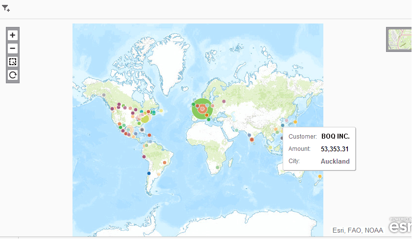
Figure 11
Geographic visualization with the city dimension, sized by amount and color-coded by customer
Filtering Geospatial Data
Now let us move onto filtering on geospatial data, which is a lot of fun. This visualization and analysis technique helps focus your attention on that segment of the data that is of highest importance to you. Your A/R department is interested in learning about customers who have an outstanding balance of at least $100,000 and where they’re located. First, change the Color field back to Customer as the driver of the color of the data points. Then click plus-sign icon—the filter icon—to add a filter, which opens a pop-up window with a list of the available Geo Dimensions (
Figure 12).
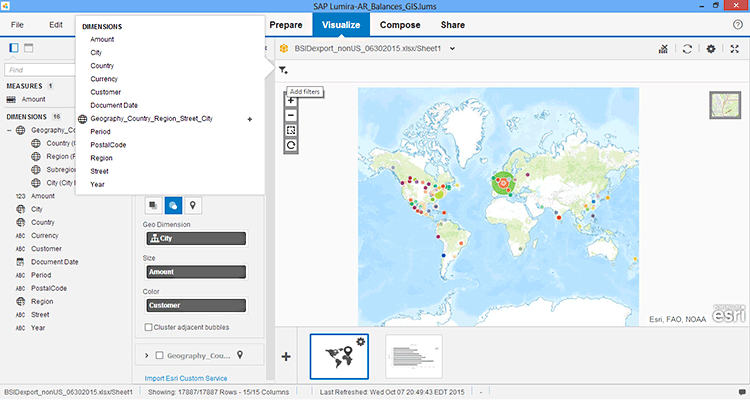
Figure 12
Navigate to the filtering function in the geo-map
From the list, click the Amount dimension. This opens the Amount pop-up screen (
Figure 13) where you can either enter a minimum or maximum amount manually, or move the sliders to the desired location. In this case, I enter 10,000 on the left. Note that I could have moved the slider to the right, but getting the exact amount on the slider when you have such a vast range is hard. (The larger number on the right, 221694219.9, is the total amount of all the outstanding A/Rs for all the customers.) Now click the OK button and you can see that the number of data points in the map has gone down, as shown on the map on the back right of
Figure 13.

Figure 13
Create a filter for Amount
Looking at this map, you now know that the U.S. has multiple customers who owe money above the threshold of $100,000, and there are two customers in South America who are over the threshold. When you mouse over these bubbles, the names of these customers are revealed.
The company’s A/R team started filtering to get similar information for other thresholds and gain a better understanding of where the A/R balances are locked up and to make decisions based on this information.
Anurag Barua
Anurag Barua is an independent SAP advisor. He has 23 years of experience in conceiving, designing, managing, and implementing complex software solutions, including more than 17 years of experience with SAP applications. He has been associated with several SAP implementations in various capacities. His core SAP competencies include FI and Controlling FI/CO, logistics, SAP BW, SAP BusinessObjects, Enterprise Performance Management, SAP Solution Manager, Governance, Risk, and Compliance (GRC), and project management. He is a frequent speaker at SAPinsider conferences and contributes to several publications. He holds a BS in computer science and an MBA in finance. He is a PMI-certified PMP, a Certified Scrum Master (CSM), and is ITIL V3F certified.
You may contact the author at
Anurag.barua@gmail.com.
If you have comments about this article or publication, or would like to submit an article idea, please contact the
editor.