Get to know Xcelsius, a BusinessObjects tool that you can use with SAP NetWeaver BI to create dashboards quickly. See how to set up a simple dashboard, from preparing the Excel file to customizing the dashboard design.
Key Concept
A dashboard is a visual representation of data either in summarized or granular format in the form of sliders, graphs, maps, and dials. It can have a single source or multiple disparate sources and aids in easy analysis, sophisticated simulation, and effective decision-making.
Decision-makers need to make sense of the huge volumes of data at their disposal, quickly grasp the story that the data is trying to tell them, and react with alacrity. Visualization tools help facilitate this process by providing users not only with information organized in a concise, understandable manner but also the ability to run “what-if” analysis that is so important for projecting and forecasting. They drive analytics. I think of these value-added tools as the icing on the BI cake. Of all the various data visualization techniques that are available today, none is more effective (and attractive) than dashboards.
If your enterprise is running SAP BW 2.x or higher (including SAP NetWeaver BI 7.0) you know that you can create dashboards that are fed data from a BI system. Until SAP BW 3.5 (when the process of creating dashboards was somewhat simplified with advanced controls in the Web Application Designer [Web AD]), creating a dashboard in BI required a lot of manual work.
In addition to creating dashboards, there was also the maintenance effort involved. In SAP NetWeaver BI 7.0, the effort needed to create dashboards has been significantly curtailed since the introduction of Visual Composer. Among other things, Visual Composer, in conjunction with the SAP NetWeaver Composition Environment (CE), allows creation of dashboards to sit on top of a BI query. However, there is some effort required and you need some familiarity with SAP NetWeaver technology.
Xcelsius, a data visualization and dashboarding application from Business Objects, an SAP Company, can simplify these tasks. With Xcelsius, you can just feed the data to an application, create dashboards, and perform analysis on the fly with high visual impact. If you are a heavy user of Excel, gaining proficiency in Xcelsius is relatively easy.
Xcelsius: An Introduction
To understand why Xcelsius is easy to use, it is important to understand its genesis. The first version of it was designed by the Becerras, a father and son team. The father had suffered the illogical world of corporate presentations that presents voluminous data without much of a message. The son is the creator of several popular videogames. The net result of the collaboration of the Becerras is Xcelsius, which contains a liberal dose of videogame technology.
Figure 1 shows a historical timeline that maps Xcelsius' evolution. As you can see , the product has changed a couple of times. Business Objects acquired Infomersion in Q4 of 2005. SAP later inherited this application when it acquired Business Objects in early 2008. The current release is 8.0 and it comes in four different editions:
- Xcelsius Present
- Xcelsius Engage
- Xcelsius Engage Server
- Xcelsius Enterprise

Figure 1
Xcelsius time line
Here's what happens from a technical standpoint:
- You can import data into Xcelsius from a variety of sources, such as Excel spreadsheets, BusinessObjects Universe, Web services that are SOAP compliant, and databases that are XML compliant
- You design a dashboard (as shown later in the article) and bind the imported data to the controls in your dashboard
- The dashboard data is sent to various media such as the Web, PDF file, MS PowerPoint, Word, Outlook, and SharePoint. An Adobe Flash file with the extension .swf encapsulates this output.
Tip!
One noteworthy feature of dashboard dissemination is that the recipient of this Flash file does not need Xcelsius installed to view the contents. You just need Adobe Flash Player, which is free and downloadable from Adobe Systems.
How Xcelsius Is Integrated in SAP NetWeaver
Now that you have been introduced to this application, you are probably interested in knowing how you can create dashboards that accept data from an SAP NetWeaver system. In the “Resources” sidebar, I have provided a link to a series of blogs that walk you through every step of installing and configuring Xcelsius to sit atop an SAP NetWeaver system. Basically, once you have installed and configured the necessary components, you should be able to extract your data from an SAP NetWeaver system and build dashboards that add value to this data. In fact, SAP has made it convenient to build dashboards on top of a Visual Composer application by integrating Xcelsius with Visual Composer in the NetWeaver Composition Environment (CE).
If you are interested in installing Xcelsius without connectivity to an SAP NetWeaver system, you have a few options. For an understanding of these different options, the hardware and software pre-requisites, check out the Xcelsius installation document at https://help.sap.com/businessobject/product_guides/. Look for the document titled “Crystal Xcelsius Designer 4.5 – Installation Guide.”
In terms of SAP's roadmap for dashboarding and visualization, it is working on an integrated product (currently named Xcelsius+), which is slated to become its primary product in this space sometime in 2009 or 2010. In fact, at this time, SAP is not planning on providing any further enhancements to BEx Web Application Designer in future releases of SAP NetWeaver. For a detailed overview of SAP's roadmap for its BI components, please check out this PowerPoint presentation from the SAP NetWeaver BI Product Management team at https://www.sdn.sap.com/irj/sdn/go/portal/prtroot/docs/library/uuid/10c3bca6-7dbc-2a10-7aa8-81d2731c7bb1 titled “Extending the Value of SAP NetWeaver BI with Business Objects Business Intelligence Platform.” Note that this roadmap was last updated in August 2008 and is subject to change.
Xcelsius (8.0) Design Interface
Figure 2 shows the intuitive and user-friendly design interface. The initial design interface consists of several panels . For the sake of easy identification, I have demarcated each panel with a different color. The panel with the red boundary is the Components panel. Figure 2 displays a partial listing of all the elements you can use to build your dashboards. It is arranged in the form of tabs. Each tab contains a list of elements relevant to that particular area. For example, when you click on the Single Value tab, you find a list of elements such as sliders, gauges, dials, and progress bars that you can use to build your dashboard.
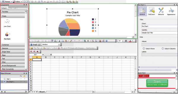
Figure 2
Initial Xcelsius screen
The panel with the green boundary is your dashboard layout builder. You drag your dashboard elements from the Components panel and drop them into the layout panel. This adds the element or object to the panel with the blue boundary — the Object Browser. In the example in Figure 2, I dragged and dropped a pie chart into the layout builder. This automatically populated the Object Browser with the pie chart object. The Object Browser is a hierarchical representation of the various elements in your canvas and it allows you to perform various operations on them.
The panel with the black boundary is the area where you customize the appearance and behavior of the elements that you have dropped into the layout editor. You can also set up alerts for each of the elements. In addition, you can customize the properties of the entire canvas when you click on an area outside of an element. This application populates this panel as you place your cursor on a particular element in the layout builder.
At the bottom of this panel is a panel called Quick Start. It provides you with guidance to quickly create a simple dashboard. Those who are new to Xcelsius are likely to find this feature very useful.
Finally, the panel that I've not bounded by any color is the one that provides integration with Excel spreadsheets. One of the most common ways of building a dashboard in Xcelsius is by either importing a spreadsheet (which then populates the spreadsheet in the Xcelsius screen) or building your own spreadsheet directly in the application.
Create a Simple Dashboard for “What-If” Analysis
In this section, I will walk you through a very simple “what-if” analysis, an area for which Xcelsius is ideally suited. Let's do a “what-if” analysis on the impact to profit when revenue and expenses change. Your simple dashboard has three key performance indicators (KPIs): revenue, expenses, and profit. The entire exercise should take you no more than 10 minutes, even if you are a novice. Here are the steps that you need to take.
Step 1. Populate your Excel spreadsheet. Figure 3 shows the data I am using for my example. Set the Profit cell as the difference between the revenue and expenses.
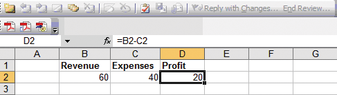
Figure 3
Spreadsheet with data for the dashboard
Step 2. Set up the dial. Drag-and-drop the dial element from the components panel on to the canvas as shown in Figure 4. Place your cursor on this dial and on the properties tab on the right. Bind this dial to the revenue value.

Figure 4
Create a dial for the Revenues KPI
To give the dial the same title as the one on the spreadsheet (Revenue), place your cursor on cell B1, click on the red arrow next to the Title box in Figure 5, and click on OK in the pop-up window. The title of the dial now changes to Revenue. Now bind the data to this dial by placing the cursor on cell B2 and clicking on the red arrow next to the Data field in Figure 5. Click on OK in the pop-up window. The dial now displays the current value of 60 at the bottom. Adjust the scale of the dial as you desire. I selected Manual and set a minimum value of 20 and maximum of 200 for this KPI to keep the example simple.

Figure 5
Binding static spreadsheet data to dial
Step 3. Customize the dial behavior. While still in the Properties panel for dial 1, click on the Behavior menu item to customize the behavior of this (Figure 6). To keep things straightforward, I'll customize the most relevant aspects. Set the Increment to a number of your choice. I set this to 20 and selected Major ticks. Finally, I selected the Adjustable option for both the maximum and minimum limits. As a result of these customizations, the ticks and the maximum and minimum values are displayed in and around the Revenue dial.
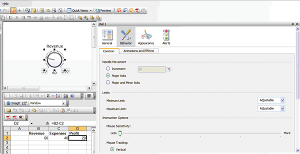
Figure 6
Customize the behavior of the Revenue dial
Step 4. Set up the Expenses dial. Repeat steps 2 and 3 for the Expenses KPI with the relevant values and properties. When you complete these steps, your layout canvas should look similar to the one shown in Figure 7.

Figure 7
Revenues and Expenses KPIs on layout canvas
Step 5. Set up the Profit dial. Repeat steps 2 and 3 for the Profit KPI. The only difference between the previous two KPIs and profit is that I used a gauge instead of a dial (Figure 8). Xcelsius provides myriad controls that you can select. Dashboard design is also about aesthetics and personal choice, so different individuals are likely to choose different controls. Users set the minimums and maximums. You can set them to any upper or lower limit to convey the relationships among the KPIs in a more meaningful manner. Within these values, you can keep adjusting the values.

Figure 8
Layout editor with all three KPIs
Step 6. Save your work. Make sure to save the file with the .xlf extension. Now click on the Preview button to generate the file with the .swf extension. Your dashboard is now ready for your “what-if” analysis. Move the hands on the revenue or expenses dial and notice how the profit value changes appropriately. As you move the hand on each dial, the value at the bottom changes to show you the current value. Similarly the value of the affected KPI (Profit) is also displayed at the bottom of the dial. As an example, when I changed the value of revenues to 90 and expenses to 15, the application automatically adjusted the profit value to 75 (Figure 9).

Figure 9
Generated dashboard with the three KPIs
Although these dynamic changes cannot be shown in an article, I hope you now have a feel for how easy it is to create a dashboard in Xcelsius and, more importantly, the many possibilities that this presents. In a future article, I will discuss the various Xcelsius products and also show how you can implement a more sophisticated executive dashboard that accepts data from an SAP NetWeaver system.
Anurag Barua
Anurag Barua is an independent SAP advisor. He has 23 years of experience in conceiving, designing, managing, and implementing complex software solutions, including more than 17 years of experience with SAP applications. He has been associated with several SAP implementations in various capacities. His core SAP competencies include FI and Controlling FI/CO, logistics, SAP BW, SAP BusinessObjects, Enterprise Performance Management, SAP Solution Manager, Governance, Risk, and Compliance (GRC), and project management. He is a frequent speaker at SAPinsider conferences and contributes to several publications. He holds a BS in computer science and an MBA in finance. He is a PMI-certified PMP, a Certified Scrum Master (CSM), and is ITIL V3F certified.
You may contact the author at Anurag.barua@gmail.com.
If you have comments about this article or publication, or would like to submit an article idea, please contact the editor.