SAP Analytics Cloud (formerly SAP BusinessObjects Cloud) is SAP’s one-stop shop for the analytical needs of a company. Learn how to use SAP Analytics Cloud to do comprehensive, in-depth geographical or spatial analysis that accelerates your decision-making process.
Key Concept
SAP Analytics Cloud offers a suite of geographical or spatial features and functions that enables both the analyst and casual user to visualize their data in a spatial context. The ability to layer multiple types of data helps users ask questions they never really thought to ask and get insights into what their data means in various spatial contexts. These features enable companies to make strategic decisions by quickly detecting patterns and anomalies.
SAP Analytics Cloud is SAP’s sofware-as-a-service (SaaS) offering for data integration, planning, and analysis (both historical and predictive), all made available in a single application to which you subscribe. This application does not require you to buy or install any SAP software, and there aren’t any technical prerequisites involving SAP applications or any other software that you need to fulfill. All you need is a subscription to SAP Analytics Cloud and access to a browser. SAP Analytics Cloud also allows you to work with data from various sources.
Incorporating geographical visualization capabilities in your data and enabling users to analyze such data in a geographical or geospatial context allows you to accelerate your analysis, detect patterns hidden in the data, and thus gain insights that you would otherwise be challenged to obtain. I provide you with a real-life scenario of geospatial analysis using a specific scenario after a technical overview of the engine that enables geoprocessing and geo-analytics?SAP HANA.
SAP HANA and Geospatial Processing for SAP Analytics Cloud
So what exactly is spatial or geospatial processing and when is an application deemed to be a geospatial application? In general, the following conditions must be fulfilled:
- Display and support of raster- or grid-based and vector-based (lines and polygons) elements
- Resolution of address inconsistencies
- The ability to create multiple layers of geospatial information or overlays
A geospatial application needs to be able to use geoprocessing capabilities as well as store and manipulate geospatial data. Spatial databases are optimized for geoprocessing and storing geospatial data. Most of the commonly used database products are not spatial databases, but have incorporated a library of geospatial functions and generally behave like one. So the most logical question that comes to mind is whether SAP HANA is a spatial database. That remains a matter of opinion, but suffice it to say that starting with Support Package Stack 08, SAP has incorporated spatial functions and this library continues to expand. Today, SAP HANA provides a spatial library that allows you to process, enhance, and store geospatial data regardless of the source, volume, and complexity.
Business Scenario
A recent client of mine put forth a business scenario: Is there any correlation between the location of Starbucks cafes in the United States and the amount of rainfall as well as number of rainy days in a year in those and surrounding areas? And how easy or hard would it be to demonstrate that correlation visually? Basically, the client had a use case (i.e., the impact of weather conditions on consumption of one of its flagship products) and wanted to be knowledgeable about whether this analysis could be done in an SAP system and if so how. On seeing how popular Starbucks was with the company’s employees, the client decided that it would present an engaging, relatable, and analogous use case.
The answer to the first question hinged on availability of relevant data. Fortunately, a quick search for relevant data in the public domain yielded positive results. I was able to find location data of each Starbucks location in the United States. I was also able to find relevant rainfall data in the public domain. So now I moved on to addressing the second question. Not surprisingly, my client thought that geospatial analysis in an SAP system would either require a lot of legwork (installation, implementation, and configuration) or was not possible. With SAP Analytics Cloud, however, geospatial analysis of multiple datasets can be done in a relatively painless way. The legwork you need to do is limited to importing the datasets into the cloud environment and then “wrangling” the data (in SAP terminology) to meet your need for analysis and visualization.
Importing the Data and Creating a Model
I want to create an analytics model with dimensions and measures based on the data source. After I have created this model, I can reuse it every time I want to do any analysis. You can think of a model as an InfoCube in SAP BW. SAP Analytics Cloud generates a basic model off the imported dataset by automatically identifying the dimensions and measures. That way, you can focus on analyzing the data rather than becoming bogged down in the technical minutiae.
Figure 1
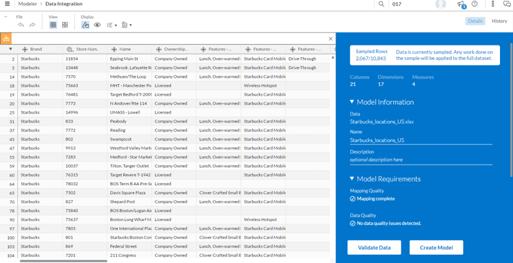
Figure 1
A preview of Starbucks location data in SAP Analytics Cloud
As part of the data manipulation, I carry out the following steps:
- Fill in the empty cells by doing a basic transformation of replacing blanks with some meaningful text such as Not known. Keep in mind that this is a good practice. Having blanks and unassigned cells does not make for more meaningful analysis.
- Check for data quality by running the Validate Data function for each of the dimensions. My data has some duplicates, so I took the necessary action to achieve uniqueness.
- Once all data quality issues are successfully resolved, click the Create Model button to have SAP Analytics Cloud generate a model for you. Make sure you give it a meaningful name so that you can easily search for and identify your model.
Note
To carry out geospatial analysis, you need to designate at least one
dimension as a location dimension. The field that you designate as a
location dimension should have some locational attributes such as a
complete address, part of it, or coordinates. Without a location
dimension, you are cannot do geospatial analysis. Read SAP Note 2433853
for details. I recommend that if your address data does not have
geographical coordinates, you should consider geocoding it in advance
using either SAP HANA Smart Data Access (SDA) or a geocoding transform
in SAP Data Services.
Figure 2

Figure 2
Sample of rainfall dataset
Preparing for Geospatial Analysis
Now that you have both your data and data models created in SAP Analytics Cloud, you are ready to prepare for geospatial analysis. On the SAP Analytics Cloud home page, click the main menu icon ![]() . From the menu that is displayed, choose the Create option and then Story to start your storyboard as shown in Figure 3. You can choose from a variety of storyboarding options. My preference for doing any kind of geospatial analysis is to use the canvas page option (circled in Figure 3).
. From the menu that is displayed, choose the Create option and then Story to start your storyboard as shown in Figure 3. You can choose from a variety of storyboarding options. My preference for doing any kind of geospatial analysis is to use the canvas page option (circled in Figure 3).
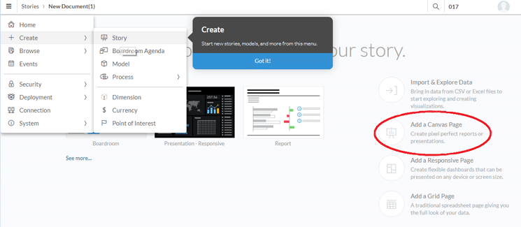
Figure 3
Set up your storyboard or canvas
You are taken to the next screen that shows the various options for adding objects to your storyboard or canvas (
Figure 4). GeoMaps is a component of SAP Analytics Cloud. Functionality from sources such as ESRI and Garmin is incorporated directly into SAP Analytics Cloud. You can use it out of the box. The geo-processing horsepower is provided by SAP HANA behind the scenes.
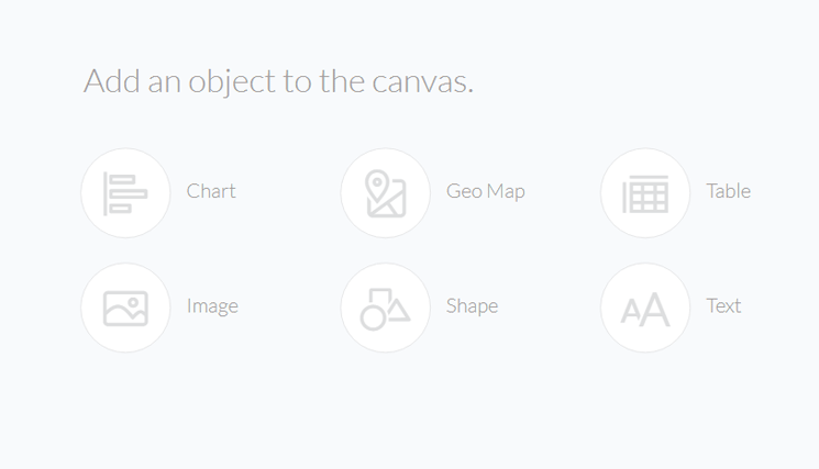
Figure 4
Add objects to your storyboard/canvas
Add a GeoMap to the canvas by clicking the Geo Map link. The system displays a canvas with a GeoMap. You now need to pick your model, select the layer type, and identify the location dimension. You can choose from various layer types, but the bubble type is the most appropriate for this display. Figure 5 shows both the GeoMap display of the Starbucks locations in a clustered mode as well as the design panel on the right.
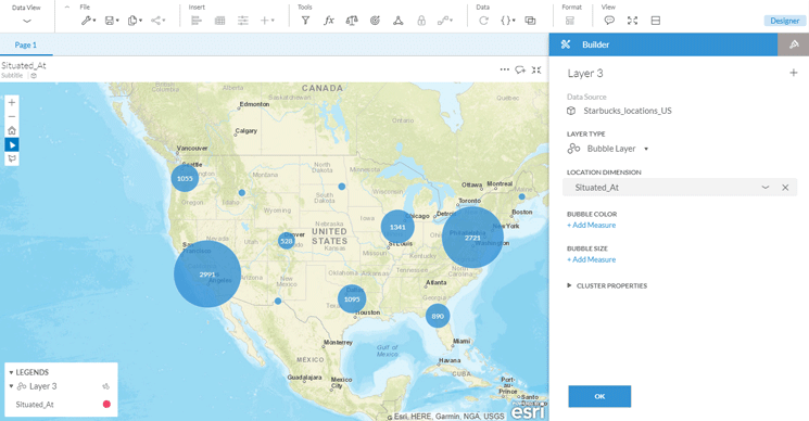
Figure 5
A clustered view of US Starbucks locations
Note that you can zoom in or zoom out using the + and - icons on the upper left corner of the GeoMap. If you are new to geospatial analysis, I suggest that you zoom in to assure yourself that you can view the Starbucks location at a more granular level. At a very strategic level, with just this dataset, a commonly held belief can be debunked: the Seattle area does not have the largest number of Starbucks cafés. Let’s say I’m interested in viewing at a more granular level the distribution of Starbucks cafes in the US East and upper Midwest regions. After zooming in, you see something like the map in Figure 6.
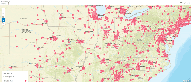
Figure 6
Starbucks locations in parts of US East and Midwest regions
My immediate inference is that there seems to be a dense concentration of Starbucks locations in and around major cities. This is one of the beauties of a good visualization tool: You uncover patterns that you were not necessarily pursuing. Sometimes, you detect unexpected patterns such as the fact that the Seattle area does not have the most Starbucks locations.
Now I am ready to layer in the second data set (i.e., the US annual rainfall by amount and number of rainy days per year for the largest 100 US cities). I do this the same way I did for the first dataset (i.e., by choosing my data model for rainfall). This brings into my canvas both the metadata and the data. I now identify the key characteristics of my geographical data (Figure 7).

Figure 7
Add the US cities rainfall layer
Here are a few comments on how I set up the various parameters. I chose the bubble layer since the other options would not really aid the correlation analysis. I chose a palette that is different from that of the Starbucks location palette. To aid in visualization, I chose the maximum number of ranges available (10) with the darkest hue for cities with the highest average annual rainfall with a sliding scale of the lightest for the driest cities. I did not want to control the size of the bubble because for now I wanted attention drawn to only one variable (i.e., average annual rainfall). The GeoMap is immediately populated with the rainfall information.
Carrying Out Geospatial Analysis
Now let’s look at the entire map of the US with both the Starbucks locations and annual average rainfall data by state layered in to it (Figure 8).
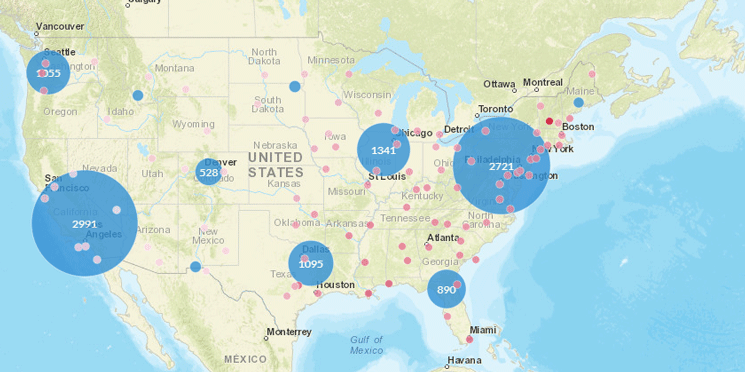
Figure 8
Starbucks locations and average annual rainfall data juxtaposed
Based on this visualization, I can say that at this level there seems to be very little correlation between the concentration or clustering of Starbucks locations and the amount of rain each of the cities gets. Some rainy cities in the Southeast seem to have very few Starbucks stores. I would now like to take my correlation analysis a level deeper and zoom in to cover a large swath of the continental United States. After zooming in and repositioning, I now can see things at a more granular level as shown in Figure 9.
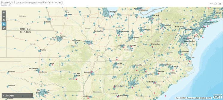
Figure 9
Correlation analysis at a more granular level
This is a more comprehensive view. My initial hypothesis of the minimal correlation between the number of Starbucks locations and average annual rainfall by city is strengthened. Cities such as Memphis and Birmingham have relatively high rainfall yet have very few Starbucks cafes compared with cities like Chicago, Baltimore, and Washington, D.C., all of which have a lot less rainfall yet have many Starbucks cafes. In the southern region of the United States, Houston and Dallas-Ft. Worth have a lot more Starbucks cafes for the (meager) amount of average annual rainfall they get compared with New Orleans.
I now include a second measure (i.e., the number of days of rainfall per year to control the size of the bubble for each city to analyze if there’s any correlation between this variable and the number of Starbucks locations). A partial view is shown in Figure 10.
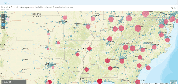
Figure 10
Combine both average annual rainfall and number of rainy days per year
Once again, I can quickly detect that there is no pattern or correlation between the number of rainy days per year of the top 100 US cities and the number of Starbucks locations.
Conclusion
The possibilities of an application like this are considerable. It allows you to experiment without the fear of making mistakes. More importantly, you gain deep insights into relationships that you did not know existed. As in my example, you realize that relationships that you thought existed are no more than perceptions or opinions not backed by facts.
More Information
Here are some good sources of information on this topic:
Anurag Barua
Anurag Barua is a principal at TruQua Enterprises. He has 23 years of experience in conceiving, designing, managing, and implementing complex software solutions, including nearly 18 years of experience with SAP applications. He has been associated with several SAP implementations in various capacities. His core SAP competencies include FI and Controlling (FI/CO), logistics, SAP HANA, SAP BW, SAP BusinessObjects, Enterprise Performance Management, SAP Solution Manager, Governance, Risk, and Compliance (GRC), and project management. He is a frequent speaker at SAPinsider conferences and contributes to several publications. He holds a BS in computer science and an MBA in finance. He is a PMI-certified PMP, a Certified Scrum Master (CSM), and is ITIL V3F certified.
You may contact the author at
Anurag.barua@truqua.com.
If you have comments about this article or publication, or would like to submit an article idea, please contact the
editor.